When monsters call: new hang at AGNSW in Sydney worth seeing
A new hang at the Art Gallery of NSW offers a fascinating insight into printmaking

In the new hang of the AGNSW’s Grand Courts, the little room at the end of the gallery of old masters, which used to house treasures of the 17th century, including works by Claude, Rubens and the Dutch landscape painters, has been turned, for the time being at least, into a print gallery. The small size of the space and its low lighting make it a suitable choice, and because it is much easier to acquire museum-quality works on paper than oil paintings, a room of prints like this can add greatly to the range of art history covered in the adjacent picture galleries.
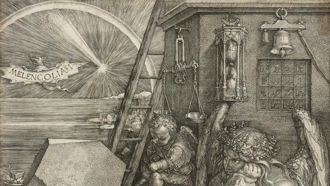
The current exhibition, titled Of Gods and Monsters, in fact includes a couple of the most famous images in modern art, Durer’s Melencolia I (1514) and Goya’s The Sleep of Reason (1797-98), as well as William Blake, Hogarth, Mantegna, Salvator Rosa and a few who will probably be much less familiar but worth discovering such as Hendrick Goltzius or Charles Meryon.
It is helpful in appreciating any art to have some understanding of how it is made, but this is particularly true of printmaking, which becomes far more interesting when you know how the images have been produced. Part of the aesthetic effect of a print is the simultaneity of the whole surface; although the plate takes time to prepare, the image itself is struck at the same time and thus acquires a kind of abstract and definite stillness which is unlike a drawing, for example, in which we can feel the successive stages and layers of the work.
Most forms of printmaking – with the exception of more recent techniques like lithography or screen printing – fall into one of two categories, either relief or intaglio. In relief prints – woodblocks or, in the last hundred years, linocuts – it is the part of the block that remains in relief that prints the image. The image is drawn onto the block and then the spaces between the lines are cut away.
What remains of the surface is inked and prints the original image, albeit in reverse, like all prints. Because they are in relief, woodblock prints do not require a great deal of pressure to print, and can thus be assembled with letterpress as illustrations in a book or magazine. This was how all illustrations in books, and even the great illustrated papers of the 19th century, were produced until the advent of photogravure in the last decades of the century.
Intaglio prints use metal plates, usually copper or zinc, and the design is incised into the surface – the plate is inked and wiped, and it is the ink remaining in the incised lines or grooves that produces the image. Thus if in woodblock it is what remains of the original surface that makes the image, here it is what has been cut away from that surface. And because the ink has to be forced out of the grooves and onto the paper, intaglio prints must be printed under very high pressure.
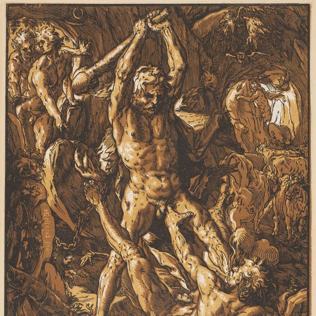
So how are these grooves incised into the surface of the copper plate? In the oldest technique, known as engraving, lines are cut directly into the plate with a burin. This requires considerable strength, control and dexterity, but it gives the most precise result, as we see here in examples by Durer or Goltzius.
The finest discriminations of form and effects of light and shade are produced entirely by the quality of the line and the engraver’s skill in hatching, evoking texture as well as light or shade.
A far easier technique is etching, in which the plate is first covered with an acid-proof varnish – the artist draws the design on the plate with a needle, scratching away the varnish in the process. Then the plate is submerged in a bath of acid which eats away grooves wherever the copper is exposed. After cleaning, it is inked and printed, although etchers frequently then rework the plate, producing further states. The result is a much freer line, more akin to the line of drawing, as we see here in the etchings of Salvator Rosa.
Drypoint is scratching directly into the plate with a needle, and this is often used to add depth of tone to an etching. But so far tone is produced almost entirely by hatching. Aquatint, a later development, allowed the artist to introduce nonlinear areas of tone. A layer of powdered rosin is dusted over the surface of the plate and heated to make millions of tiny dots of acid-resistant surface. Between these dots, the acid can bite tiny pits which, together, form areas of tone.
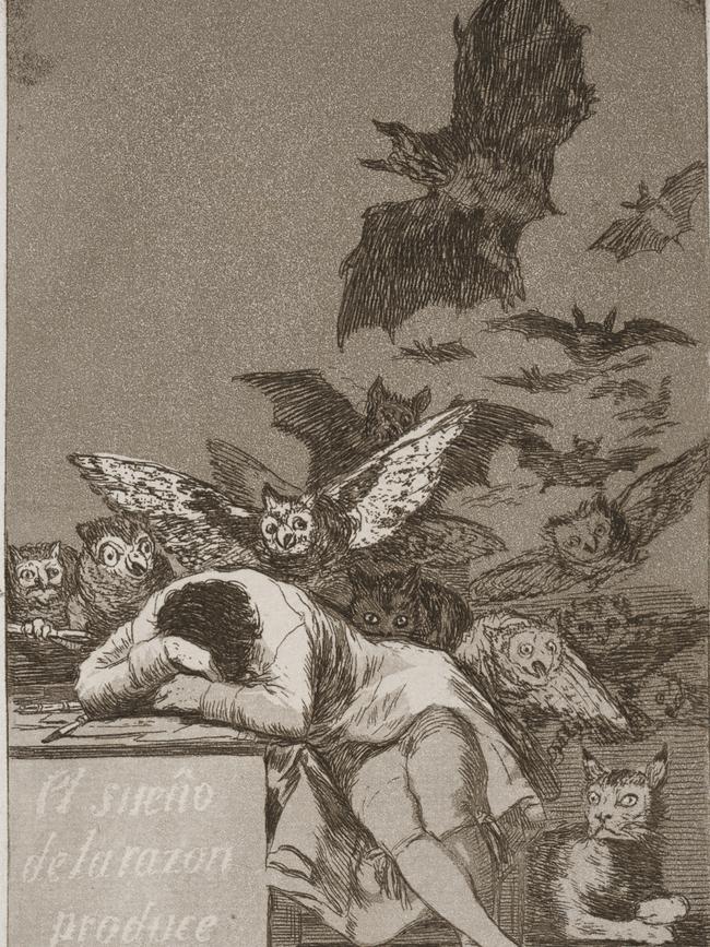
The plate can be submerged several times in the acid, stopping out the areas that the artist wants to keep white, or, after the first immersion, of a lighter tone. The supreme exponent of aquatint is Goya, who uses this tonal technique in The Sleep of Reason, including for the title on the left of the print. Part of the pleasure of an aquatint is the limited number of tones – easily discernible – in a print, giving the image a slightly artificial as well as expressive quality.
A full range of tone, on the other hand, as in a photograph, is achievable in a technique perfected only a couple of generations before photography. In mezzotint, the plate is covered with millions of tiny pits by a mechanical process using a rocker.
If inked, wiped and printed at this stage, the plate should produce an even black surface. Lighter areas are achieved by burnishing away the pits wherever the artist chooses, and because the subtlety of transitions is limited only by the skill of the engraver, there is no limit to the range of tone.
The exhibition starts with three examples of mezzotint by the romantic artist John Martin: these are illustrations to Milton’s Paradise Lost (1667; second version 1674), another author who, like Dante, was rediscovered in the romantic period. Mezzotint allows Martin to create extremely dramatic contrasts of light and dark as he evokes the infernal world ruled by Satan after his banishment from Heaven.
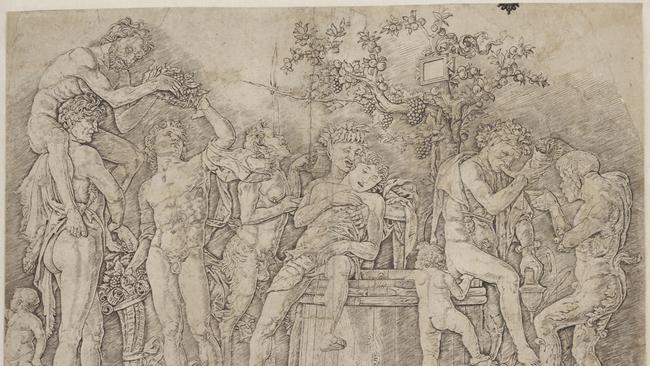
On the next wall we encounter an allegorical self-portrait by the eccentric Neapolitan artist Salvator Rosa, in which he presents himself, as the text in Latin tells us, as a Diogenes-like figure who despises both material wealth and death. Next to this is an important early example of engraving by Andrea Mantegna, one of the most intriguing artists of the 15th century and the first modern artist to hold a full-time appointment as official court painter.
The composition is a mysterious collection of Dionysiac figures gathered around a wine vat expressing varying degrees of inebriation and lust. There are fascinating archaeological details like cornucopias or the bells on the Satyr’s ankle, but this is the very beginning of the modern representation of ancient myth, and the iconography has not yet become standardised. Mantegna is followed by Durer, who admired him but whose engraving technique, 40 years later, reflects the growing sophistication of the medium and the new taste of the High Renaissance for chiaroscuro.
Melencolia I is not a work that can be discussed briefly; it has inspired countless articles and scholarly books, as well as modern poets and artists. It is not itself a theoretical treatise however, but a meditation on the melancholy humour, characteristic of artists and intellectuals, and on the insoluble intellectual questions that puzzle and weary the mind.
Next to this is Goya’s Sleep of Reason, which emerges from the very different intellectual milieu of the enlightenment, but which seems to suggest not just that monsters arise when reason is inattentive, but even more disturbingly that reason itself can fall asleep and generate its own antithesis.
Hendrick Goltzius, one of the great virtuosi of renaissance printmaking, is represented by a couple of engravings, notably Mars and Venus (1588): Apollo is seen through the window driving the chariot of the sun, symbolising, as the Latin inscription tells us, the revelation of the couple’s adulterous liaison (in this version of the story); the motif of the draperies drawn apart to show them in each other’s arms is also a symbol of the uncovering of truth.
Goltzius’s engraving technique was exceptionally brilliant, but he was also a leading exponent of the chiaroscuro woodcut, as illustrated here in his Proserpine and Pluto (both 1588-90), as well the remarkable Hercules and Cacus (1588). Chiaroscuro woodcut was a variation on the normal linear woodcut described above, in which additional plates were printed with areas of tone – essentially like a very much simpler and monochrome version of the later ukiyoe technique in Japan.
Chiaroscuro woodcuts have been brought to contemporary attention in recent years because the German artist Georg Baselitz has formed an important collection, which was exhibited at the Royal Academy in London in 2014. The show included Hercules and Cacus of course, with its extraordinary evocation of violence as the hero kills the monstrous giant in the foreground.
In later periods, a lithograph by Delacroix and two works after Henry Fuseli – another fascinating character – remind us of the renewed appreciation of Shakespeare too in the romantic period. The final section is composed of four intricate illustrations to the Book of Job by William Blake, while William Hogarth is represented with a complex anthology of various forms of folly and superstition.
As foreshadowed above, however, it is worth looking carefully at the work of Charles Meryon (1821-68), the son of an English doctor and a French dancer who was working in London at the time, but who gave birth to the boy in Paris.
Meryon grew up to be a naval officer – spending some time in New Zealand – but eventually turned to art; as he was colourblind, he took to etching, at which he excelled, in a style that combined elements of realism and romanticism with reminiscences of great 16th century etchers like Jacques Callot.
Meryon suffered from schizophrenia, growing worse in his later years, but produced a number of memorable etchings of Paris which attracted the attention and admiration of Charles Baudelaire. One of these, perhaps his best-known today, shows a gargoyle from Notre-Dame looking out over the skyline of Paris, with a caption alluding to the universal plague of lust besetting the city.
The other etching in this exhibition shows one of the two 18th-century palaces in the Place de la Concorde in Paris: the air is filled with monstrous and surreal forms, distantly inspired by memories of the artist’s experiences in the South Pacific, but more specifically recalling the horrors of a place where, before it was rededicated to the ideal of Concord, over one thousand men and women had been guillotined during the Terror.
Of Gods and Monsters
Art Gallery of New South Wales (part of new hang)
Pictures: The Art Gallery of NSW
Gallery puts female artists in the frame
Ethel Carrick Fox and Anne Dangar, the two subjects of the National Gallery of Australia’s latest exhibition of women in art, are of a very different calibre.

Author leaves final testament
Victoria Amelina was bravely documenting the Russian war against Ukraine when a missile ended her life, but her story lives on in her posthumously released book