There’s an art to making a standout beer
In the bad old days, beers announced themselves with labelling that had the nuance of a name tag at an accounting convention.
In the bad old days, Australian beers announced themselves with labelling that had all the nuance of a name tag at an accounting convention. There was no confusion or creativity, just a “Hello, I’m Jeremy, nice to meet you”.
The craft beer fridges in bottle shops these days hit the eye like a psychedelic trip. Rows and rows of cans bear bold art that stretches the spectrum from comic book to the classical.
Eye-catching beer cans came of age in the northern hemisphere, spearheaded by the Danish Mikkeller brewery over a decade ago and the trend has spread through the industry as brewers realised they had to gain attention on a crowded shelf.
There were early adopters of the artistic label. Bill Leak, a former cartoonist for The Australian, was involved in the early part of this century with Chuck Hahn’s Mad Brewer range.
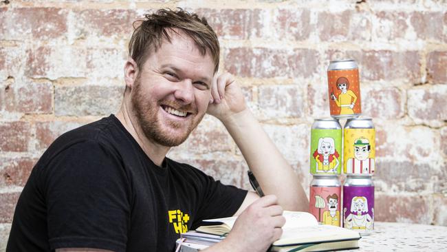
Melbourne’s Clint Weaver runs a bottle shop and a design business, Pocketbeagles, responsible for the award-winning CoConspirator Brewing imagery that has been catching eyes for some years now. His works are angular, understated and instantly identifiable. “I’ve been doing it for five years but paying attention to it for a lot longer than that,” he said. “The overseas market was way ahead of us on a lot of things, including design, but Australia has caught up in the last three years.”
The designer believes it is “very important” to dress up your beer.
“There is a large saturation of breweries in Australia and very limited shelf space, so when you walk into a bottle shop and are presented with 300 options there is a very good chance you are not going to know 90 per cent of them,” he said.
“That first hurdle for getting a new customer is making sure it looks good on the shelf.”
In many ways the cans reflect what’s in them and the loud, American comic-book style favoured by many usually wraps around a beer that has all its key elements turned up to 11.
“A couple of years ago you could make a nice design and it would stand out because nobody else was putting in any effort, but now you have to try to be different still but make sure you are not shouting because they are all sort of shouting,” Weaver said.
In a country besotted with regulation it is no surprise beer can art has to meet with approval under the Australian Beverage Advisory Code Scheme. Weaver has had labels rejected because the colour scheme was too soft and a factotum believed it would appeal to minors. “They came back and said beer has to be primary colours like VB and Melbourne Bitter,” Weaver said.
Some brewers have rejected the rush to cans. La Sirene in Melbourne and Wildflower in Marrickville, Sydney, have classic art design on bottles in a manner more common to boutique wines. “Those brands that persevered, like La Sirene, have their own niche. It looks nice and people are buying it.”
Add your comment to this story

This is the best way to see Italy’s magnificent southern coastline
The road hugs the coastline, swooping and turning above the Adriatic. The climbs are generous, the descents rewarding, and the views? Ridiculous.

Secret Cellar offer: premium shiraz and cabernet deal
One of Australia’s most innovative winemakers has an idea to re-ignite wine sales in China, while our wine club releases its latest red wine bargain sale.
To join the conversation, please log in. Don't have an account? Register
Join the conversation, you are commenting as Logout