The big picture
THE overwhelming power of figure and narrative painting in Rome can make us forget that this was also an important centre of landscape.

THE overwhelming power of figure and narrative painting in Rome can make us forget that this was also an important centre of landscape.
It was here that a number of tendencies that had arisen in Florence in the 15th century and Venice in the 16th wove together with memories of the antique to form the classical synthesis epitomised by Claude and Poussin, who lived and worked in seicento Rome.
Another element that entered into this synthesis was the Flemish tradition, with its characteristic mixture of naturalism and fantasy. Flemish painters were in Rome throughout the 16th century and landscape was one of their specialties; about 1600, this tradition began to merge with the narrative mainstream to form what we think of as the classical landscape idiom.
One remarkable set of paintings that I had not seen before a visit this Easter is in the cloister of the old church of Sant'Onofrio on the Janiculum. It was in this cloister, apparently, that the great poet Torquato Tasso died in 1595. (His earlier confinement in a madhouse is represented in a painting by Delacroix, which in turn inspired a poem by Baudelaire.) The cloister is surrounded by a series of remarkable lunettes painted in 1600 and attributed to the Cavaliere d'Arpino, the late mannerist artist whose lack of naturalism was often contrasted with Caravaggio's excessive attachment to his models. But Arpino is here almost certainly working with a Flemish associate and the series represents a significant stage in the evolution of modern landscape painting.
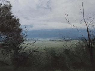
From the cloister of Sant'Onofrio, the Wynne Prize for landscape at the Art Gallery of NSW is a rather insipid memory, yet it is a better exhibition than the one last year. There are not as many painters throwing in the towel and settling for abstraction, or doing things that are in other ways beside the point; more are facing the specific challenges of the landscape genre.
In this, as in other areas, we may be witnessing the beginning of a movement that doesn't have a name but is genuinely after, and different from, modernism as well as postmodernism. It has been suggested that we are in an anything-goes phase of art, but it is perhaps a bit more interesting than that. Nothing really good happens when anything at all is permissible; artists, like all of us, respond to specific demands, constraints and opportunities.
Quite a few of the Wynne pictures are appealing in parts but none is wholly satisfying; one can see the artists attempting to engage with the language and tradition of landscape, although they are not always successful in understanding the principles, the resources and the limits of the genre they are trying to use.
This is hardly surprising, considering how hard it is to find anyone capable of teaching such things; and without wishing to deny the virtues of various pictures, it is instructive to consider the points at which they fall short of success. The most glaring problem is that so many of them are just too big for what they have to say.
It is like the difference between having material for a short story and a novel. How often, in exhibitions, are the little pictures better than the large, the studies more satisfactory than the finished works?
In most cases, scaling up from the study to the large canvas involves little more than dilution; the final version is simply a watered-down version of the original idea.
Thus Rodney Pople's picture of The Gap in Sydney is too big and consequently too vague; a small sketch of the same subject could have been much more striking. This case also reminds us how much an artist benefits from understanding the history and theory of the tradition he is practising.
The sublime, precisely because it is an experience of the infinite and the amorphous, cannot be expressed through formless painting. The masters of the sublime, from Friedrich to von Guerard, are meticulously precise; one could compare the way Samuel Beckett employs the most articulate language to evoke the effect of inarticulacy.
Ian Grant's painting Inland West would be much more successful on a smaller scale; the minimalist rendering of forms and the very restricted palette could have tautness and focus if they were close to, say, an A3 size; as it is, amplification makes them rather bland. John Walker not only paints very big pictures but doesn't paint them enough. As was the case last year, you are left looking at a lot of marks that don't quite come together as a convincing image, in this case of a plum tree in a back yard. Walker seems to be trying to reproduce the spontaneity and almost calligraphic economy of Chinese ink painting with Plum Tree Backyard. Once again, though, a deeper understanding of both the Western and Chinese traditions would help to avoid glaring misunderstandings.
The artist may feel that his work proceeds from a deep sense of attunement to his subject, but conviction cannot be expressed without a mastery of the instrument.
David Keeling's picture Lockridge, Macquarie Tier, Then and Now, demonstrates a feeling for his subject -- for the morphology and even the sentiment of trees -- but again betrays a lack of thought about how this material is meant to become a painting. It is not enough to be able to reproduce appearances; a picture is an artificial thing, with a shape, but Keeling's has no composition, no sense of tonal or chromatic structure (it is all too green), and the sky is vacant and inanimate. There are even more serious problems with Neil Frazer's work Shore Leave, which looks like a commercial pastiche of Nicholas Harding's recent sea and shore pictures; the painterly tricks are so blatant as to be quite nauseating.
With Bushfire Season, Alexander Mackenzie's case is a bit more subtle, but not much. The problem is a fundamental one and cannot easily be corrected: his style is kitsch, a tissue of vulgar formulas that make you almost as queasy as Frazer. Of course Mackenzie probably prefers to think of it as somehow meta-kitsch, as though it were all right to paint chocolate-box cliches as long as you know that's what you're doing.
But this is an illusion; the trite visual conceits he uses cannot compensate for the ugly little trees, the banal paint surface and the broad areas of rollered-in sky. In striking contrast are Viola Dominello's sketchbook studies (which won the Trustees' Watercolour Prize), fresh notations of plein-air experience.
Sam Leach was named this year's winner for Proposal for Landscaped Cosmos. (He was also awarded the Archibald). Some weeks after the announcement of the prize, it was revealed Leach had substantially copied a composition by Adam Pynacker, a Dutch 17th-century landscape painter of the so-called Italianate school. This matter has been discussed at great length in the media and I have also commented in some detail on the principles involved in The Australian. There is nothing wrong with borrowing, especially when there is reinvention and renewal; copying almost literally is obviously more problematic, while reducing the scale and omitting the figures, far from qualifying as original adaptation, merely serves to disguise what has been done.
It has been argued that appropriation is characteristic of his work, as though people should have known what to expect; but this would be disingenuous even if Leach were a widely familiar artist, which he is not. In the end, he was foolish not to acknowledge his debt in a title or subtitle, especially in the context of a valuable and coveted prize.
The most accomplished landscape painter in the exhibition is again Philip Wolfhagen, who has manifestly spent much time thinking about the heritage of the landscape genre. Precisely because he does understand many things about the tradition within which he is working, however, Wolfhagen should beware of falling into certain routines and devices that become too predictable, like his use of scraping back to make small branches and twigs. There is a danger when such shortcuts, evidently employed for the sake of spontaneity, become too prominent a part of the style. Precisely because they are personal mannerisms rather than part of a more universal language, these effects can become self-referential rather than expressive.
Whereas the other two prizes are judged by the trustees of the AGNSW, the Sulman is selected and awarded by a guest artist. This year the invited judge is Imants Tillers, and he has done a better job than last time in selecting the works to hang, although many still fall outside the terms of the prize.
However, the entry to which he awarded the prize, Michael Lindeman's Paintings, Prints & Wall Hangings, a series of panels reproducing classified advertisements for cheapjack made-to-order pictures, seems a too obvious and almost lazy choice, given Tillers's predilections. The idea is clever, but art has to be about more than a clever idea; it has to speak to the mind in a deeper and more intuitive way and convey some insight that is not exhausted at a glance.
Among the more interesting things are Jo Bertini's rather whimsical painting Tracking the Night Parrot and Caroline Williams's Sonia Tolstoy Watches her Dying Husband at Astapovo Station, 1910, an instance of how paintings can in some circumstances transform photographic sources.
Marcus Wills, who won the Archibald in 2006, has a characteristically eccentric composition, The Doom: dozens of little naked figures, all based on life studies and recognisably images of a number of particular models, tumble through the air and fall to earth like the rebel angels in Rubens's famous picture. The whole thing is meticulously drawn and carefully composed but all the figures are stiff and static; the lesson of Rubens's original is that to achieve a sense of movement, the artist must take liberties and trust to his invention.
The works that really stand out in the Sulman, though, are both perhaps strictly beyond the terms of the prize; but in a show that includes pictures that belong blatantly to different genres, one may accept one of these as a subject picture and the other, at a pinch, as a mural.
The first is James Powditch's Cathedral, an assemblage of wooden and metallic elements composing a kind of skyscraper against a background composed of pages from the Odyssey; Powditch evokes the analogy between the searching curiosity of Homer's hero and the drives that created our modern urban civilisation.
Most striking of all is a low-relief -- or rather flat -- sculpture by Paul Selwood, Sacred Play, producing the illusion of a kind of portal in three dimensions. Although based on an optical illusion, Selwood's sculpture is much more than the plastic equivalent of a pun; the combination of a motif that speaks to the human mind with sober materials and a large scale that is for once appropriate gives it a monumental and enigmatic presence.

My husband’s mistress was a twirling roulette wheel
Tony was 14 years older than me, and he had already been married, and had children, but I loved the way his energy spilt out in all directions. As time went on, suspicion crept in.

At 90, I look back at my life in wonder
Doug Pleasance takes stock of his blessings – none greater than the fact his dad came home from the war.