The history of colour on show at National Gallery of Victoria
This exhibition is an opportunity to ponder the mysteries of colour perception and the deeper implications of language and names

Colour is all around us in the visible world, although we are less aware of it today when it is relentlessly synthesised and exploited for commercial purposes: from lurid product packaging to the new digital screens that allow moving advertisements to invade and dominate urban spaces both indoors and outdoors. Everything in commercial culture is designed to stimulate appetite and desire, but the abuse of stimulus dulls our apprehension and numbs our sensibilities.
We love the country because it allows us to escape from this nightmare of predatory consumerism. There, as well as peace and communion with nature, we can rediscover the delight in natural colours, which may be abundant or sparse according to the passage of the seasons; grass is brown in summer or green after rain; wildflowers suddenly appear in spring.
For most of human history, nature provided much of our experience of colour; our forebears lived in chromatically low-key or neutral environments, in houses of timber, mudbrick, fired brick or stone, and in clothes that were largely undyed. To such peoples, the luxuriant glazed tile decoration of a Persian mosque or the stained-glass windows of Gothic cathedrals were like visions of paradise.
In the home, oriental carpets, ceramics, arrangements of fresh flowers all gave pleasure to a visual sense not blunted by over-stimulus. Paintings, in particular, were appreciated in a different way when our eyes were more accustomed to subtler perception and discrimination; looking back over the last century, it is clear that even serious painting became increasingly crude as it tried to assert its claim on the attention of a distracted and jaded audience.
Think, for example, of the intense pleasure that the Renaissance Italians took in the imaginary worlds evoked by the art of painting, or the delight of even the simplest Dutchman of the 17th century in pictures of landscape or still life. Although we sometimes hear people talk of visual literacy, the unfortunate truth is that most people today have little idea how to read pictures. Their attention span has been stunted by the pace of mass media and their capacity for visual apprehension has been so compromised that they can no longer perceive subtle chromatic harmonies and contrasts.
Our experience of colour is determined both by physiological and by cultural and linguistic factors. Physiologically, the perception of colour is an evolutionary adaptation that allows us to differentiate more clearly among the things that surround us in the visual world. Sight is the perception of light reflected from objects, and the most primitive form of vision registered greater or lesser intensity of light as a tonal or black-and-white image. But various properties of bodies also cause them to reflect light waves of different bandwidths, and that allowed a more sophisticated visual cortex to label these different frequencies with the colours of the spectrum.
The human eye has three kinds of cones in the retina for the perception of colour, as well as more primitive rods around the periphery, which we use for night vision: the cones can make finer distinctions, but need higher intensity of light to function, while the rods allow us to perceive tonal distinctions at very low levels. This is also why our night-vision is monochrome, and why we see colour return to the world at dawn.
But it seems that not all humans see colour in quite the same way, or at least they are not aware of it in the same way – a crucial but also rather elusive distinction. For anyone interested in this subject I recommend Guy Deutscher’s fascinating book Through the Language Glass (2010); it is one of the very few recent books that I was literally unable to put down and from which I felt that I learned something of real substance.
Deutscher begins with a problem first raised by William Gladstone, today generally remembered as a statesman, but also a distinguished Homeric scholar. Gladstone noticed that Homer had very few words for colour, and often used these – words for red and purple for example – in ways that seem inconsistent to a modern reader. Most surprisingly, he didn’t seem to have a word for the colour blue; two words which in Classical Greek referred to shades of blue appear, in Homer, to refer to light and dark tones rather than to the colour itself.
It seems almost unbelievable that in Greece of all places, surrounded by the sea and sky, it could be possible to lack a term for this ubiquitous colour. But seeing the sky as blue is not as natural or universal as we may think. Deutscher did an experiment with his own infant daughter, introducing her to the names of colours with reference to other things, but not mentioning the sky at first; one day, when she was old enough to understand, he asked her what colour the sky was, and she was at first at a loss to answer.
It turns out that all languages start by discriminating tone rather than colour or hue. They have words for lightness and brightness, and words for black and darkness. The first real colour that is named, in all cases, appears to be red, no doubt because of its profound association with life and death – whether the blood of warriors or of menstruating women – in all cases associated with taboo or pollution.
At the same time, red is a common pigment in nature, available to the earliest cultures in the form of red ochre, and later in the form of madder, cinnabar and other plant or mineral sources that require processing. So the naming of a colour may depend not only on its cultural importance but also on our ability to reproduce or represent it in art.
The second colour to be named is either yellow or green, the third also either yellow or green; blue is the last of all these, and many Indigenous languages do not have a distinct term for blue; instead they may include blue under a word for green.
Tests show that individuals in such cultures can recognise the difference between colour samples, and yet they cannot name that difference.
All of this raises fundamental questions about the relation between language and thought or consciousness, which go far beyond colour perception. Think of the power of political words, from the Greek ideas of freedom or citizenship to modern conceptions of the state or nation; or of new ideas of race and ethnicity which arose from 19th century science but have had such disastrous consequences; or the very conception of sexuality, only 150 years old, and its more recent fragmentation into alphabet sexualities, where words denote identities.
At any rate, this exhibition is an opportunity not only to ponder the mysteries of colour perception and the deeper implications of language and names, but in particular to think about some of the most important colours defined in various traditions of art, and to examine the materials from which they could be reproduced in painting and other media.
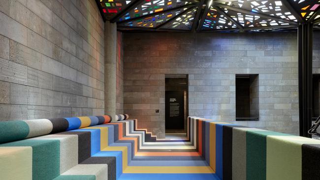
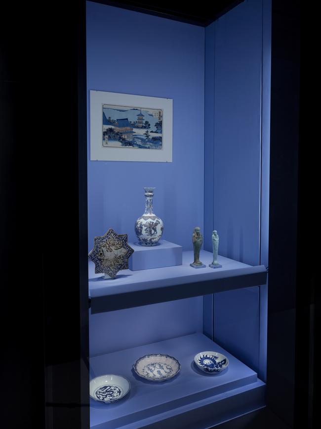
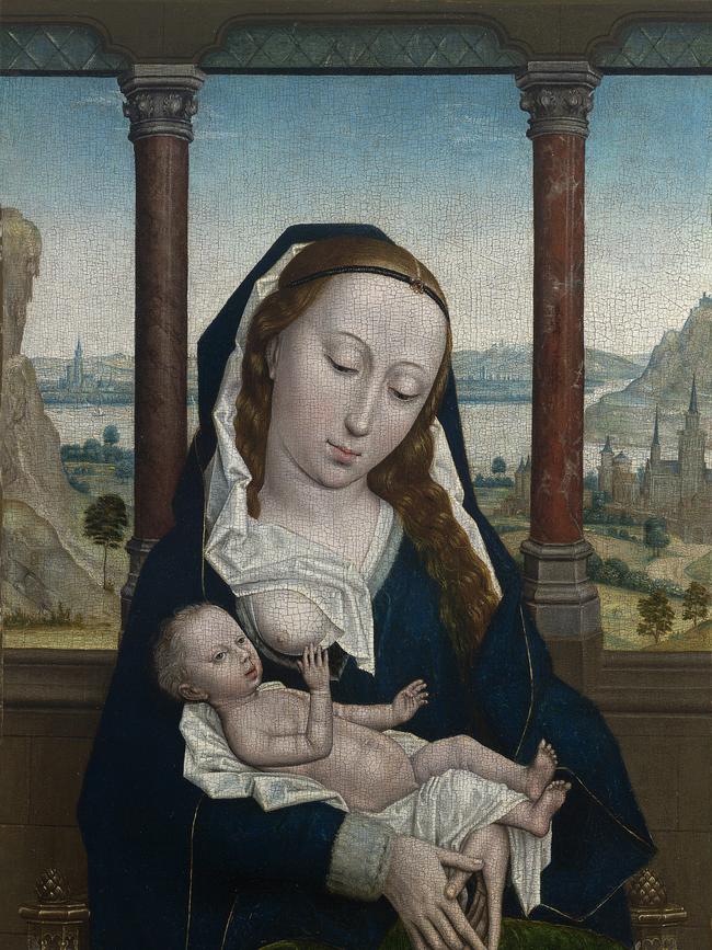
The exhibition is set out in a series of 19 bays, framed at either end by examples of occidental and oriental art; on one side an 18th-century Indian Mughal painting in gouache and gold paint – a brilliant palette of complementary oranges and aqua – and on the other a 15th-century Flemish oil painting of the Virgin in Child by Simon Marmion, dominated by the rich blue ultramarine derived from lapis lazuli.
The other 17 bays are mostly devoted to particular colours, starting with white, grey and black, followed by purple, indigo, blue, green, yellow, orange, pink and red. The list is not entirely coherent, as we can see from separate bays for blue and indigo, which is really a form of blue dye, as well as a couple of other bays that don’t fit the sequence at all, one being devoted to “colour” and the other to the pastel medium that reached its peak in the 18th century.
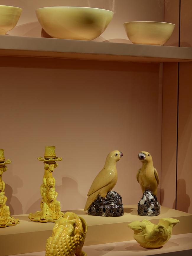
Of the colours included, some are fundamental in human culture and others rare or more historically specific, like pink (which appears as a glaze in Chinese ceramics only in the Ching dynasty). Black and white are fundamental: they are common as drawing materials (charcoal and chalk), and white paint – highly toxic – was made from the oxidisation of lead. Black and white clothes, though often associated with plainness and austerity, were expensive to produce, requiring repeated dyeing for black and long bleaching for white. But it is the story of the pigments used to produce colours that is of greatest interest.
Lapis lazuli was the most precious pigment used in medieval and Renaissance art, imported from Afghanistan and more expensive for its weight than gold. It also had to be expertly ground to achieve the richest colour. Interestingly, this may have been the first real blue used in art, since it is already found in the decoration of Sumerian artefacts; this region, then, may also have been the first to develop an awareness of blue as a colour. And later the Persians imported blue and white ceramics from China, coloured with cobalt mined in Persia.
Purple was famous in antiquity for its enormous cost, because it was derived from tiny molluscs on the Phoenician coast – hence the name Tyrian purple; it was a byword for luxury and was used in Rome for senators and later emperors. Yellow was a surprisingly hard colour to produce and Indian yellow was notoriously made from the urine of cows fed on a diet of mango leaves.
But perhaps most fascinating of all are the many pigments used to produce various hues of what we would generally call red. Crimson was produced from madder roots, but it is a dye (used in Persian carpets, for example) rather than a pigment, and it was a complicated process to convert it into a form that could be mixed with oil to produce Alizarin crimson. This is a rather cherry-like colour compared to the slightly more orange hue of vermilion, which is close to a postbox red. Cinnabar, widely used in Chinese lacquerware, is the ore from which mercury is extracted; vermilion is a more highly-processed form produced by combining mercury with sulphur.
The most recently-discovered natural red – before the beginning of synthetic pigments in the 18th and especially 19th centuries – was cochineal, which came from the new world and was derived from a tiny Mexican insect. The Spanish had a monopoly on the production of cochineal and kept its source secret; it was only in 1704 that Antonie van Leeuwenhoek, one of the pioneers of microscopy and the first man to see single-cell organisms (1676), examined a sample and detected tiny scale fragments. Modern science was already beginning to break down trade secrets, monopolies and seemingly entrenched commercial advantages.
Spectrum: An Exploration of Colour
National Gallery of Victoria, until June 26
Add your comment to this story

He won the Archibald three times and then disappeared. Why?
Eric Smith repeatedly won some of Australia’s most important art prizes – including the Blake, Sulman and Archibald – but has in recent decades been almost completely forgotten.

Obsessed with protein? You’re not alone
From protein kefir to beef jerky and YoPRO, the supplement isn’t just for jacked dudes at gym anymore.
To join the conversation, please log in. Don't have an account? Register
Join the conversation, you are commenting as Logout