Printmakers Ethel Spowers and Eveline Syme side by side in Geelong
Ethel Spowers and Eveline Syme, daughters of newspaper proprietors, caught the fashion for linoprint and Japanese printmaking.

Linoleum was invented in the middle of the 19th century as a floor covering. By the early 20th century, the German expressionist group in Dresden, Die Bruecke, had adapted it for artistic purposes. It became popular with a number of modernist artists between the wars and has been used ever since, particularly in schools as a first introduction to printmaking.
The principle of linocut is the same as that of woodcut, except that the medium is easier to use and free of the complexities of woodgrain: a design is drawn on to the block, and everything around the lines or masses of the design is cut away. The block is inked and an impression taken – without the need for the extreme pressure required in etching – representing the part of the surface of the block that was not cut away. As in all prints, the impression is the reverse of the design on the block.
The Dresden prints were in black and white, emulating the effect of earlier woodcuts but in a deliberately expressionist and neo-primitivist spirit. After World War I, at the Grosvenor School in London, Claude Flight taught a more sophisticated form of linocut, inspired by the Japanese tradition of ukiyo-e. These “images of the floating world” had flourished in Japan from the late 18th century to the mid 19th, and had in turn greatly appealed to modern artists in Europe in the late 19th century.
Ukiyo-e prints are coloured woodblocks, using an initial block for the black outlines of the design – transferred from the artist’s original drawing – and then separate blocks for each colour, so that the same sheet is printed many times over and then sometimes burnished or finished in other ways.
The linocut version of this process, technically somewhat simplified and stylistically shaped by contemporary modernist movements in England, is illustrated in most of the works in a modest but appealing exhibition at Geelong Art Gallery, devoted to the careers of Ethel Spowers (1890-1947) and her lifelong friend Eveline Syme (1888-1961).
Spowers and Syme, like almost all women artists in Australia in the early 20th century, were independently wealthy, unmarried and probably lesbian. Both attended the Church of England Girls’ Grammar School in South Yarra (now Melbourne Girls’ Grammar) and were the offspring of newspaper proprietors: Syme was the daughter of Joseph Syme, co-owner of The Age, while Spowers’ father was William Spowers, publisher of The Argus and The Australasian; Spowers continued to live in the handsome family residence, Toorak House, and the exhibition includes a couple of photographs of the comfortable studio she set up above the stables.
They were both intelligent and talented young women, but of the two Syme was the more intellectual and Spowers the better artist. Syme, who was a couple of years older and finished sixth form in 1905, studied classics at Newnham College in Cambridge from 1907 to 1910; Cambridge did not at that time award degrees to women, but subsequently, in 1930, conferred on her the degree of Master of Arts. She was later instrumental in setting up Women’s College at the University of Melbourne and was a foundation member of its council from 1936 to 1961 as well as president from 1940 to 1947.
Spowers was a natural artist with a gift for illustration, as is evident from the works she did both at the beginning and at the end of her career. This inclination was not entirely consistent with the curriculum of the National Gallery School in Melbourne, which she attended for the full seven years of the course, from 1911 to 1918, and which was intended to give a complete grounding in drawing and painting; nonetheless she completed the course successfully, even winning second place in one category of drawing and two of painting.
Her natural talent for illustration and in particular the illustration of children’s books, as Sarina Noordhuis-Fairfax points out in the fine catalogue that accompanies the exhibition, coincided with “the golden age of illustration, which spanned the years 1880 to 1920”. Her experience is also a reminder of the value of the thorough if sometimes conservative training she received at the NG School, which developed not only her graphic skills but also her feeling for composition, light, shade and colour.
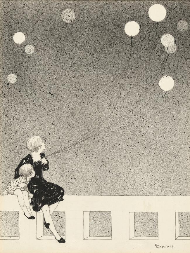
Several of the earliest works in the exhibition are charming images of children, or of mothers and children, as in the stylised and refined drawing Balloons (c. 1920) or The Noisy Parrot (1926), in both of which Spowers demonstrates her equal talent for narrative and for decorative composition.
The same feeling is evident in a beautiful view, Melbourne From the River (1924), which combines recollections of Corot’s late landscapes with the more recent example of Whistler and of the Japanese prints that influenced Whistler himself.
Spowers’ early work is already profoundly shaped by the Japanese printmaking tradition, well before her experience in London at the Grosvenor School. In fact the view of Melbourne is a woodcut print in the Japanese manner, in coloured inks and five blocks. As in all forms of prints, the artificiality of the printmaking technique, and in this case the five distinct pigments that make up the composition, is inseparable from the aesthetic effect: constraint becomes, once again, a source of inspiration.

The Japanese technique had been familiar since the previous century, but an important practical manual, as the catalogue points out, was Frank Morley Fletcher’s Wood-block Printing: A Description of the Craft of Woodcutting and Colour Printing Based on the Japanese Practice (1916). By the 1920s, however, there were already attempts to reproduce the same effects with the easier medium of lino. This development elicited a critical article by Fletcher in 1924, and Claude Flight’s defence of the practice in A Handbook of Linoleum-Cut Colour-Printing in 1927.
Spowers was clearly experimenting with both techniques, for while The Noisy Parrot is a woodcut in the traditional Japanese manner in five blocks, The Bamboo Blind, also from 1926, uses lino in six blocks. A couple of years later, in 1928, she left for London to study with Flight, and the works of the subsequent years are all in lino. There is a notable shift in style, too, in accordance with Flight’s interest in modernist themes. Influenced by Italian Futurism and the contemporary British Vorticist movement, he believed that modern art should speak of a world of machines, movement and speed.
The exhibition includes linocuts made in this spirit by other followers of Flight, but none is as successful as Spowers, in part because she leavens the earnestness sometimes found in this kind of work with a quality of playfulness and humour connected to her love of children’s illustrations, and also because of her superior feeling for composition and visual rhythm.
Spowers also understood that, as in all printmaking and indeed as in all works on paper – for the same principle applies to watercolour – the areas of the sheet that the artist chooses to leave blank play a crucial part in the visual whole. This is one of the secrets of her Wet Afternoon (1930), a print in four blocks in which the light reflected from the wet umbrellas is rendered as areas of bare white paper.
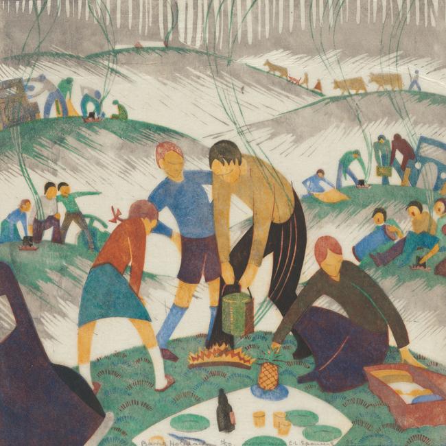
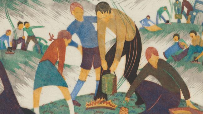
This print was included by Flight in the second annual exhibition of British linocuts that was held in the summer of 1930. But Spowers’ handling of blank areas is even more sophisticated a few years later in Bank Holiday (1935), printed in six blocks. Here, the family picnicking on a small hill in the foreground is distinctly set out against an almost blank immediate middle ground, and yet surrounded by other groups of figures on hills in the further background. The transition between these background vignettes and the blank paper, necessary to throw the main subject into relief, is ingeniously provided by the fingers of grey shadow.
The composition is closely based on the matrix of the pictorial plane, including diagonals from the midpoints of bottom and side which define the external figures of the main group, the midline of the composition (the bottle in the centre and the father’s right hand), as well as the golden section vertically (the pineapple) and horizontally (the eyes of several figures).
The ingenious composition of these prints is a strength, but also a limitation in the sense that they are at least as concerned with decorative pattern as with anything else. The drawing for Now to Bed (c. 1934) makes this clear: once the pattern is worked out, the rest of the process is essentially a craft. For this reason, although the formal modernism of the works is striking, their ambition as art is fairly modest.
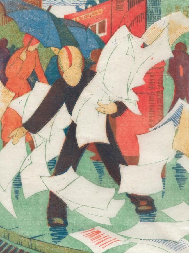
In fact, these designs work much better on paper, and cannot be translated into painting. In the one example in the exhibition of a very similar idea produced in both media, The Gust of Wind (1931), the print version is far more successful. It is light, brilliant and animated, and makes inspired use of the bare paper to represent the broadsheets flying away in the wind. The version in oil seems comparatively leaden in treatment while the subject appears too slight for the medium.
Eveline Syme’s work is much more modest than her friend’s. Some of Syme’s best work is of landscape subjects, such as her charming and very low-key Banks of the Yarra (1935), printed from four blocks. She was a great traveller and a highly educated woman who spoke several languages as well as studying Greek and Latin; there are several engaging prints that record her travels, like Outskirts of Siena (1930-31).
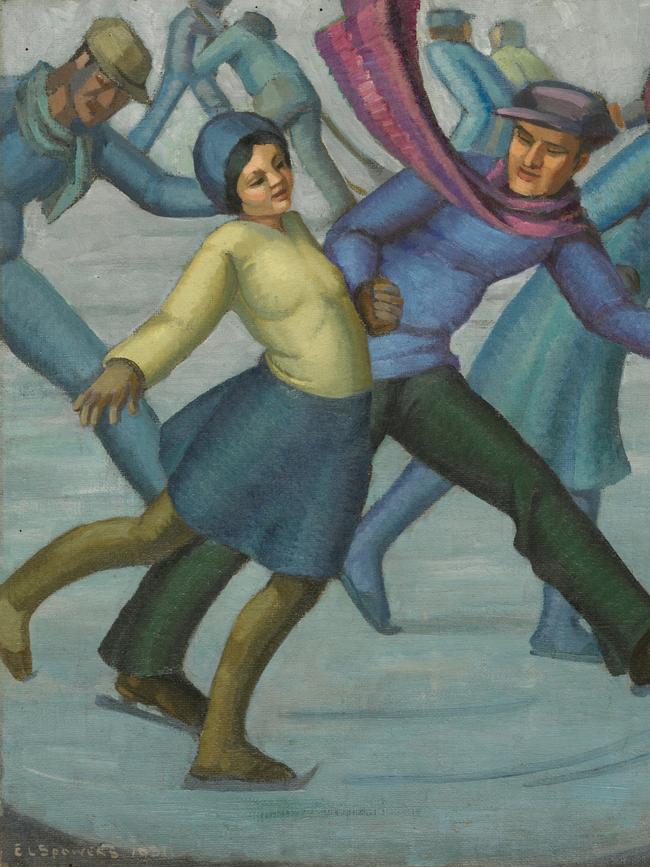
Her figure subjects are less successful. There is an early print, Skating (1929), executed in linocut in two blocks when she had joined Spowers at the Grosvenor School in London. It is animated and witty, but does not have either the compositional skill or the feeling for figure drawing that Spowers possessed, partly naturally and partly in virtue of her years of training. These limitations are more sadly apparent in Beginners’ Class (1956), a very late linocut made almost 10 years after Spowers’ untimely death from cancer in 1947. Spowers had largely stopped making prints after her diagnosis in the mid- 1930s, but the tide had turned against the dynamic, cheerful and decorative modernism of the 1920s and early 1930s, as the mood of the times darkened with the Depression, the rise of totalitarianism and the approach of war. Spowers returned to writing and illustrating children’s stories, recalling the charmed world of the two women’s Edwardian childhood, and Syme busied herself with war work and philanthropy as the nightmare of butchery settled over the world once again.
Spower & Syme
Geelong Art Gallery to October 16
Add your comment to this story

He won the Archibald three times and then disappeared. Why?
Eric Smith repeatedly won some of Australia’s most important art prizes – including the Blake, Sulman and Archibald – but has in recent decades been almost completely forgotten.

Obsessed with protein? You’re not alone
From protein kefir to beef jerky and YoPRO, the supplement isn’t just for jacked dudes at gym anymore.
To join the conversation, please log in. Don't have an account? Register
Join the conversation, you are commenting as Logout