Why restaurant designers are turning their backs on social media trends and millennial pink
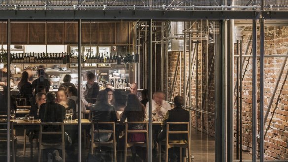
The look and feel of a restaurant is more important than ever in determining whether it survives and thrives. We talk trends with four of Australia's emerging designers.
The devil is in the detail. He (or is it she?) is in the red neon sign, the tree-trunk pillars, the pink staircase, the end-of-Empire rattan chairs and the velvet banquettes the exact colour of the moss you find growing on rocks near flowing water.
They're all arresting design details plucked from restaurants, cafes and bars newly adorning the Australian hospo scene; just a standout sample of many, many more peacocking for customers' eyeballs and wallets. And they all prove one thing. Design matters. In our image-obsessed age, in fact, design matters so much it keeps chefs like Shane Delia awake at night.
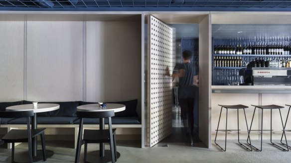
"It was the colour palette more than anything," says the owner of Melbourne Middle Eastern restaurant Maha. "It's a basement venue, but we were trying to be light and bright."
Delia had just dropped a cool $1 million renovating Maha at the end of 2014, but something wasn't right. "Aesthetically it ticked all the boxes but where the restaurant fell over was that common problem that we'd concentrated on how it looked rather than how it made you feel. I just decided, let's be who we are. We're a basement, let's be dark and moody." Cue another $200,000 shifting the colour palette with new paint and upholstery.
In a word: ouch. But as restaurateurs such as Delia are painfully aware, design is embedded in the DNA of hospitality business success. It colludes with the food and drink and the service into a Bermuda Triangle where ruthless competition means it's sink or swim.
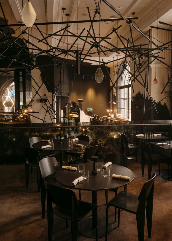
The design of restaurants (and cafes, bars, pop-ups, bakeries and patisseries and everything in between) has turned names such as George Livissianis, Pascale Gomes-McNabb, Teche and Six Degrees into … well … names. If you haven't heard of Projects of Imagination, Acme Co. or Anna Spiro, you haven't been paying attention. And just wait to read more about the new crop of up-and-coming designers snapping at their heels, creating memorable fit-outs that add a whole new layer of experience to the simple act of eating and drinking.
As a founding ambassador for the Eat Drink Design Awards, food writer Jill Dupleix knows the importance of good design. "It's not simply about making things look pretty. Good design thinks about how a diner feels sitting in that space, it thinks about how that space works. Above all, it presents a sense of authenticity about a restaurant. The best thing is when you sit in a place, adoring being there, and then you start to analyse why it makes you feel so good. Is it the attitude, is it the sheer comfort factor, is it the fact that for once the chair at the table and the banquette are at the same height?"
Anyone who's poised to open their own cafe or restaurant and trembling at the thought of the expense, take some heart. Fifteen years ago, a lighting designer was famously flown business class from Los Angeles to Sydney to adjust the lighting levels at Sydney's Flying Fish before it opened, but Dupleix says the Gordon Gecko days of lavish budgets is slightly diminishing as an ethos of designing smarter, not harder, takes over.
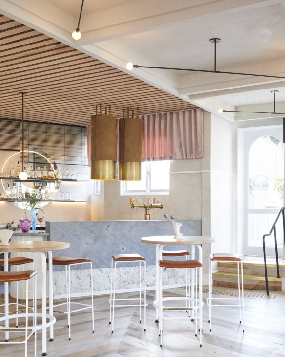
"Now it's a much more sustainable mindset. What's here that I can use, how can I either strip it back or move it around and make do? It's about working with what you have."
The classic example is modern Greek restaurant, the Apollo, in Potts Point. "George Livissianis started stripping everything back, went home and came back the next day and said, 'My god, it's beautiful'," says Dupleix. "It was like a gorgeous ancient Greek ruin."
Design inspiration comes from many places. Wes Anderson's sumptuous, retro Middle European-inspired set for the film Grand Budapest Hotel is a repeat offender on contemporary inspiration boards. Social media, especially Instagram, has fomented a certain look. Maybe it's a standout feature such as a neon light that owners hope will turn into clickbait, or maybe it's the inescapable trend for restaurants to be kitschy and pastel-toned rather than dark and moody.

It's easy to see how it can be tempting to go the Insta-bling route – after all, what owner doesn't love their customers doing the advertising for them? – but such an approach can mimic the built-in obsolescence of the very smartphones used to take the pictures.
"If you're building in an Instagram hook and it's that obvious then it's going to die as quickly as it should," says Dupleix. "It'll get the easy customers in, but it won't get the hard ones back. Good design is about the authenticity of a space, such as Sunda in Melbourne, which has the cheek to make it feel like sitting in a building site in the nicest possible way."
Pascale Gomes-McNabb, the keen-eyed stylist of Melbourne's Cumulus Inc and Sydney's Bentley, isn't the kind of designer to leap at trends of the moment such as millennial pink. "Being fashionable is the worst thing you can be, because you have a certain expiry date. I designed Cumulus with the idea that I wanted it to last 20 years. The European and Di Stasio also have that longevity of feeling and place. They're timeless."

If you think restaurant design only matters to the one-per-centers, think again.
Materials such as terrazzo, marble, concrete and concepts such as open shelving, utensil racks and bar seating have been dominating home kitchens as a kind of trickle-down effect of restaurant design. You can think of the restaurant as the Baz Luhrmann answer to the home kitchen, a bold testing ground for colours and concepts. Maybe the neon sign won't be adopted, except by the very brave or foolhardy, but things such as white subway tiles and industrial lighting have become a common sight in Australia's domestic spaces.
"People just want the fun factor of eating out in their own homes," says Gomes-McNabb.
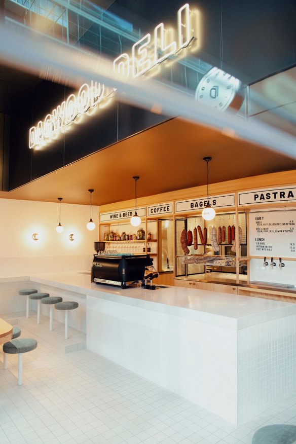
After the debut of Cutler & Co, she ended up making a few of its signature lights – frothy balls of cream-coloured silk loosely wrapped in black aluminium mesh – for admiring customers. "A few quirky details never go astray," she says. "Everyone wants some humour and intelligence behind a space, which is exactly what you want to see in the food. Otherwise what's the point?"
Matt Woods Design
Sydney-based Matt Woods, is the anti-designer's designer. He studied industrial design at university before a few weeks on the job with Sunbeam put him on a different creative path. Now in his ninth year as Matt Woods Design, he's put his stamp on the likes of Percy Plunkett, Bloodwood, Devon Cafe and Allegra Dining. In 2015, he won best restaurant design at the Eat Drink Design Awards for Waterloo restaurant Beccafico.
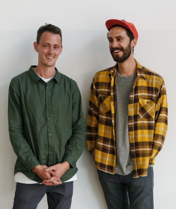
I feel like designers do too much, which makes me a terrible advocate for design. Owners think having some amazing design gives them a get-out-of-jail-free card, and it's definitely an important part of it. But there are certainly more important things. My favourite places are my crappy local Vietnamese with pictures of food on the walls and an old man's pub. I guess why I love them is they feel authentic, which is something I try to achieve in my designs as well – minus the pictures of food on the walls.
My first project was Bloodwood, a small bar in Newtown that which is still there. It's great to see, because in the last eight or nine years I've learned how quickly stuff can come and go.
Aesthetics bend and change. These days I lean on using one material with lots of different textures. My desk is always covered in 100,000 different textured things I'm playing with. Pastels have been around for a while now – guilty as charged. Geometric shapes have been another big thing: built architectural forms with arches, curves, everything rounded off. Now I'm going back to squares. It's time to bring back the right angle.
Matt Rawlins, Figureground Architecture
The budget-conscious design of Fitzroy cafe/roastery Industry Beans won multiple Australian and international awards for Figureground Architecture in 2013. Principal Matt Rawlins has since put his stamp on a slew of Melbourne hospitality businesses including Meatsmith, Mr Joe and Sunda, a collaboration with Kerstin Thompson Architects.
We're all about amplifying the particulars of place. It's difficult starting with sites that are just a shell; it's like creating a theatre set from scratch. Just as Heston Blumenthal believes that the sensory experience of food creates emotional links for the diner, we believe that the emotional link between a spatial experience and food is also very important. The design sets the scene and creates emotive links, but it shouldn't beat you over the head. I would say that ''no design" can be better than a bad design because at least a simple setting doesn't distract you from the food.
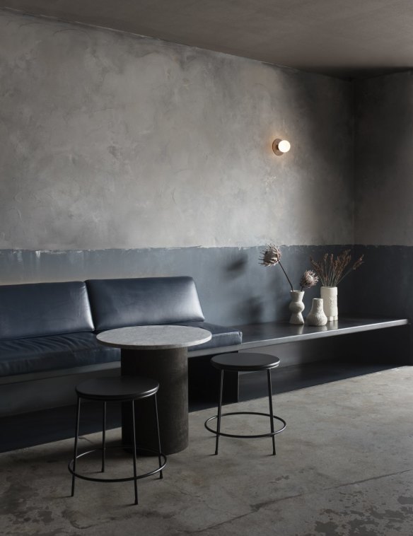
Trends often start in hospitality, where designers feel freer to make a statement than they would in a home. At the moment we're seeing a celebration of natural textures and finishes. There's lots of metal detailing, leather, coloured marble and Venetian polished plaster. If people are cooking food from celebrity chefs' cookbooks at home, they want the spatial experience to be at the same level as the food, so domestic entertaining areas now incorporate swathes of brass, customised built-in seating and commercial-level appliances.
Fit-out costs can be greatly minimised if there is no change of use or if a building has existing attributes. A beautiful heritage building with a high ceiling may be more expensive to rent but has an interior that needs little intervention. At a starting point, we have found that $200,000 is the least you can spend if you are starting from scratch, although to spend double that is not uncommon on small to medium-sized fit-outs. In my experience the average spend for a small to medium sized professionally "designed" space is $300,000-$450,000 for a cafe and about $450,000-$650,000 for a restaurant (due to added expense of cooking equipment, coolroom, stainless benching etc), however this can vary dramatically with $1 million plus for a small/medium restaurant not uncommon, especially if there are works to the external building. Stone tops, unique light fittings, "original" furniture and built-in, upholstered furniture all add to the cost and will put you in the upper range. For example dining chairs can cost $600 each. Multiply that by 60 seats and you are spending $35,000 just on the seats.
Sans-Arc Studio
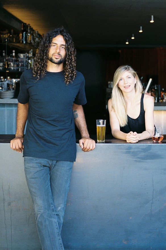
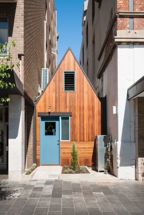
The alpine hut stylings of Adelaide bar Pink Moon, tucked in a former alleyway, won shed-loads of attention for Sans-Arc Studio founder Matiya Marovich in 2016. He's since joined forces with Sam Cooper and opened an office in Melbourne. Their environmentally conscious design of Adelaide's Malt & Juniper recently bagged the Eat Drink Design Award for best bar design.
The industrial trend is well and truly behind us. A lot of our early projects were about trying to push people away from that kind of palette, but some buildings still have that kind of feel so it's about trying to reinvent it. At the moment we're doing a slightly brutalist project that we're leaning towards it being all overgrown, with concrete masonry… it's going for a ruined kind of aesthetic. It's good to bring something new to each project.
We try to minimise steel and non-recyclable materials. We use timber for structure – Australian timber, not imported Indonesian hardwood. It's about designing responsibly.
We do tend to go for green and blue. Lots of green and blue. Millennial pink is hanging around at the moment but we don't really go there. There's a real trickle-down thing where you get a trend around the world and give it a couple of years and you see things turning up in Kmart. That super-glam Italianate thing is pretty big at the moment but it's just not me.
If you had the choice between a dream client and dream budget, you'd take the client. We like to work with people who are passionate but can't afford to over-capitalise on what is essentially an investment. I think Malt & Juniper was successful because we had a quite limited budget. There are clever ways to achieve what you want.
Pattern Studio
After starting Pattern Studio two years ago, Byron Bay-based Lily Goodwin and her partner Josh Cain have swum against the tide with fit-outs including the moody Mexican bar Locura, for the Three Blue Ducks crew, as well as a cheeky neon sign for the bar at Sydney's Collectionist Hotel proclaiming, "I hope this looks good online".
There are a lot of high impact palettes and themes around at the moment. Merivale has a lot of venues focused on one stylised experience, such as a nautical theme. With Locura, we wanted the restaurant's aesthetic to veer away from culturally appropriated imagery typically associated with South American food. It was about being different to the typical Byron context and being low-fi and unpretentious but elegant, crafted and special.
One of the biggest changes in design has been the rise of digital media. People documenting a place on their social channels is really valuable for our clients. We prefer not to do something that explicitly aims for that. It's a bit insulting to treat people like they're only potential Instagrammers. The Collectionist sign was a joke we inserted into a little inconsequential nook off the main thoroughfare.
I think we're going to be seeing a lot more authentic collaborations between designers and local craftspeople. Florists, artists, furniture designers, all contributing to a venue that has a real sense of place. In terms of trends that won't die, millennial pink is an enduring theme, although it shouldn't be.
The best recipes from Australia's leading chefs straight to your inbox.
Sign upFrom our partners
Original URL: https://www.theage.com.au/goodfood/tips-and-advice/the-up-and-coming-designers-20190215-h1balj.html
