
Bring back the glory days of the Adelaide Crows shield logo | Michael Mkoka-Nicholson
Let’s face it, the last “new era” of the Crows wasn’t exactly a stunning success, writes Michael Mkoka-Nicholson.
AFL
Don't miss out on the headlines from AFL. Followed categories will be added to My News.
The raptor had to go.
The Adelaide Football Club has revealed it will have a fresh logo next season to symbolise a new era for the club as it prepares to move to Thebarton, Matt Turner reports.
Honestly, it’s about time. The current logo looks more akin to something you’d see at an NBA game (negative) rather than representing South Australia’s premier sporting organisation (my unbiased opinion).
A fresh logo and some changes to the guernsey are in store for the Crows 👀
— The Advertiser (@theTiser) August 15, 2024
Read more 👉 https://t.co/QJ57pLsIe4pic.twitter.com/HcIBqj9Ae1
When the current logo was first revealed, I remember it was to signal a new dawn at the club in 2010.
Sadly, that hasn’t resulted in anything resembling success for the men’s team unless of course you’re happy with clawing back a lopsided Showdown ledger and a spectacular September failure we do not speak of.
TELL US WHY IN THE COMMENTS
Oh wait, and let’s not forget it was our logo as we secured an inaugural AFLX premiership at the “home of Aussie rules” at *checks notes* Hindmarsh Stadium.
I digress.
I miss the glory days of the Crow on the shield.
Is that coloured by the only premiership success I and the majority of our supporters have tasted? Perhaps.
Now I understand that clubs look to rebrand and refresh either to satisfy commercial apparel agreements or attempts to re-energise a brand – but the current logo has never had the broad appeal of the classic 90s iteration.
As fans we are often the club’s harshest critics, but I am cautiously optimistic that the rebrand is heading in the right direction because as a precursor to this update, in 2024 the Crows have nailed their on field looks.
Home guernsey – simple and effective.
Clash strip – back to basics.
Gather Round – straight fire.
Sir Doug Nicholls kit – stunning.
Even the Anzac Day edition smashed the brief.
We might suck at the moment but my god we look good doing it. #weflyasone#gocrompic.twitter.com/VPIEApPcb5
— Mikey Mkoka-Nicholson (@Mikey_Nicholson) March 30, 2024
For years the Crows game day outfits have left little to be desired, but it looks like the club is listening to the players and supporters and reaping the rewards.
Here’s hoping they’re doing the same for 2025 and that unlike trying to relocate home bases to Thebarton, the new logo and fresh direction go off without a hitch.
As a shield enthusiast, one part of their statement holds concerns, “the fresh look is considered to be modern with some traditional aspects, but with no shield.”
Sigh. Vale shield. We hardly knew ye.
But perhaps I’ll be pleasantly surprised when our next premiership-winning logo is released for 2025.
Michael Mkoka-Nicholson is The Advertiser’s Digital Editor and a long suffering Crows supporter.
More Coverage

Originally published as Bring back the glory days of the Adelaide Crows shield logo | Michael Mkoka-Nicholson
Join the conversation
Lions set to unleash Levi Ashcroft
Having recovered from shoulder surgery, Brisbane Lions father-son pick Levi Ashcroft is set to take part in a three-team trial on the Gold Coast.
Read more
AFL boss opens door for shock Origin return: Who could play?
After the success of the Indigenous All Stars match, AFL CEO Andrew Dillon is keen to kickstart talks to revive State of Origin footy. Who would have the best team?
Read more
AFL boss open to return of State of Origin
AFL chief executive Andrew Dillon says the Indigenous All Stars buy-in has paved the way for more representative footy.
Read more
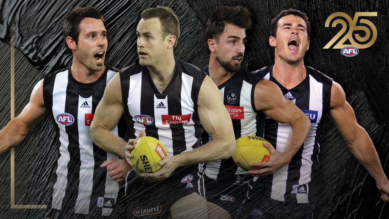
Pick your line-up: Collingwood’s best team of the 21st century
Jolly or Grundy? Howe or Maxwell? What about De Goey? Glenn McFarlane had to make some big calls in his Collingwood team of the century. Now you can too. Select your team HERE.
Read more
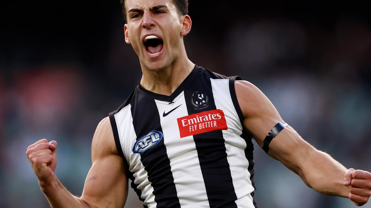
Daicos moves close to Magpie captaincy
Nick Daicos has achieved a lot in his 70 AFL games including superstardom but could be on his way to Collingwood captain after the club’s latest move.
Read more
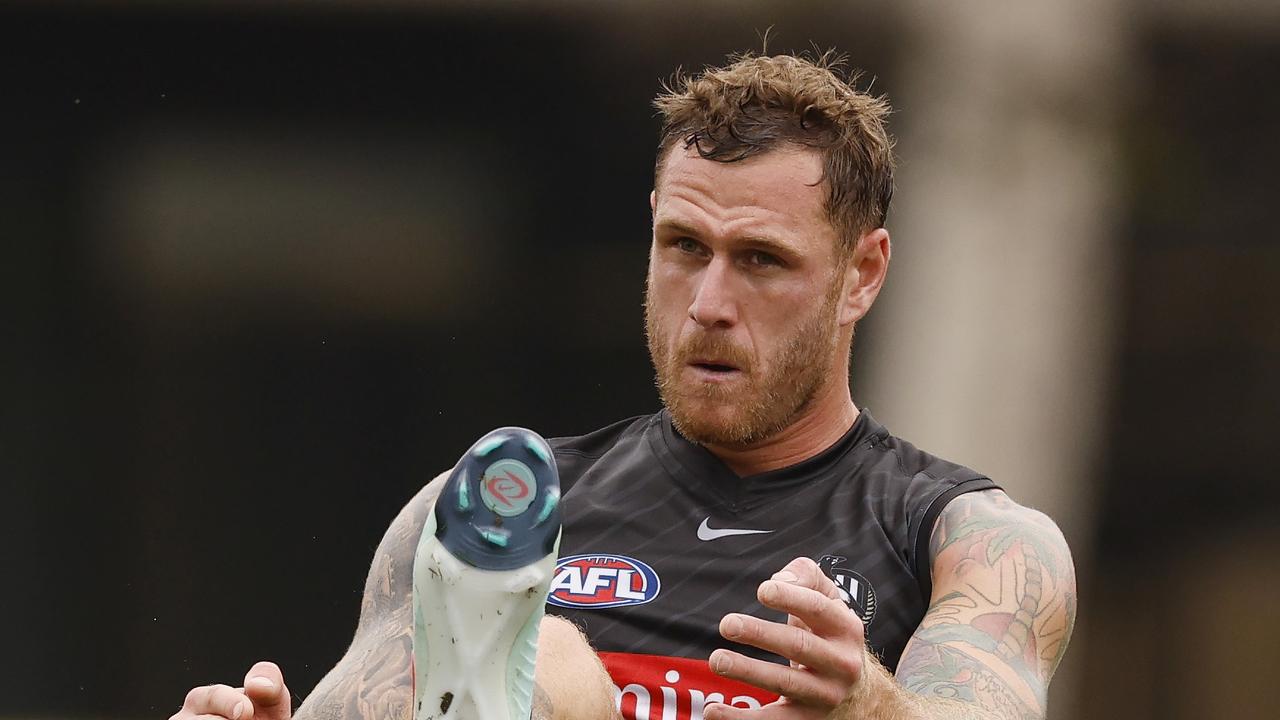
‘Unbelievable’ Membrey tipped to be missing piece for Pies
Look away now St Kilda fans. One of the Collingwood’s most-important players is expecting Tim Membrey to have a huge impact for the club after being discarded by the Saints. Here’s why.
Read more