Sydney Modern: art is an after-thought in gallery of nothingness
Sydney Modern’s lavish opening and soft press coverage aside, the question remains: is the Art Gallery of NSW’s new building effective as a work of architecture and specifically as an art gallery?

The opening of the long-awaited extension of the Art Gallery of NSW, the so-called Sydney Modern was accompanied by a huge promotional campaign, almost universally echoed by a compliant mainstream press and media. The Sydney Morning Herald was particularly fulsome in its admiration, with the honourable exception of its art critic John McDonald, who wrote a couple of balanced assessments, following which the paper itself finally printed a more considered editorial on December 7, including some caveats.
One question that has become increasingly pressing, through the breathless praise as well as the reservations, is what exactly this new building is, what it is for, and how its success or shortcomings are to be assessed. What are we to make of the SMH’s observation that “unlike traditional galleries, which are often inwardly focused boxes, Sydney Modern has huge glass windows which open out on to harbour views”? Is that necessarily a good thing in a gallery? Or is it perhaps more what you expect in a reception centre?
If readers remember, it was in 2015 that Paul Keating condemned the original and much bigger version of Sydney Modern as “a large entertainment and special events complex masquerading as an art gallery”, and it was thanks to his intervention that the project was reduced in scale, separated from the main building and made somewhat less invasive of the surrounding parkland.
It still sprawls over the hillside, and cannot be said to be an ornament to the harbour or an improvement on the natural landscape; at best one can concede that the structures are light, rather than ponderous. The more important questions, however, remain whether it is effective as a work of architecture and specifically as an art gallery.
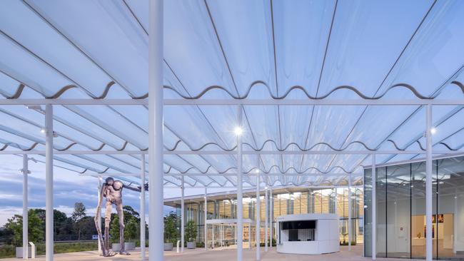
One of the odd things you notice, especially if approaching on foot from Woolloomooloo, is how many entrances there are to the complex, all closed. As you come down Art Gallery Rd from the north, you pass another apparently significant entrance, with path and handrails, but that too is blocked. Finally you reach the real entrance point, in front of which is a kind of shed structure, rather like a carport, of corrugated glass raised on poles.
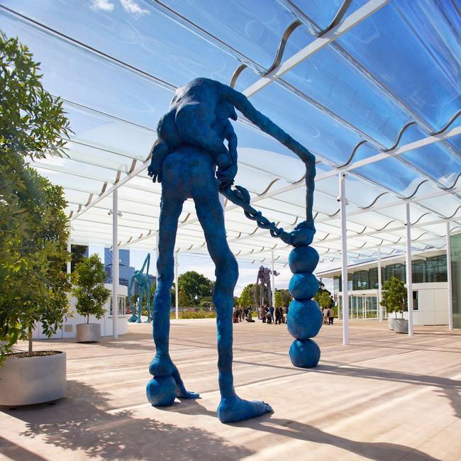
This carport structure is unfortunately reminiscent of the tinny aesthetic of Darling Harbour, and seems like something of an afterthought: it is inconsistent with the main building in materials and awkwardly out of alignment. Clinging to its poles are some colossal and completely gratuitous figures, neither aesthetically interesting nor thematically relevant to their site.
But all this really draws out attention to the odd lack of any proper entrance to the building. A mean little covered walkway, like the back entrance to a country motel, conveys visitors from the carport directly into the gallery, where again there is no foyer or other transitional space to welcome us, to mark the entry into a special environment, to set the mood or tone; the impression is of going straight from a carport into a shed.
That first impression is not a good one, but it gets worse as we take stock of the area around us. On the right there is an opening into the new Indigenous galleries. On the left is a swelling curved structure whose purpose is not immediately apparent and whose entrance – once we realise that it is the gallery shop – is on the far side. Why would you conceal the entrance to a shop? Apart from the practical and economic illogicality of this choice, it also means that the shop turns its back on us – one could put it less politely – instead of facing and welcoming us inside.
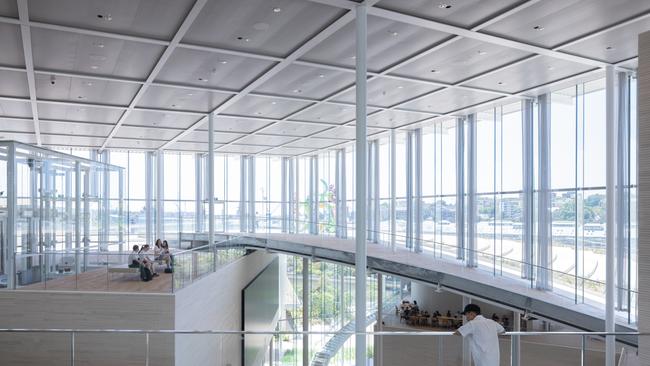
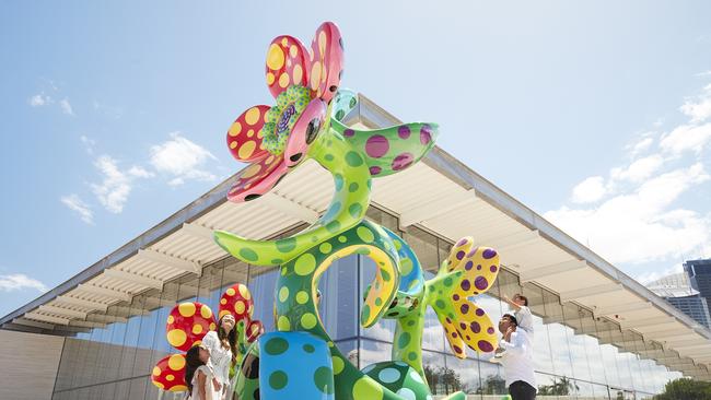
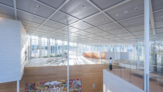
Looking ahead, we discover a featureless, empty space leading up to two lift wells, beyond which there is a terrace overlooking the harbour. Why have lift wells blocking sightlines in this way? Wouldn’t it be more sensible to locate the lifts on the inner side of the building? So far, then, our impression is of a mixture of emptiness, discomfort and clutter. Already on this level, and increasingly throughout the building, we see how a design based on overlapping squares produces uncomfortable angles, odd corners and dead spaces everywhere. Walking out between the lift shafts, with flashbacks to Dubai airport, one reaches the terrace and has the unfortunate sense that this is the real point, a venue for corporate receptions – decorated with a predictable piece of corporate, content-free art by Yayoi Kusama or more exactly her art factory.
Meanwhile we have looked down to the next floor, far below, and the main foyer space of the building. The effect is impressive in scale but disappointing in all other respects, especially in contrast with the effective handling of space at the new Sydney University CCW Museum building. This is also a structure built on a sloping site with an entrance at the top, and indeed a view at the far end. But at the CCW Museum the whole central space is managed in a way that is at once grand – a single atrium void reaching from the top to the bottom of the building – and economical, serving the galleries on several floors all around it, and looking down on significant displays of work.
Here, the space is uncomfortable, massive without being grand, and the main thing that strikes us below is a pair of escalators. The impression would be little different in the foyer of a large city building or even a shopping mall. A few works of art hang on the wall in this enormous space, but no more than in the entrance of a city bank. It is a curious thing, especially considering the way the architecture of art museums has become increasingly extravagant and showily anti-utilitarian in recent decades, how this interior seems to replicate the corporate towers whose values contemporary art increasingly espouses.
In a sense none of this should have been surprising. I remember attending the original press briefing, still in Edmund Capon’s time, when this project was first announced, and being struck by the fact the word “art” was never mentioned by any of the speakers. Nor was there any reference to collections. All the talk was of visitor numbers or so-called “visitations” and circulation of customers through the space. We could just as well have been hearing about a new Westfield.
Since then there have been repeated attempts to justify the extension by the need for more space to house and display the gallery’s collections, but these were always disingenuous, both because the space problem was largely caused by the gallery’s perverse insistence on competing with the MCA in the field of contemporary art and because there was manifestly less and less focus on building the important collections in other fields.
But in any case, the new extension has surprisingly few exhibition galleries. The vastly greater part of the volume of the new building is empty space, foyers, or else restaurants and other spaces suited for corporate receptions. Virtually the whole harbour-facing side is dedicated to this kind of thing. In contrast to the CCW Museum, this is a spectacularly uneconomical use of space.
The relatively few and disconnected galleries are largely tucked underground or in the back and are mostly not suitable for collection display. In fact the Indigenous collection is the only one that has been moved from the old building, and its place has been taken by the new Edmund and Joanna Capon Research Library, the one really successful part of the whole project. In other words, shocking as the conclusion may seem, the whole vast and enormously expensive extension has done very little to increase the space available to display the Gallery’s collections.
The best thing about the new structure is the use of materials, from rammed earth to stone and timber floorings, all of which are tasteful and harmonious. But unfortunately there is only so much that the quality of finishes can achieve, when form and function are so lacking.
By far the most memorable part of Sydney Modern is the enormous subterranean space that was once an oil storage reservoir, a vast dark basement filled with steel pillars. At the same time, it is hard to see how this could be used for anything much except the work that is currently exhibited and which perfectly matches the ambience of the unusual environment.
Adrián Villar Rojas’s sculptural installations in the Tank are huge amorphous masses which on closer inspection turn out to include discarded machine parts, car engines and other industrial waste, hanging suspended in chains as though just hauled from the bottom of a tar pit and thus happily appropriate to the history of the space they occupy. The display is effective too in its use of lighting: the whole area is very dark and the lights sometimes go out almost entirely, while individual pieces are suddenly picked out by a spotlight.
It is undoubtedly engaging and entertaining, but ultimately in a rather superficial ghost-train way that leaves little memory after the experience, like those visitors to Biennali who exclaim “cool” before each new piece as they register a micro-second of aesthetic stimulus, and then move on with no recollection of what they have seen.
A similar problem, or rather attitude towards the audience, is apparent in other exhibition areas too. In the Aboriginal galleries, for example, works of all kinds and periods are thrown together in a way that is essentially unintelligible to a visitor not already familiar with the subject. A chronological and thematic display could instead have begun with art representing pre-contact culture, then followed the changes that came with the adoption of Western materials and gradual aesthetic and cultural hybridisation.
But the aim is to produce an immediate sensation rather than open the way to a deeper understanding of culture and history. Similarly in the exhibition downstairs centred on the theme of “home”, items that are fundamentally disparate in media, content, feeling and culture are juxtaposed in a way designed to produce a sequence of sensations, but also to cancel themselves out in the end – as in the final pairing of an extremely minimal work with a loud and vulgar one.
This is clearly not fortuitous, but an evolution of the museum, consciously or not, towards a post-cultural age in which audiences are assumed to be visually illiterate. Whereas a classic museum display assumes an audience with some understanding and capacity for attention, and tries to help them to new appreciation and enjoyment, the new assumption is that visitors have no prior knowledge and a very short attention span, and need to be entertained by a carefully curated sequence of aesthetic impressions which presuppose nothing and leave nothing behind.
Add your comment to this story

Diverse portrait of key moments in time
This latest exhibition at the National Gallery of Australia, named for Cezanne and Giacometti, highlights the unbreakable bond between art and history.

How to fail spectacularly at unboxing
It was four boxes, not one; the ASMR was dire; and completion took more than four hours: a shambolic unboxing.
To join the conversation, please log in. Don't have an account? Register
Join the conversation, you are commenting as Logout