Jeffrey Smart: cleverly consistent
He was one of our great painters, and one who was consistently reticent about the meaning of his work. But why?

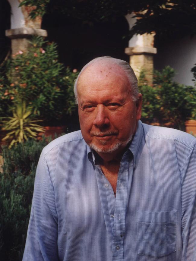
Jeffrey Smart, who would have been 100 this year, enjoyed a remarkable and exemplary career, although typically it was one that largely escaped Australia’s art establishment, including many institutions and the curators of successive surveys of contemporary art. Indeed Smart’s success as a painter demonstrates once again the crucial importance of integrity and persistence in the face of fashion, which has been the plague of the art world since gallery managements, traumatised by the consequences of their failure to recognise important new art in the early 20th century, decided the safest course in future would be to renounce any attempt at discrimination and follow every passing trend like teenagers in a dress shop.
I had many interesting conversations about these questions with Jeffrey Smart both in Sydney and at his and Ermes’ house near Arezzo in Tuscany, where I stayed with my daughter in 2006 while I was working on a new book about his work. He had rung me from Italy early in the year to ask if I would be interested and I remember laughing and asking him – since Barry Pearce’s beautiful monograph had only recently been published – how many books would be enough. But Smart had always had a flair for finding sympathetic authors who would appreciate his work, from Germaine Greer and David Malouf to Frank Quatermaine, Barry Pearce and John McDonald.
Beyond that, he pointed out that previous publications had reproduced to a large extent the same group of pictures, and he felt that he had painted many others worthy of closer attention. And so we came up with the idea of Jeffrey Smart: Unpublished Paintings 1940-2007, which appeared in 2008 and reproduced more than 100 pictures that had not previously been published in colour in one of the existing monographs.
Working through the archive of Smart’s paintings – only possible because of the care and thoroughness of his archivist Stephen Rogers – it was clear that he had pursued a consistent vision from the beginning; one that had evolved and grown formally and thematically clearer over many decades, but had never wavered. And yet, as Smart told me, there was little encouragement from the art press, which was infatuated with abstraction during the first two or three decades of his career.
As he remarked on more than one occasion, you could look through international or Australian art magazines and hardly ever encounter a painter still engaged in looking at and giving shape to the world of visual appearances. And when the vogue for abstract painting collapsed in the early 1970s, it was accompanied by a sense that painting itself, having reached the end of its predetermined course in the emptiness of the colour field movement, had now expired altogether.
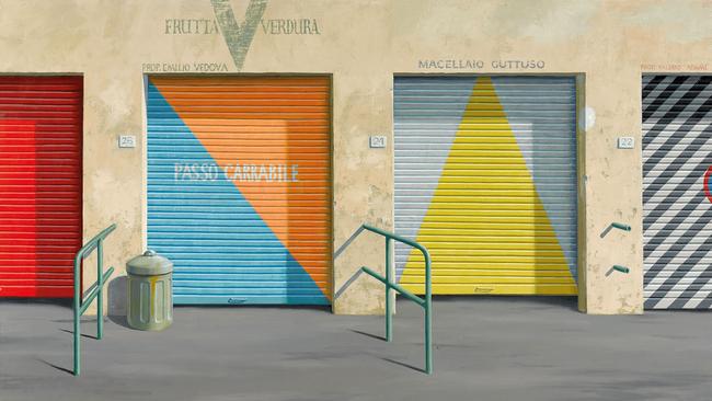
Our galleries and museums, which had wasted a considerable amount of money on abstract paintings that were now out of fashion, proceeded of course to chase more short-lived trends in the 70s before becoming bogged down in the morass of postmodernism. Meanwhile private collectors had bought almost all of Smart’s production, confirming once again that people spend their own money more wisely than that of others, especially that of taxpayers. Almost as striking as Smart’s persistence and consistency was his reticence about the meaning of his work. His apartment blocks, trucks and freeways, as well as frequently dark and lowering skies, naturally led interviewers to ask whether he was expressing a bleak view of the human condition or deploring the alienation of life in modern cities. Smart always dismissed these questions: he claimed to find beauty in the impersonal industrial forms, and the dark skies were simply there to serve the purposes of composition.
Of course these replies were evasive, but as I observed long ago, he was right to give his questioners the slip in this way. He knew that if he countenanced this line of inquiry it would look as if he was making some kind of social or political point when his vision was more agnostic than that, concerned to see but not to editorialise. And people in general are so reluctant to look at pictures attentively that they will always seize on some superficial ideological content rather than take the trouble to understand more subtle pictorial thinking.
Smart’s approach in this is also the reverse of what we have become sadly accustomed to in contemporary art exhibitions, where meanings and intentions are regularly claimed with no foundation in the work itself. In a curious devaluation of the inherent semiotic power of images and objects, it is assumed that meaning can simply be asserted. But the meaning that can be asserted, or even spoken, is not the meaning that art is designed to formulate in more intuitive and embodied form.
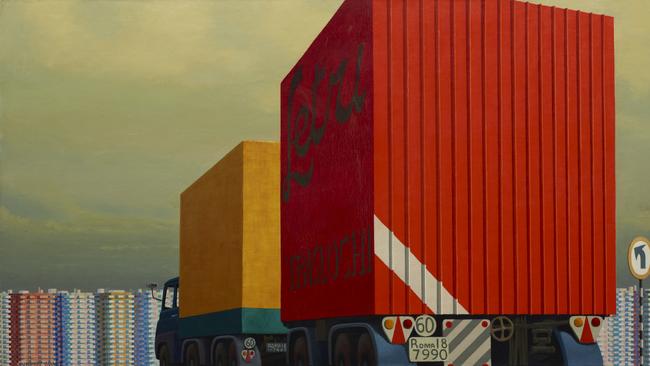
Smart’s vision of the world was in fact a melancholy and occasionally bleak one, but never simplistic and even less ideological. In some of the earliest pictures he is attracted to old houses, deserted buildings surrounded by traces of a human presence that is no longer apparent; in one case an old house overlooks train tracks, anticipating his later conjunctions of roads and buildings. In the masterpiece of his early maturity, Cahill Expressway (1962), he develops these themes, borrowing one of the few such motifs then available in Australia.
Shortly afterwards he moved to Italy, where he found an abundance of material of this kind. From then on he began to develop more complex meditations on the anonymity of the modern city, the roads that form networks through this impersonal world, and especially the many cues and symbols – traffic signs, lane dividers, arrows painted on roadways – that direct and regulate our movement around the urban labyrinth.
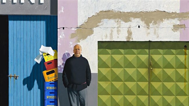
Cahill Expressway also illustrates Smart’s use of figures, always important both thematically and compositionally; characteristically, he would always emphasise the latter to avoid discussing the former. The early pictures often include a stout man in a suit and sunglasses, sometimes a kind of alter ego and sometimes a figure of menace. A different category of figures – boys glimpsed on beaches or in bathing boxes – evokes notes of the erotic. In his later compositions, both the men in suits and the boys give way to men in overalls, truck drivers or maintenance workers on roads: the human figures becoming ever more explicitly the servants of the urban system within which they dwell.

Put like this, Smart’s pictures sound rather grim; and this is precisely why he did not say any of these things – knowing also, as Eliot, Proust and others have observed, that an idea explicitly articulated can no longer be employed in the deeper intuitive mode of art. But when he said he found these subjects beautiful, he was not being entirely disingenuous; in what we might call a proleptic manner, he was being quite truthful: in the sense that he was going to make these motifs into things of beauty.
This does not mean, however, that he turns ugly things into pretty ones, or does anything to mitigate the inhumanity of the cityscapes that interest him because he sees in them something quintessential about the experience of modern humanity. But his pictures are composed with supreme care and artifice, as I explained in Unpublished Paintings. Smart’s interest in the geometry of art and the golden section had often been asserted, but I tried to demonstrate more concretely how these structures were employed in a number of paintings.
The function of such compositional structures is to give a sense of formal completeness, equilibrium or – as Smart often said – stillness to his compositions. A painting is not a copy of something seen, but its translation into an artificial, constructed object, a product of the human mind.
What is apprehended in the world, motifs that may seem banal but which have some charge of human significance, must be converted into patterns and colours within two-dimensional space. Smart indeed loved to play with the kind of flat areas of colour beloved of the abstractionists, while implicitly demonstrating that they were nothing on their own.
People who do not understand painting assume that the beauty of a picture derives from its subject, and thus imagine that any picture of an appealing motif is inherently beautiful. In reality the beauty of a painting arises both from its sensitivity to the truth of its subject and from the sophistication of its pictorial structure and painterly execution, in the same way that the beauty of writing, even when speaking of painful subjects, lies in the clarity and effectiveness of its articulation.
The appeal of Smart’s paintings, then, arises both from the clarity of his vision of the modern world we inhabit and from the harmony and stillness of his compositions. But clarity does not exclude imaginative resonance and an ultimate sense of the ineffable dimensions of human experience. And harmony does not compromise the acerbity of his vision; on the contrary, it renders what is revealed in these compositions more poignant and more penetrating while allowing the viewer to contemplate them dispassionately.
Jeffrey Smart runs at the National Gallery of Australia until May 15.
Christopher Allenis The Australian’s art critic and the author of Jeffrey Smart: Unpublished Paintings 1940-2007.
To join the conversation, please log in. Don't have an account? Register
Join the conversation, you are commenting as Logout