Dobell show proves there is hope yet for the lost art of drawing
There are no absolute rules in the making of art, but the results in this exhibition speak for themselves.

Drawing is, in the broadest sense and if we include everything from cave painting to designs painted or carved on weapons and tools, a universal practice. Like language itself, which may have evolved around the same time, making pictures or signs of things in the world is among the earliest signs of a fully evolved human brain, even at the earliest stages of cultural and technological development.
How drawing is understood, however, and even named – tens of thousands of years later than the origins of the practice – varies considerably. The Greek verb “graphein”, originally to scratch or inscribe, gives us modern derivatives such as graphic, graphite, engrave and even grammar. The English “draw”, meanwhile, implies leading the line across the page, like the Persian verb “keshidan”.
But the most prominent word in modern art theory from the renaissance onwards was the Italian “disegno” with its French translation “dessin”, in large part because art theory arose in Italy in the 15th century and migrated to France 200 years later. These words derive from the Latin “disegnare”, to mark out or delimit or set boundaries to an area. Such a way of thinking about drawing is especially suited to the practice of modern painting in fresco on plastered walls or in tempera on panel, and later in oil on canvas, referring to the laying down of the “design” before applying the pigments. Design naturally became a greater concern as painting departed from the stylistic conventions of Byzantine and medieval painting.
And this is the distinction that gives rise to one of the most persistent debates in modern art theory, over the relative priority of drawing and colour: which was the more important, accurate drawing or rich and harmonious colour? The question first arose in 16th-century theory, partly out of the rival claims of the two greatest living artists, the Florentine Michelangelo and the Venetian Titian. In the 17th century the debate flared up again at the newly founded French Academy of art, where the dominant party upheld the supremacy of Raphael and the opposition maintained, once again, the virtues of Titian.
As the debate progressed during the 1660s and 70s, these models were updated to the more recent Poussin and Rubens. Later, in the 19th century the “line versus colour” debate was reborn with new champions: Ingres for line and Delacroix for colour; and as we have seen before, a similar divergence in fundamental aesthetic orientation and priorities can be seen in the restless and graphic Picasso and the hedonistic colourist Matisse.
Drawing in the conceptual sense attracted a considerable amount of theoretical writing over these centuries. Meanwhile, however, there is the separate question of the drawings as aesthetic objects. They were rare before paper became more readily available in the 15th century – which also made possible the invention of printing – and the earliest ones were on parchment. With the improvement in paper manufacturing, it became possible for artists to use paper more freely for a variety of uses, even creating full-scale paper cartoons which could be transferred like stencils, especially for the execution of increasingly complex fresco paintings.
But drawings were used for many other purposes. One of the earliest was for life studies, both to understand the figure better and to plan the attitude of a particular figure in a composition. There were also portrait drawings, executed with great care and accuracy in preparation for painted portraits; this allowed the artist to visit his important sitters rather than require them to come to his studio. In the same way, the artist might make very close studies of flowers or plants that were to appear in a painting. Drawings of landscape elements were made for the same purposes, and from the later 15th century, plein-air sketches of real topographies, for example in the Arno Valley near Florence.
At the same time, Leonardo advises the artist, in the notes on painting collected by his pupil Francesco Melzi and published much later as the Trattato della pittura (1651), to draw real people in the streets and markets rather than just studio assistants posing, as his predecessors had done. He encourages the artist to carry a silverpoint and a notebook of prepared paper with him wherever he goes, and to capture the authentic gestures and expressions of people as they talk, laugh or squabble unselfconsciously in the streets. Later artists, especially in the baroque period, try to capture figures in animation and even models moving or disrobing rather than posing in a static way.
Finally, drawings were used to define complete compositions before the process of painting began; and these could vary from highly resolved sheets, certainly to be kept as a studio resource for reference and teaching, and sometimes perhaps intended as presentation works in their own right, to much more generalised studies, like Poussin’s drawings that are like maps of the fall of light in a composition. Increasingly, in the baroque period, there are also very generalised or sketchy drawings or “invention sketches” which record the artist’s process of feeling his way to the composition.
Although all of these different forms of drawing were part of the artistic process, they were appreciated by collectors from a very early period, even from the later 15th century, and interest in autograph drawings has continued ever since. What was understood from the very beginning was that a drawing is not only the mark of the artist’s own hand, but the trace of an individual mind and sensibility. This was particularly important because much of the actual painting in the case of a large-scale project could be carried out by members of a great artist’s studio: thus Raphael’s or Annibale Carracci’s frescoes were largely executed by highly able assistants, as were Rubens’s huge altarpieces. But in each case the drawings and, in Rubens’s case, the small oil studies preserve the master’s own hand.
Drawing can take many forms, then, from life or nature studies to invention sketches to large-scale compositional pieces and even finished presentation works. But the quality that has always been most highly prized, from the renaissance to the present day, is the intimacy of the artist’s hand and mind, the sense of unique immediacy and freshness. The risk in contemporary drawing exhibitions, especially those that show drawings expressly made for exhibition, is that it is almost inevitably the least intimate of drawing modes, the large-scale presentation piece, that will predominate.
This year’s Dobell drawing prize presents what is on the whole a reasonable range of drawings, which to the credit of the curators mostly avoids modish or irrelevant work. There is indeed a video work of Julie Rrap once again baring all for art, as a friend of mine once put it, but interestingly this is now sequestered in an alcove at the back of the main space downstairs. Perhaps this reflects the new puritanism that has crept over our cultural life: the nudity that was once transgressive is now, ironically, verging on inappropriate and could even be considered disturbing or offensive to some viewers.
Little of the work, however, conveys any great feeling of warmth or vital energy; and this is because, as already suggested, it has been deliberately made for exhibition, instead of arising from some kind of real and spontaneous sense of encounter with the world. There seems also, in several cases, to be an excessive reliance on working from photographs.
This is not to say that artists cannot use photographic resources as a reference, but they must have a capacity for engagement with the subject and experience of drawing from life, or the work will be flat and inert. In fact those who have a profound feeling for the life of nature may sometimes be able to extrapolate a sense of life and animation from a snapshot. There are no absolute rules in the making of art, but the results speak for themselves.
One can tell much about the quality of an exhibition from first impressions: life, warmth and feeling are either present or not. But the memory of an exhibition a day or two later is equally revelatory. Are you left with any durable impression? Was there any work you would care to look at again, or which solicits the imagination? Anything you even remember with clarity?
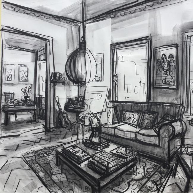
In this case, a small number of works fall into one or other of these categories, and they don’t unfortunately include the winner which, while able, is overly designed and has little sense of inherent life. One of the first things you encounter is John Bokor’s drawing of an interior. It is not especially subtle, but it has a simple and direct energy which is immediately appealing, in contrast for example to the curious but contrived interior by SC Grennan – as contrived, indeed, as its accompanying catalogue note. Bokor’s room feels like one that he knows and loves.
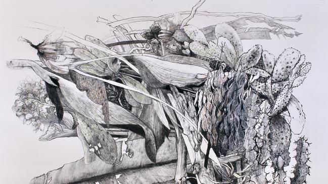
So does Alison Mackay’s tiny colour drawing of the interior of a house where she stayed in Far North Queensland, drawn on folded out medicine boxes. Among landscapes, Chris Gentle’s Potpourri and Angus Fisher’s Parsley Bay both stand out for the attention to the motif and sensitivity to the life of nature that they embody – a vitality that is different, independent of us and transcends our ambitions and desires.
Gentle’s picture in particular, though it lacks the compositional structure of a landscape, is particularly notable for evoking this mysterious and alien process, composed of simultaneous growth and entropy.
Ashley Frost’s Mogo Study, a collection of nine little ink landscape studies, is one of the very few works in the exhibition that conveys a feeling for the spirit of a place. Two other notable landscape works are by Remnim Tayco – though the eccentric framing distracts our attention from the delicacy of the drawing – and Michael Terkildsen, whose Garden of Light and Shadow is the embodiment of his close meditation on the subject.
A couple of subject pictures stand out, both evoking derelict or abandoned technology: Jeff Rigby’s drawing of the carcasses of two trucks, decaying in the sunlight of the outback, and Paul White’s colour pencil drawing of the grounded shell of a passenger jet.
We could add, in very different veins, Joanna Gambotto’s Deluge, which seems to arise from a central European combination of realism and expressionism, and Tamsin Ainslie’s tender portrait of her sleeping dog.
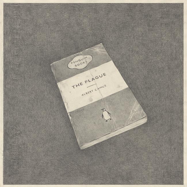
But of all the drawings that remain in the mind and float back up to the surface of memory days after viewing the exhibition, I should especially mention Teo Treloar’s drawing of the Penguin edition of Albert Camus’s The Plague (1947); the quiet but absolute care with which every detail of the book and its background have been rendered in graphite pencil, an inherently slow and patient medium, is like an analogue of the attention of reading itself.
Dobell Drawing Prize
National Art School Gallery, until June 10
Dobell,
Art Gallery of New South Wales
Which empire introduced coffee to Europe?
What fish is used in Worcestershire sauce? Which two film sequels have starred Robert Carlyle? Test yourself.
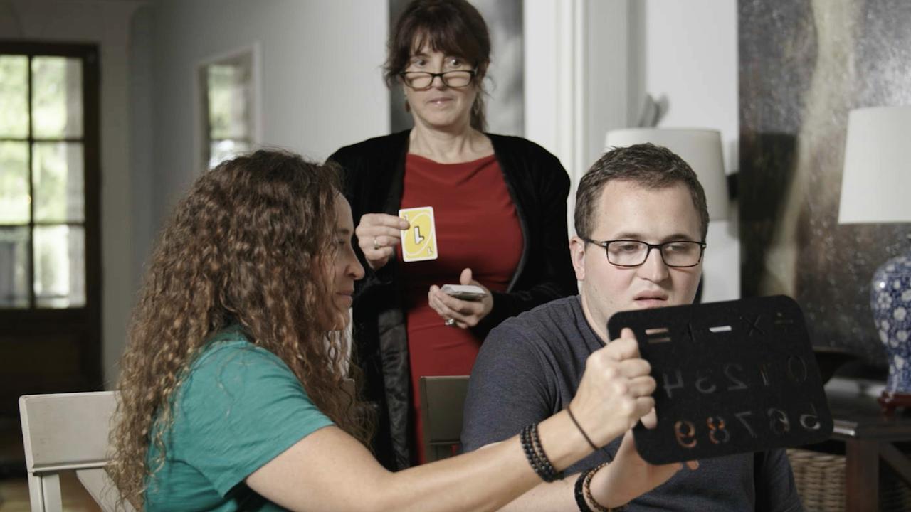
Can the non-verbal be telepathic? This podcast says yes
Hugely popular The Telepathy Tapes explores the alleged telepathic abilities of some spellers in the autism community but lacks balance in the telling.