Arresting visions from the austere
An exhibition of Tacita Dean’s film work, and her observations of art and artists, focuses on the idea of generating new creativity.

One of the most arresting and thought-provoking parts of this exhibition at the MCA is a short film in which Tacita Dean, whose own work is permeated by a consciousness of the artifice of making art, documents another artist at work. Her subject is Claes Oldenburg (1929-2022), the Swedish-American pop artist mainly known for large-scale sculptures based on everyday objects produced from the 1960s to the 1990s, and whose career perhaps more than anything else illustrates the rapid assimilation of originally avant-garde forms by the corporate, academic and civic establishments in the latter part of last century.
What this film reveals is something actually more interesting than most of these public anti-monuments. It shows the artist in old age – in 2010 and thus aged 81 – making modest coloured drawings on a small scale. Some of these, like one of an apple core, recall large sculptures, in this case Apple core (1992) at the Israel Museum in Jerusalem.
It is particularly striking to watch Oldenburg working in what we might think of as a completely traditional way and with the most direct of media. He uses pencil, coloured chalks, and brush with watercolour and gouache. With the confidence of long experience, he draws in the dry media and then adds colours and washes in the wet ones, blending and modelling with the brush or even his fingers.
These little drawings may remind us of the thousands of iPad drawings that David Hockney has made in recent years, many of which were included in his survey exhibition at the NGV in 2016-17. Here too we could watch the drawings being built up progressively on the screen, but what was most notable was the primal compulsion that a real artist feels to engage with the inexhaustible challenge of making a visual account of the phenomenal world.
Those who have no idea about art are sometimes tempted to think that drawing or painting some fragment of that world is straightforward, and that it is essentially a matter of making a “copy”; drawings and paintings are in reality no more “copies” than stories, novels, plays or films are.
They are essentially acts of making, in forms, media and materials that are entirely different from those of which the phenomenal world is composed; it is in the process of making, in a set of artificial media, an equivalence or semblance of the intangible world of experience, that art crystallises a form of knowledge of that world.
Making comes before imitation, as Aristotle saw and as the Australian classicist Gilbert Murray pointed out in the lecture “Poiesis and mimesis” (1920), later republished in Essays and addresses (1921). And this is what we see Oldenburg doing: not copying but rather manipulating lines and colour and tone to elicit the magic of an artificial image, a design that evokes, in its fundamental material difference, something in the world of our common experience.
Dean’s fascination with the way that materials such as chalk and carbon and ochres become simulacra of things is evident in another film work near the beginning of the exhibition. Even before we see the title, Buon fresco (2014), it is clear that we are looking at very close-up images of early fresco painting; the perspective is so close that often we cannot make out a recognisable image or “gestalt” at all, at others we see a belt buckle or some other motif. These micro-details are taken from the upper basilica at Assisi, traditionally attributed to Giotto, although many scholars attribute them to his school. These fresco cycles, of course, narrate the life of Saint Francis, founder of the Franciscan order. But Dean’s details are filmed on a scale at which the narration disappears and we are left only with a sense of the mystery of the image-making process itself; more exactly the spectacle of materials in the process of becoming an image in a tiny fragment barely intelligible in isolation.
This kind of reflection on image-making is no doubt what lies behind another complex work near the beginning of the exhibition, titled Monet Hates Me (2021), a random collection of images, lists and other items in a clothbound box; following in the tradition of Marcel Duchamp, this work is produced in a limited collectors’ edition of 100.
The title, too, no doubt recalls Duchamp’s remark about disliking art that focuses on optical phenomena, such as that of the Impressionists; Dean rather more modestly says that Monet doesn’t like her, presumably because her work is so different from the Impressionist aspiration to see the world with what Ruskin called “the innocent eye”.
Instead, her work is pervaded by a sense of art history and an awareness of centuries of art theory and technical practice. Among other things the collection in Monet Hates Me includes a pair of letters from 1968 in which the curator of the Davison Art Centre Gallery (Wesleyan University, Connecticut) writes to the Anthony d’Offay Gallery in London claiming that the watercolour on the cover of a catalogue of Fifty drawings by Egon Schiele is not in fact by the artist, together with the dealer’s reply defending the authenticity and provenance of the piece in question.
Another curious document is what looks like an art history test from a second-year university course; the list of questions is to be marked true or false, but the range of knowledge expected is extensive. A sequence of three questions gives an idea: “The Corinthian order is the oldest and most severe of the three Greek orders” (False); “Dada used chance, ‘ready-mades’ and was anti-art, but is still an important force in the history of art” (True); “Charlemagne’s Chapel at Aachen was modelled after San Vitale” (True).
It is not surprising that an artist so steeped in the history of art and of the culture that has produced it should have been – unlike almost all artists and public galleries in Australia – aware of the 700th anniversary of the death of Dante Alighieri in 2021 and of his completion of the Divine Comedy a year earlier. Dante is not just the greatest of medieval poets and the greatest author in the first European vernacular to reach literary maturity – in large part thanks to his writing – but also, since his rediscovery in the romantic period, a central reference for modernist artists and writers from Delacroix and Rodin to T.S. Eliot.
Dean designed the sets and costumes for The Dante Project (2021), a co-production by the Royal Ballet and the Paris Opera Ballet, and the exhibition includes several works related to her meditation on the great trilogy of Inferno, Purgatorio and Paradiso. The simplest and most straightforward of these is a drawing in white chalk on paper primed with blackboard paint, of The Expulsion of Adam and Eve from Paradise, based on Masaccio’s fresco in the Brancacci Chapel in Florence. It is one of the most memorable pairs of figures in the history of art, with Adam covering his face in shame, and Eve attempting to hide her nakedness, in an attitude borrowed and radically transformed in meaning from the pose of the Medici Venus.
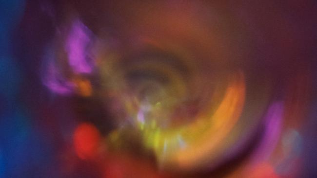
Next to this is a film projection, Paradise, evidently the animated backdrop to the third part of the ballet project. It is presented here as a work in its own right, but it clearly would have been more effective as a set for dancers; the circular form of the work, with expanding rings of colour, evokes Dante and Beatrice’s progress through the circles of Heaven, reaching to ever-higher levels of blessedness, clarity of insight, and ultimately the witnessing of a revelation that surpasses the comprehension of human reason.
Inferno, a series of eight photogravures with screenprinting, is also presumably derived from the sets for the first part of the ballet.
The images are based on found 19th century photographs of mountain ranges, printed upside-down, in a manner that is inherently disconcerting, but also evokes the confusing subterranean topography of Hell, which ends with Satan himself locked in ice at the centre of the globe.
The images are printed in white on a black background, like the copy from Masaccio, reproducing the negative of the photographic image – there are relevant associations with Dante’s majestic vision of a world driven by the love of God, and in which all evil results from the absence or perversion of this love. The evocative but ineffable landscapes are annotated with scattered words: “Inferno”, “Virgil” – Dante’s guides in the first two sections of the afterlife – “Paolo and Francesca”– the tragic lovers whose story is perhaps the best known of all – “the envious”, “Minotaur”, “the angry”.
The most memorable room in the exhibition is the big central hall with a large and impressive drawing on either side: one is Chalk Fall (2018), briefly discussed here almost a year ago, when it was part of the Air exhibition in Brisbane, and the other is The Wreck of Hope (2022). At the end of the room is a large work that is equally impressive in a rather different way: Small Sakura study (2023), based on the photograph of a revered 2000-year-old cherry tree in Japan, still covered with abundant blossoms in spring, and hand-coloured with pencil.
The other two works are again black and white, and indeed executed in chalk on blackboard paint – the most fundamental colour concepts in the most primitive stages of language development, before the appearance of chromatic terminology, and also some of the simplest materials available for the making of images, carbon for black and calcium carbonate for white. In the case of Chalk Fall, the image is executed in the same material as the collapsing face of the cliff.
The unfixed chalk is vivid against the jet-black background, yet also fragile, evoking the vulnerability of the natural environments represented, for all their sublime grandeur.
Once again the images are inscribed with titles and other barely legible annotations. Some seem to be names of friends who have died; others note the month or the season in which the artist was working. At the bottom right of The Wreck of Hope is the word “finis”, referring to the end or completion of the drawing but recalling the meaning of its title as well.
These powerful landscapes are no doubt based on photographic references, but they are transformed in the process of selection, of composition – notably the way that the icy mountains of The Wreck of Hope float between the black spaces both above and below – and above all, in the artifice of their remaking out of chalk. The images are evocative because they are both sensitive and highly articulate, but in the end they are visions conjured out of the most austere graphic materials; like Oldenburg’s drawings, they too remind us that poiesis precedes and is the precondition of mimesis.
Tacita Dean
MCA to March 3
Add your comment to this story

This novel is a fractious, Jekyll-and-Hyde kind of creature
This is Gail Jones’s 11th novel and her first whodunit. With it, she joins a growing list of Ozlit stars – Kate Mildenhall, James Bradley and Mandy Beaumont among them – who are having a crack at crime.

I’ve killed 64 people so far – this is how my life in violent crime began
How did a bright, churchgoing son of a country schoolteacher finish up as a literary serial killer?
To join the conversation, please log in. Don't have an account? Register
Join the conversation, you are commenting as Logout