Facial recognition
EVEN the few good portraits in the competition mistake size for quality.

A GREAT many pictures are submitted for the Archibald Prize each year. One can only suppose that the majority are unspeakably bad, especially if we are to believe those that have been selected represent the most plausible candidates.
What we are seeing, dreadful as most of it is, must be the tip of an iceberg of awfulness that goes down a very long way.
Among the better pictures is an engaging, if characteristically rather quirky self-portrait with a penguin by Wendy Sharpe, who has just been to the Australian territories in Antarctica.
At the emetic end of the spectrum is a picture, in the airbrush style of painting, of a starlet (New Zealand singer Kimbra) sitting on the edge of a bed in a hotel room by Vincent Fantauzzo, who last year produced the unforgettably repulsive portrait of Matt Moran.
Compared with this, even Adam Cullen may seem refreshing. But unfortunately his picture is little more than a cartoon composed of facile and predictable signature formulas: the ostensibly careless gestural marks are in reality all too premeditated, and the dribbles of paint that are meant to signify spontaneity are tiresome and disingenuous gimmicks. The painting hanging next to his, by Jeremy Kibel, though too big, is far more interesting in its slightly alienated intensity and its reference to earlier modernist idioms.
Cullen is not the only one to repeat himself. Kate Beynon must have a very high boredom threshold to persist in painting the same bland pictures year after year; this time, for a change, instead of a self-portrait, she has done a likeness of Lindy Lee, one of the trustees of the Art Gallery of NSW and perhaps a fitting role model for the way a limited and repetitious oeuvre can be leveraged into a career in the art world.
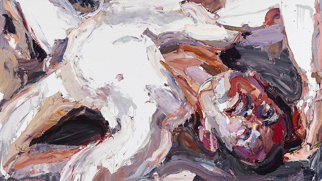
There is a large picture by Ben Quilty of a soldier wounded in Afghanistan, where he has just spent a tour of duty as a war artist - and the experience may prove a turning point in his career. For the past few years, Quilty had fallen into such predictable mannerisms with his pull-apart paintings, a predictability perniciously encouraged by his commercial success, that it was no longer possible to take him seriously. This picture, although still too big and in some ways awkward, suggests there is more to him than has been apparent recently. Engagement with a real subject, for once, overcomes self-satisfied stylistic gimmickry. If Quilty has the courage and humility to put aside the cheap bravura that obviously appeals to the less discerning, he may have it in him to become a substantial painter.
With a similar subject but at the opposite extreme of painting is Jodi Daley's picture of another Australian soldier in Afghanistan. This is a kind of painted reproduction of a photograph, the sort of thing that always leaves one wondering why anyone would bother. At least this one is life-size and monochrome. Worse still is the monstrous painted colour photograph of Tim Maguire by Angus McDonald, a picture that exudes a distressing sense of futility and almost desperation.
Some more serious works also fall short of being really satisfactory. Marcus Callum's self-portrait has a number of important virtues. It is life-size, it includes the torso and even the hands as well as the head, and the composition is well thought out. But the painted surface is extremely unattractive, smooth to the point of looking airbrushed, and that gives it the distasteful feel of a photograph, even though it is presumably painted from life.
The beauty and wonder of art is always in our simultaneous consciousness of the picture as something artificial, with its own formal and chromatic coherence, and as the image of something in the world of experience. The attempt to make the surface invisible or transparent only results in leeching all the vitality out of the picture.
In a slightly different vein, Paul Newton's portrait of David Gonski is a good likeness and, importantly in a full-length portrait, captures the attitude of its subject as well as his facial features. But as a picture it is workmanlike rather than inspired. The style is composed of routines so wooden as to be opaque; the figure stands in a void as though in a photographic studio with a rolled backdrop that eliminates the distinction between floor and wall behind, or indeed any kind of space, and the overall impression is sterile and photographic.
Two artists who can paint have both unfortunately chosen to work too large.
Gary Shead has what is, size apart, a fine portrait of Martin Sharp, a work that is presumably a contender to win the prize this year, although it would be rash to make a prediction on the basis of quality.
Jiawei Shen has also done what is - considering that as a posthumous portrait it is necessarily from a photograph - a respectable portrait of filmmaker Esben Storm, but why on this scale?
Of course there is much worse. There are the usual wall-size portraits of minor celebrities, though perhaps not as many as in previous years. Is the giant head, that bizarre phenomenon adapted only to the micro-environment of the Archibald, finally on its way to extinction? Not quite. There is still a pair of colossal photographic faces of Emile Sherman, painted in blue monochrome on the garage door scale, by Adam Chang.
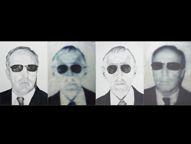
And there are other notable examples of macrocephaly from Vernon Ah Kee, Jun Chen and Luke Cornish - a photographic work reproduced with an elaborate stencil process - and a colossal dermatological extravaganza from Tim McMonagle.
And why does Jenny Sages think that what is meant to be a quiet and introspective self-portrait will become more convincing by being so much bigger than life-size? All this does is draw our attention to the fact that is must have been done from a photograph, since the eyes are looking away and down.
Among such an embarrassment of choice, it's hard to decide which is the worst picture in the show, but Michael Peck's Self-portrait in the Image of My Son is surely as strong a contender as any.
Imagine a picture meticulously reproducing, in red monochrome, a photograph of a little boy wearing what are meant to be his father's military helmet and sun glasses, which in turn reflect the father's image. Could it possibly be more kitsch? Yes, by being massively oversized, which of course it is.


Diverse portrait of key moments in time
This latest exhibition at the National Gallery of Australia, named for Cezanne and Giacometti, highlights the unbreakable bond between art and history.

How to fail spectacularly at unboxing
It was four boxes, not one; the ASMR was dire; and completion took more than four hours: a shambolic unboxing.