
American Airlines logo’s brutal smackdown from copyright agency
AMERICAN Airlines thought it was onto a good thing with this sleek logo. But it’s been smacked down in the most awkward way.

FOR years American Airlines has tried to get copyright protection over its familiar logo. But it keeps getting refused — for a pretty embarrassing reason.
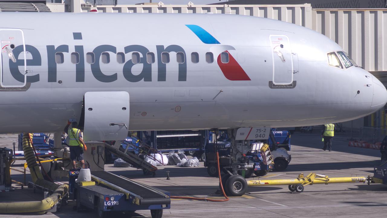
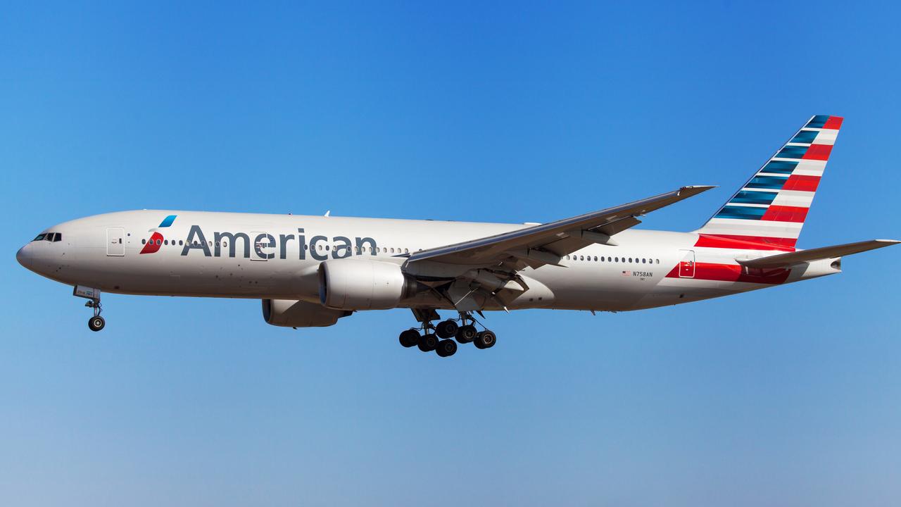
The airline introduced its current logo, which it dubs “the Flight Symbol”, in 2013.
In the very American colours of red, white and blue, the logo takes a sleek form meant to represent the tail of an aeroplane, with the subtle appearance of an eagle — another very American element — which represents flight.
The logo has become an iconic part of the American Airlines brand and designer Futurebrand even won a top advertising award for its work in creating it.
But American Airlines has repeatedly tried, and failed, to get copyright protection for it — because the United States Copyright Office reckons it’s too boring to protect under copyright law.
In the office’s words, the logo simply looks like an “elongated rectangle” with an “exceedingly common” colour palette of red, white and blue, and lacks sufficient “original and creative” authorship to warrant copyright protection.
Previously, the office said of the design: “While the bar for creativity is low, it does exist and the work cannot glide over even its low heights.”
As the logo is already a registered trademark, it can’t be used by others in commercial settings, but copyright registration would provide even more protections, the Chicago Tribune reports.
The office has knocked back the American Airlines three times already, prompting the airline to file a lawsuit in a federal court in Texas last week, asking a judge to overturn the office’s decision.
“American Airlines’ Flight Symbol easily possesses the modicum of creativity necessary to qualify for copyright protection,” the carrier said in its complaint.
“Indeed … the Copyright Office has registered multiple designs that do not approach the creativity and uniqueness embodied in the Flight Symbol.”
American called the office’s refusal “arbitrary, capricious … and an abuse of discretion”.
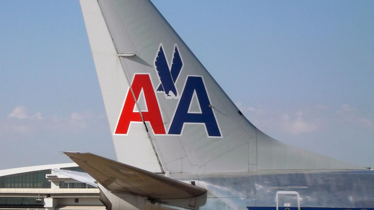
The carrier changed its logo in 2013 to mark its then-new merger with US Airways.
This isn’t the first time an airline’s logo and livery has caused a splash.
Last week, British airline Thomas Cook was subjected to ridicule after it unveiled new livery along the side of its planes — which revealed a very rude message when the door opened.
The new designs on the planes read “I love Cooks Club” — promoting the company’s new hotel brand — but once the door slid open, the “K” in “cooks” covered part of the “C”, making it appear like something else entirely.
“It goes without saying it’s an accident, but it is one way to highlight where the emergency exit is,” Thomas Cook said in response.
That came just weeks after Cathay Pacific was left red-faced after spelling its own name wrong on the side of its new planes, forgetting the “F” so it read: “Cathay Paciic”.
Oops this special livery won’t last long! She’s going back to the shop!
— Cathay Pacific (@cathaypacific) September 19, 2018
(Source: HKADB) pic.twitter.com/20SRQpKXET
“Oops … She’s going back to the shop!” a company social media staffer joked on Twitter.
And earlier this year, German flag carrier Lufthansa unveiled its highly anticipated revamped logo on its new planes — which was so poorly received, the airline had to redesign it.
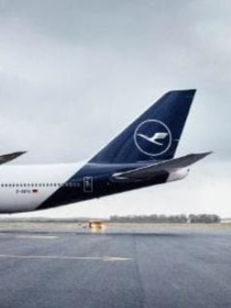
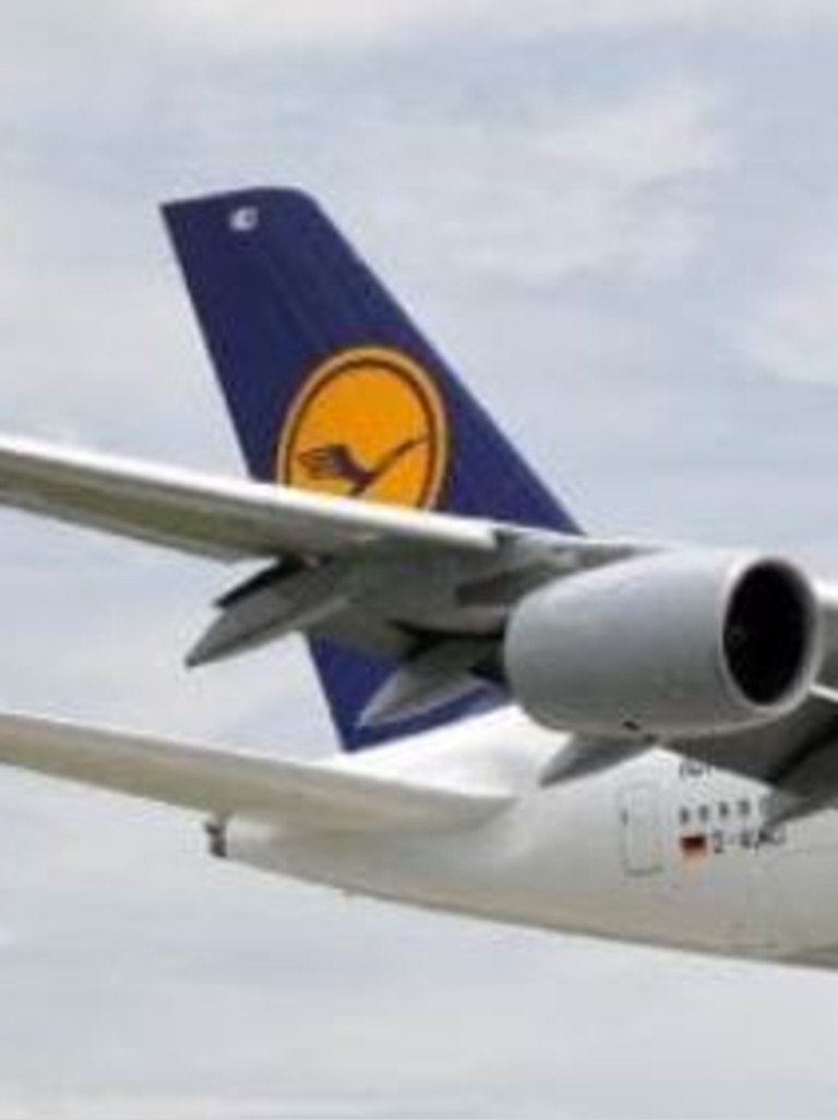
When Lufthansa revealed its classic yellow and blue livery had been replaced with a dark blue design at unveilings in Frankfurt and Munch, crowds groaned in disappointment.
The airline said it would modify the dark blue, which it admitted was “much darker” than expected.
Emirates’ huge $160m Aussie move
A popular international airline has resumed direct flights to this Aussie city for the first time in four and a half years.

Chinese cops declare war on Halloween
Chinese police are cracking down on Halloween in Shanghai, dispersing costumed crowds and hauling people away.

One thing Aussies going into debt for
Aussies are prioritising one thing at the expense of a long-term financial future, and there could be serious consequences in the long run.