
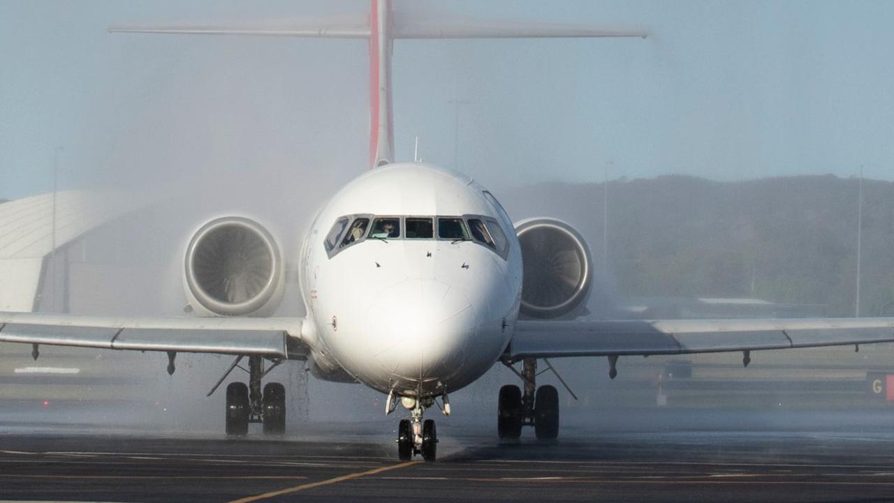
Can you spot what’s wrong with this plane?
IT TOOK 30 years for this airline to redesign its planes. But when they were finally unveiled, everyone’s jaws dropped for the wrong reason.


WHEN the biggest airline in Europe proudly unveiled its newly painted planes to a crowd of 3000 media and frequent flyers, there was great anticipation.
It would have been reasonable for Lufthansa’s executives to have been expecting a round of applause after all their hard work revamping their aircraft. Especially as it has been 30 years since the aircraft last got a makeover.
Instead, the spectators’ jaws dropped for all the wrong reasons.
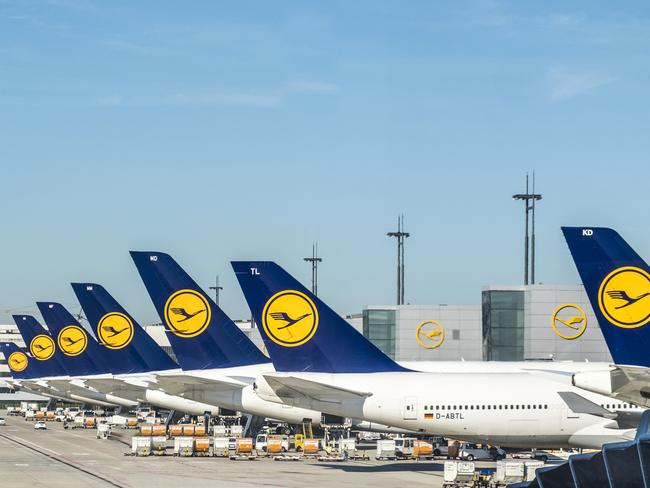
Upon discovering that the airline’s classic yellow and blue livery had been ditched for a dark blue, the crowds — who attended two separate events at Lufthansa’s hubs in Frankfurt and Munch last month for the unveiling — groaned in disappointment, ThePointsGuy.com reported.
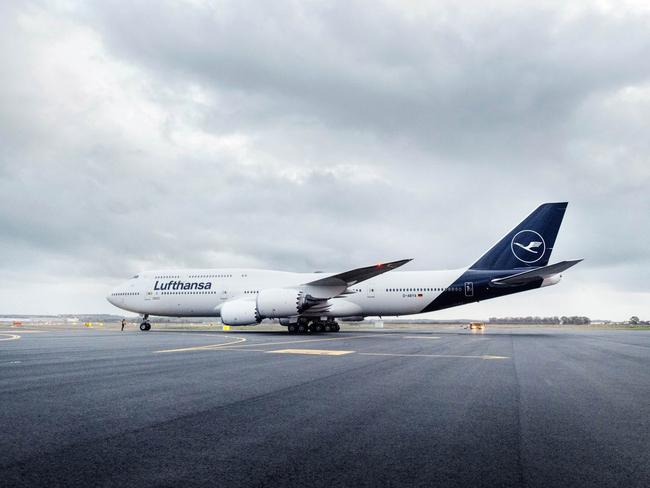
And now, it seems the airline wasted a lot of time and money on the new colour scheme. In what may be a record for an airline, Lufthansa is having to repaint the planes to fix them.
That’s because the blue is apparently too dark, especially in overcast skies, and needs to be reverted to a shade similar to what it was previously.
It appears to be a classic case of, if it ain’t broke, don’t fix it.
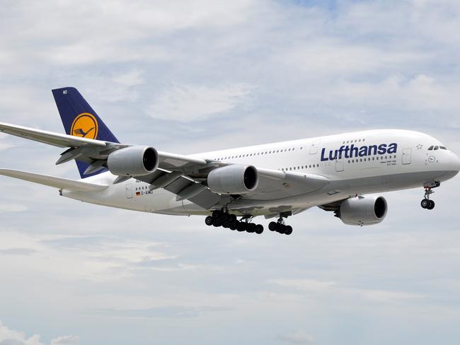
Many social media users have also mourned the loss of the classic yellow in the logo.
@Lufthansa_DE new livery is clean, but please let me say that Yellow was so much unique, also the pantone was called “yellow Lufthansa†yellow luggage tags were so nice that we’re keeping for months ! Refresh is good, but yellow was the real thing! Look this 1994 the 🌎 is Blue ! pic.twitter.com/H2vzO1gErp
— Alex (@GuyThatFly) March 10, 2018
Anything but the new livery
— Glenn Patrick Heilbron (@GlennHeilbron) March 10, 2018
Haven’t seen it in person yet. I wish they’d have left the tail logo yellow with the new dark blue colors. It looks like every other boring livery now, which is rather sad.
— Lew W (@atclew58) March 11, 2018
A spokesperson for the German flag carrier told local aviation site Airliners.de: “After landings in Hong Kong and New York, for example, we realised that the blue paint sometimes looks much darker than it did in the test environment, especially in adverse weather conditions.”
So it will modify the “desired deep blue” by adding more red and green, while dialling down the black, the spokesperson said.
The question remains, how on earth did they miss such a problem during the design phase? What tests did they carry out for their new design?
“The design was developed in a complex process with numerous experts,” Lufthansa said in a press release at the time of the unveiling.
“After intensive preliminary studies, more than 800 designs and own colour developments in the laboratory, the new aircraft design was completed ... The new Lufthansa appearance gives the individual elements a new, modern quality to sharpen their impact.”
Either way, it could prove a costly lesson for the airline.
Emirates’ huge $160m Aussie move
A popular international airline has resumed direct flights to this Aussie city for the first time in four and a half years.
Qantas plane you won’t ever see again
Aussies will no longer see this iconic Qantas plane as the last remaining aircraft recently took to the skies for the final time.
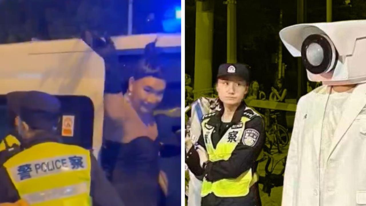
Chinese cops declare war on Halloween
Chinese police are cracking down on Halloween in Shanghai, dispersing costumed crowds and hauling people away.