The Starbucks logo has been designed with a couple of features you might have never noticed
MOST of us see the Starbucks logo every single day, but chances are you might have never noticed the secret hiding in plain sight.
WHETHER it’s the big golden arches, an apple with a small bite missing or a tick, a good logo should be so recognisable that it can be spotted from a mile away.
As the face of Starbucks since 2011, the Siren logo is an easily distinguishable design that has been brainwashed into our minds through repetition.
But even though you have seen it plastered on shopfronts and coffee cups for years, chances are the Starbucks logo has a secret you never noticed.
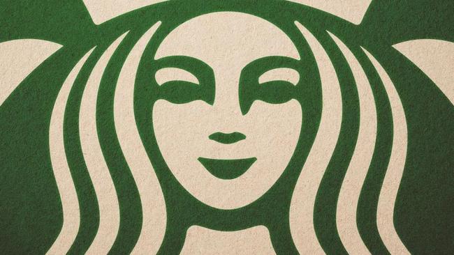
It turns out the global branding team at Lippincott — the creative consultancy tasked with redesigning the logo in 2011 — intentionally created the logo slightly asymmetric to make it appear more human.
Can you notice the flaws now you know Siren has been made to appear imperfect? No? Take a look at the eyes and how her nose dips lower on the right than the left.
Design partner Bogdan Geana explained these subtle changes made the logo more human and less like a perfectly cut mask.
“In the end, just for the face part of the drawing, there’s a slight asymmetry to it. It has a bit more shadow on the right side of the face,” she told Co. Design.

Ms Geana said this wasn’t always the plan, it was something that evolved over time.
“We looked at her proportions. The head was a bit too wide, the body felt too squat,” she said. “So we started adjusting and revising these forms, make them crisp, designed, and geometric.”
As the woman on the logo was originally a reference to a mermaid character from the 7th-century, the team didn’t want to make too many changes.
“In the end we decided that giving her a mythical, mysterious, alluring quality was something we wanted to retain,” Ms Geana said.
According to global creative director Connie Birdsall, when the redesigned logo was finished it looked a little too perfect.
“We didn’t want her to be perfect, like Barbie, or other brands with characters,” she said. “Wendy is too perfect. [The Siren] is more worldly. And not in the negative sense of ‘worldly’.”
Ms Birdsall explained that after much deliberation, the team decided that by making her face asymmetric, it was able to appear more human.
“We had [the iterations] altogether, and all pinned up on a wall. And we all stood around debating and debating and debating,” she said.
“It was like, ‘Oh, we need to step back and put some of that humanity back in.’ The imperfection was important to making her really successful as a mark.
“It was a eureka moment.”
Continue the conversation in the comments below or with Matthew Dunn on Facebook and Twitter.


