Six crazy building designs that were never constructed
THE Sydney Opera House might be ‘out there' in design, but it pales in comparison with a dome over half of Manhattan.
THE Sydney Opera House was hugely controversial — it’s bold design wasn’t only expensive, but divisive.
But the white sails of our most iconic building pale in comparison with some of the world’s most ‘out there’ designs, which were (for better or worse) scrapped before they were built.
Phantom Architecture is a book collating the world’s weirdest designs that were never made. Here’s some of our favourites:
***
DOME OVER MANHATTAN
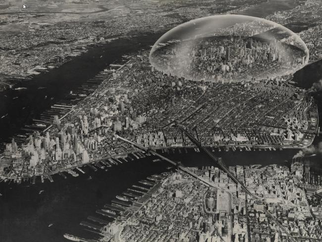
The huge dome might look like it was intended to protect the city from attack, but the idea was actually preserve energy.
American engineer and designer Richard Buckminster Fuller was looking at a map of Manhattan around 1960, and saw that at 42nd Street, the island was about 3.2km across. He thought constructing a dome over this part of the city — stretching from the East River to the Hudson — would contain the heat that leaked out from the buildings, and reduce the need for climate control.
The Ultimate Dome would have covered a large part of NYC in a Diaphanous Skin, but the idea never got off the ground.
THE ILLINOIS, A MILE-HIGH CHICAGO SKYSCRAPER
In 1959, Frank Lloyd Wright was one of the most experienced designers in the business. Already in his 90s and, as it turned out, in the last year of his life, he was known all over the world.
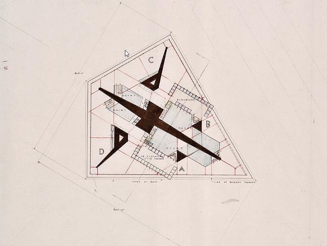
Mr Wright proposed to build his 1.6km-high tower in Chicago — the ‘home’ of the skyscraper and also the city where he had begun his own practice as an architect — where some of his best-known buildings are.
Chicago has some outstanding architecture, but it had never seen anything like Wright’s “mile high” tower, which he called The Illinois. The figures are astonishing: 528 floors, 1.71 million sqm of floor space, 76 elevators and parking for 15,000 cars.
Some estimates put the number of people using the building, either working or living there, at 100,000. The shape was unprecedented: a tapering form, rather like a jagged edged or multifaceted spire. It would have looked stunning with acres of glass glinting in the sunshine and miles of gold-coloured metal.
CLUSTERS IN THE AIR
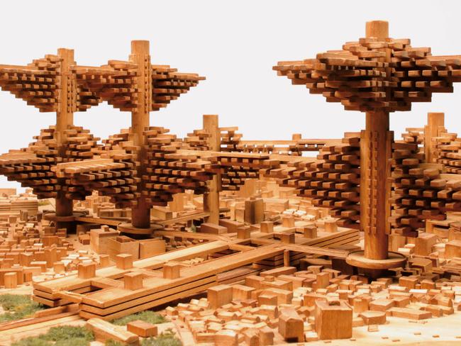
In 1962 Tokyo was growing quickly, so Arata Isozaki put forward his answer to the expanding Japanese city — Clusters in the Air.
The solution proposed by Mr Isozaki was not to address the growth of the city by extending it over the sea, as in Tange’s Tokyo Bay Plan, but by building upwards — and then outwards in a treelike design.
The central cores or trunks were to be very large — they had to be strong enough to support enormous structures and also to house the elevators that made up the central transport network. The branches, although likewise huge, would work on a more human scale. They were designed to be made up of prefabricated modules. Each module would have played the role of an entire conventional building: for example, an individual house, and modules could have been added as needed.
WALKING CITY
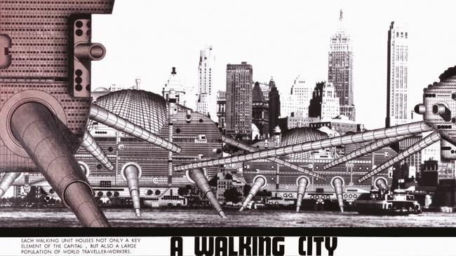
Ron Herron’s idea was truly out there. This ‘Walking City’ was designed to wander the Earth and go where it was needed.
The concept was for a metropolis consisting of a series of mobile structures that could move about on enormous telescopic steel legs. The creator of the Walking City was Ron Herron, an architect who, as he put it, ‘attempts to make architecture by fusing building, technology, and art to make something “special” for the user’.
The Walking City consisted of multistorey buildings mounted on legs — the most famous drawing shows structures that seem to be at least 30 storeys high. The ambulant buildings mostly have an ovoid, rather insect-like form.
BANGKOK HYPERBUILDING
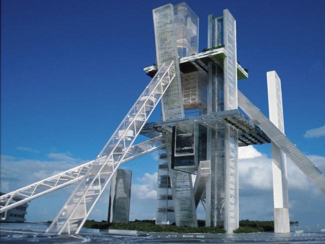
The name may be new but the concept is ancient. A hyperbuilding is simply a very large structure that can house a huge number of people and contain many different functions within its walls. Bangkok’s Hyperbuilding was to be a bundle of tall towers combined with diagonal and horizontal buildings, which were to be linked by elevators and cable cars.
It was thought that the urban sprawl — the bane of modern cities — can be avoided if you build tall structures that leave room for greenery. With the hyperbuilding, where you could have housed 120,000 people and the services and even workplaces that they required, there was a far greater chance of reducing sprawl and increasing the amount of green space.
The building would have needed only 3 per cent of the space required to house the same number in a conventional development. Another key principle behind the idea was to reduce the distance between home and workplace, cutting down on travel time and energy consumption.
ASIAN CAIRNS
Today, the fastest-changing place on the planet — the place with the greatest need for an urban rethink — is probably China. This country is facing a seismic population movement to its cities. Cities consume 75 per cent of the Earth’s energy and are responsible for 80 per cent of its carbon emissions.
The need for architects to rise to these challenges is greater than ever.
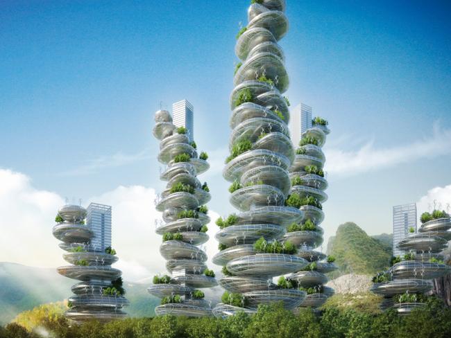
Asian Cairns (2013) is the response of the Belgian architect Vincent Callebaut to these problems as experienced in the vast city of Shenzhen.
This project brings the rural and the urban together in a tall structure: the garden tower or farmscraper. Visually, it is based on a cairn — the pile of pebbles left by a traveller by the wayside.
Mr Callebaut’s project for Shenzhen brings together six of these farmscrapers on a circular site. Each structure is based on a tall rectilinear tower. To this are attached a multitude of large, pebble-shaped structures that can accommodate a wide range of functions: housing, offices, manufacturing, leisure and, most importantly, food production
These pebble-shaped modules spiral around the central towers, which form both the structural support and the vertical boulevard or highway for the whole building. The pebbles can be clad in glass or solar panels, have wind turbines attached to them or have open tops to accommodate green spaces with trees.
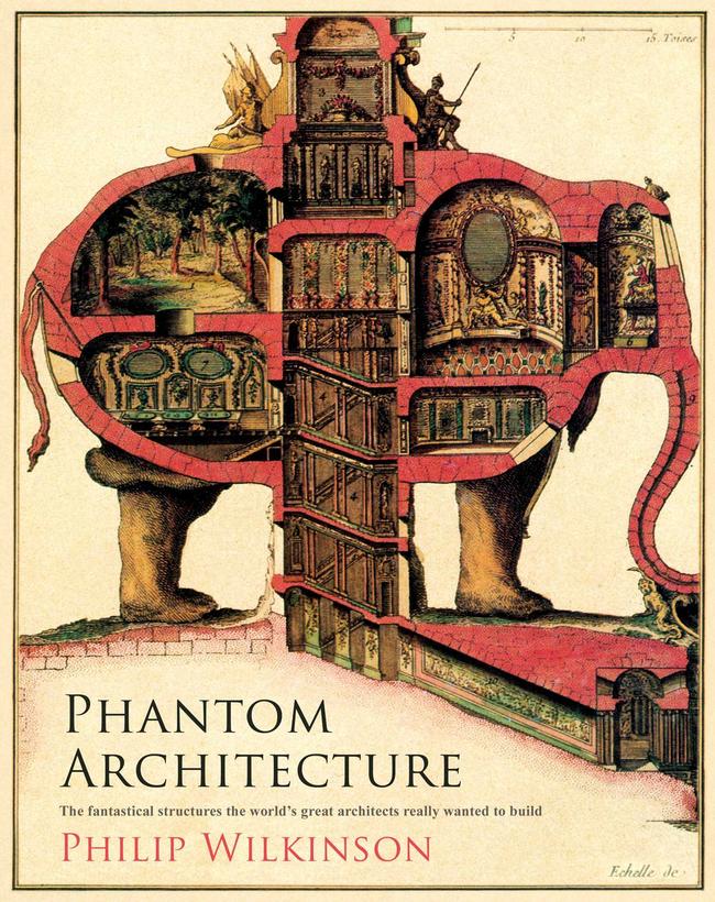
Phantom Architecture is published by Simon and Schuster and is available now.


