‘Awful’: New Gold Coast Suns logo, guernsey trashed by AFL fans
AFL fans have had their say after a club unveiled its new logo and guernsey design, and the reviews are particularly harsh.
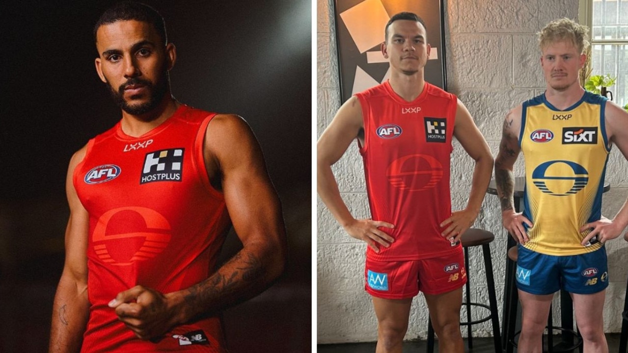
The Gold Coast Suns have unveiled their new logo and guernsey, and it’s safe to say the reaction has been mixed.
The expansion AFL club teased the rebrand earlier this week before finally unveiling their new look on Thursday night.
Watch every game of the NAB AFL Women’s Finals Series LIVE with no ad-breaks during play on Kayo. New to Kayo? Get your first month for just $1. Limited time offer.
According to the Suns, the new logo design “features three key elements - the sun of the Gold Coast rising over the ocean, a bold ‘S’ representing the SUNS, and a football at the logo’s heart.
“The logo also includes subtle shapes of a ‘G’ and ‘C’ hidden within the design, nodding to the club’s history and original logo.”
Gold Coast’s new look is part of the club’s “fearless” campaign.
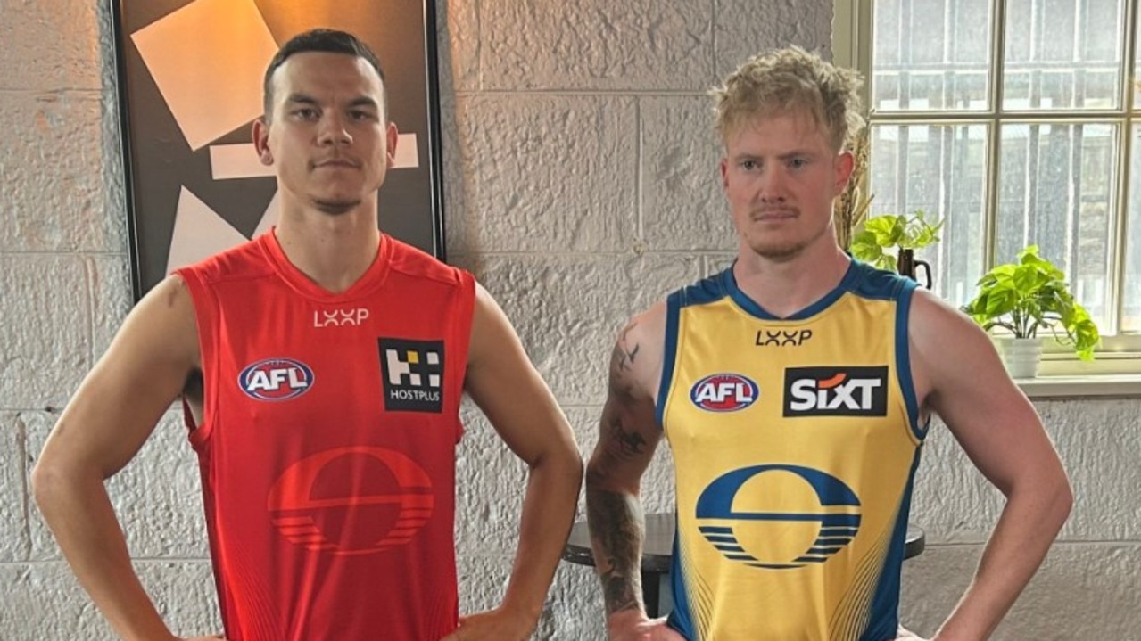
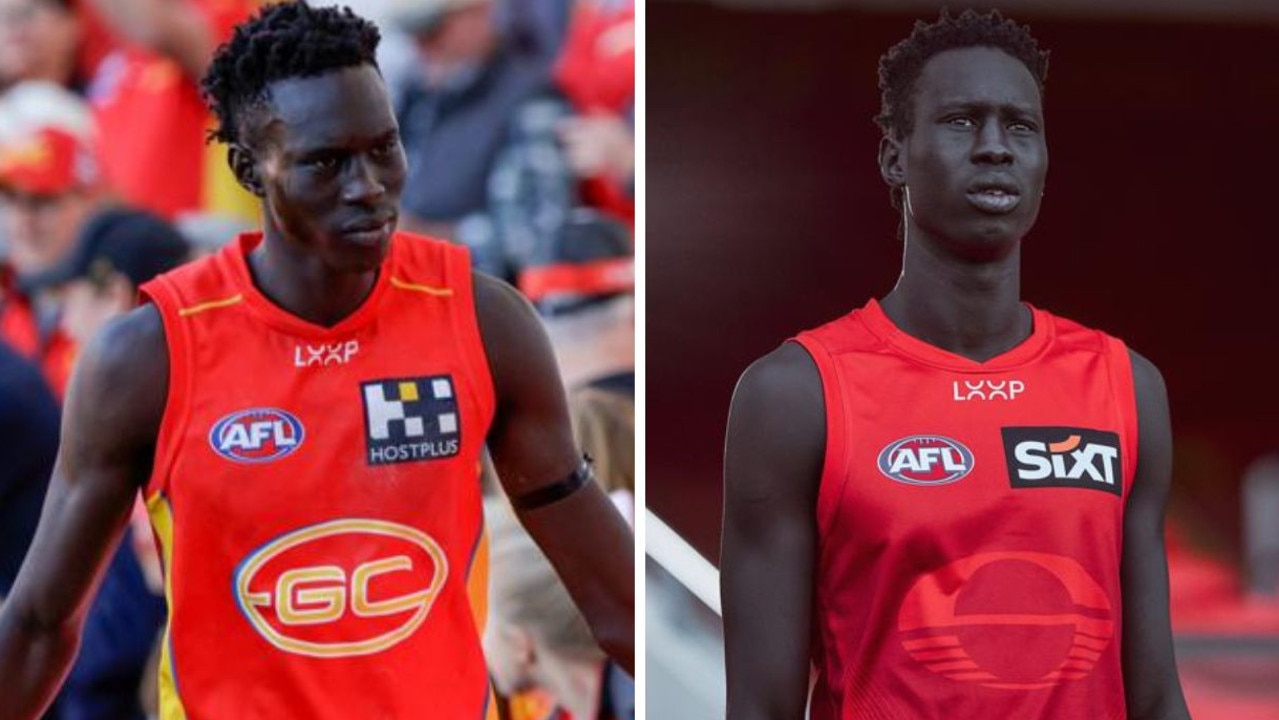
But it was the new red guernsey that divided opinion, given the new logo is barely distinguishable on the jumper itself.
New recruits John Noble, Daniel Rioli and million dollar utility Mac Andrew modelled the new red home jumper and the away strip — a muted yellow and blue number.
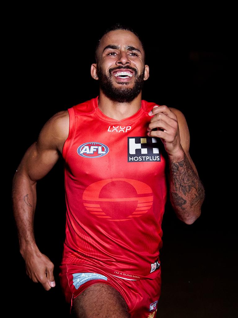
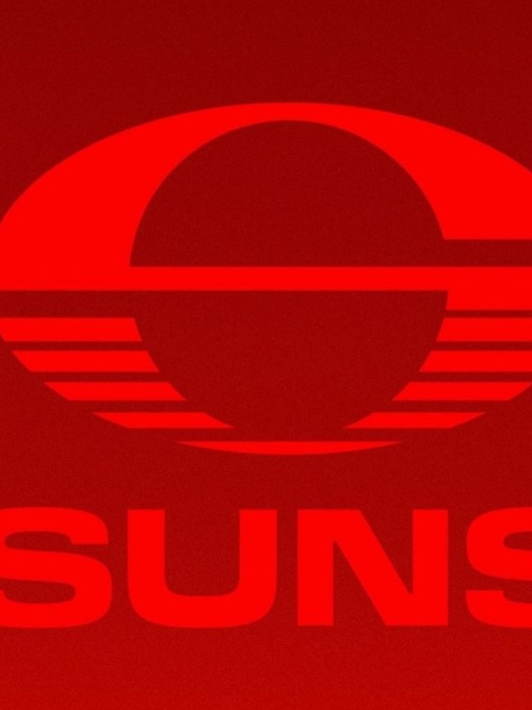
Fans seemed to appreciate the new logo, but the consensus was the all-red jersey wasn’t much of an improvement.
Fox Footy’s Max Laughton said on X: “This ain’t it. Red on red???”
Broadcaster Adam White posted: “These look like solid new training jumpers. When do the Suns release their actual playing jumper?”
The sportsindustry account on X posted: “That red jumper is awful. Like they’ve stuck a temporary logo over the old one. Yellow jumper looks like it could be an eagles training top. Both underwhelming.”
One fan said the jersey looked like “just a red shirt” and another quipped “you can’t even see the logo properly wtf.”
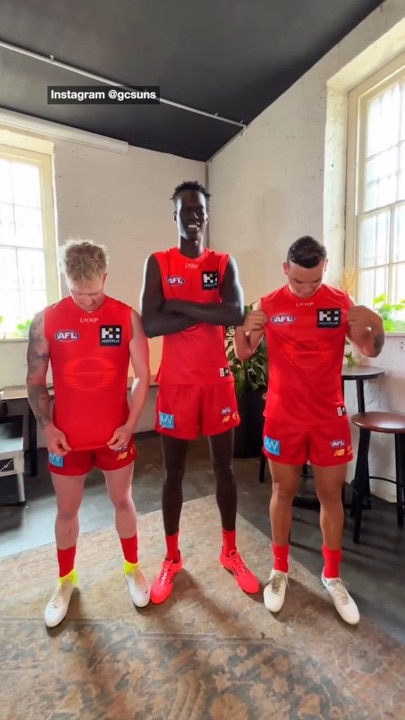
One savage fan said the new red jersey “looks like the logo of some limited edition Gatorade flavour”.
A second said: “Can’t wait to watch Red team VS Orange team.”
A third said: “Yeah red on red doesn’t work gold coast.”
A fourth added: “We don’t need a 19th team, tassie can replace these guys.”
Another commented: “Never thought I’d say it but.. their old logo and guernsey was better.”
“Mac Andrew did not sign a massive deal to play in this,” one fan said, referencing the monster $12 million contract signed by the 20-year-old at the end of last season.
Suns chief executive Mark Evans said the logo reveal was the first step in refreshing the club’s brand identity.
“We knew after 15 years with the same brand that it was time to update our look and feel to better represent how we have evolved and matured as a football club,” Evans said.
“Our new logo is modern, bold and innovative, with layers of context which speak to our history and purpose.
“We’re excited to show the world our new brand, and tomorrow we will reveal our new guernsey and colour palette, marking the start of our new era.”
It comes a week after the Adelaide Crows unveiled their new sharp-edged logo, which also had mixed reviews.
The Suns have not made finals since joining the AFL in 2011. Their best finish on the ladder is 12th in 2014 and 2022.
Damien Hardwick, who won three premierships with Richmond, coached Gold Coast to 11 wins in his first year in charge.
After a particularly tough loss, Hardwick urged the club to “grow the f*** up” in a tense post-game press conference.
The Suns lost talented swingman Jack Lukosius to Port Adelaide in the trade period, but picked up Rioli and Noble — two highly rated halfbacks.


