
Interactive map shows Victorian suburbs hardest hit by the coronavirus
A new interactive map shows the suburbs in Victoria that have been hardest hit by the coronavirus.

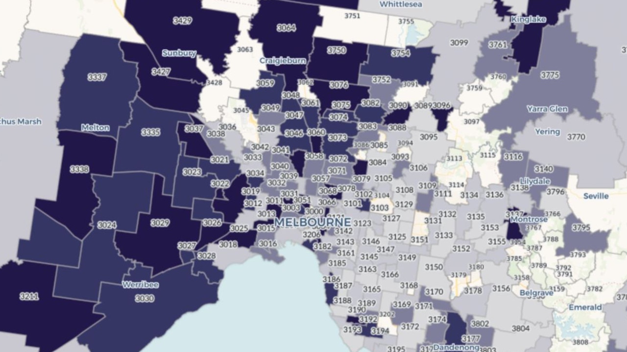
A new map of coronavirus hotspots in Victoria has shown the areas hardest hit by the virus.
This week, the Victorian Government released a new dashboard providing information about how many active coronavirus cases there are in different postcode and local government areas.
The interactive map also shows how many cases were identified in the previous 24 hours, the number of deaths and information about outbreaks.
In a statement from Premier Daniel Andrews, it was revealed the information, including data on cases in aged care settings and hospitalisations, will be made publicly available online on a daily basis.
The site will also list ‘high risk locations’, which are places where there has been a known exposure. Victorians who visit these sites during specific time periods will be asked to keep an eye out for symptoms.
Suburbs in Melbourne’s west and north appear to have a higher number of active cases as well as infections overall.
Areas where there are still more than 45 active cases include Flemington (3031), Footscray (3011), Northcote (3070) and Pascoe Vale (3044).
In total, many areas recorded hundreds of cases since Victoria’s second wave began, including Sunshine (3020) as well as Craigieburn (3064) where 839 cases have been diagnosed.
This compares to suburbs in the city’s south and east where there have been less than 20 cases including Malvern (3144) and Elwood (3184).
RELATED: Follow our live coronavirus updates
RELATED: Bunnings anti-masker has coronavirus symptoms
Analysis by The Guardian found areas of greater disadvantage had higher rates of coronavirus infections and that cases in better-off areas plateaued earlier.
Epidemiologist Associate Professor Margo Barr of the University of New South Wales said the figures may point to the need for resources in less-disadvantaged areas.
“For example in a high disadvantage area where there is more crowding, cases may need to be offered alternative accommodation or supplies when they cannot work, which may not need to occur in low disadvantage areas,” Prof Barr told The Guardian.
“Or masks and hand sanitiser may need to be provided by the local councils in high disadvantage areas which may not need to occur in low disadvantage areas.”
The government said it had partnered with local councils, health providers and community organisations to collate the data.
More data will be added to the site as it becomes available.
“We’ve heard loud and clear that Victorians want to know more about coronavirus in their community – as part of their efforts to keep themselves and their loved ones safe,” Health Minister Jenny Mikakos said.

Woman trapped in her dream $750k home
Rebecca Welsh thought she’d found her dream home. Then she uncovered building defects that will cost more than $300,000 to fix.

Meet the Aussie duo rewiring comedy
Comedy movies aren’t what they used to be, and TV ratings are in the toilet. But laughs aren’t dead, they’re just online now.

New 50-year UK, Aussie military pact signed
Defence and Foreign Ministers from the United Kingdom and Australia have signed a new 50-year military pact.