Truth about huge election debate
With the federal election under a year away it’s a fiercely debated topics – which of the two major parties have households fared better under?
Australians are ruthlessly undecided on whether Anthony Albanese is doing a good job in charge of the country, but a look back at our economic past could shed some light.
There’s currently a 50/50 split between support for the major parties, Labor and the Liberals, despite all to play for with the next federal election taking place some time next year.
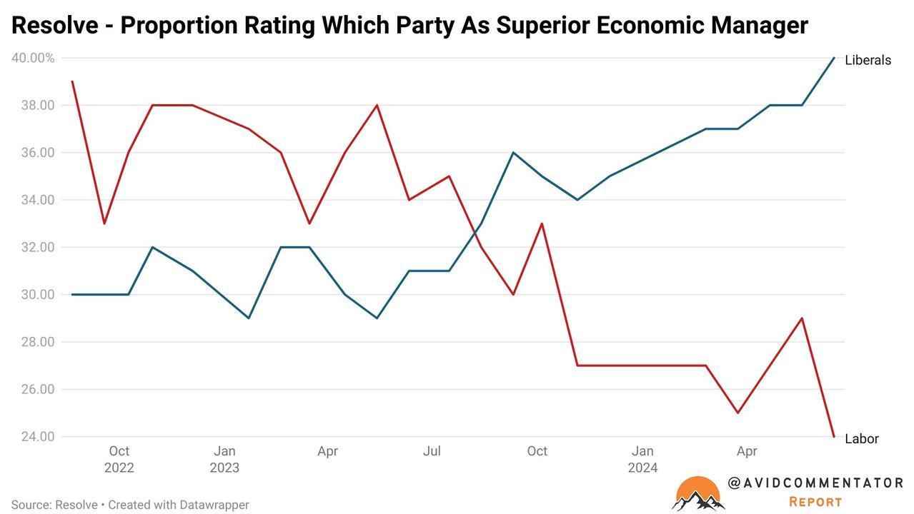
Polling company Resolve asks respondents which of the major parties managed the economy better, something at the top of the vast majority of Australian’s minds in the cost of living crisis.
In the first poll after the Albanese government came to power in August 2022, 39 per cent of respondents said Labor, with 30 per cent saying the Liberal Party.
A second 9 percentage point lead was recorded in May 2023, after the overwhelming majority of RBA rate cuts had already occurred; with a cash rate of 3.85 per cent vs. 4.35 per cent today.
But in the latest poll, just 24 per cent said Labor and 40 per cent said the Liberals.
In many ways this echoes the often repeated trope of Australian politics, that the Coalition are superior economic managers to Labor.
But is it true that the Coalition have historically delivered better economic outcomes for Aussie households and does that remain the case?
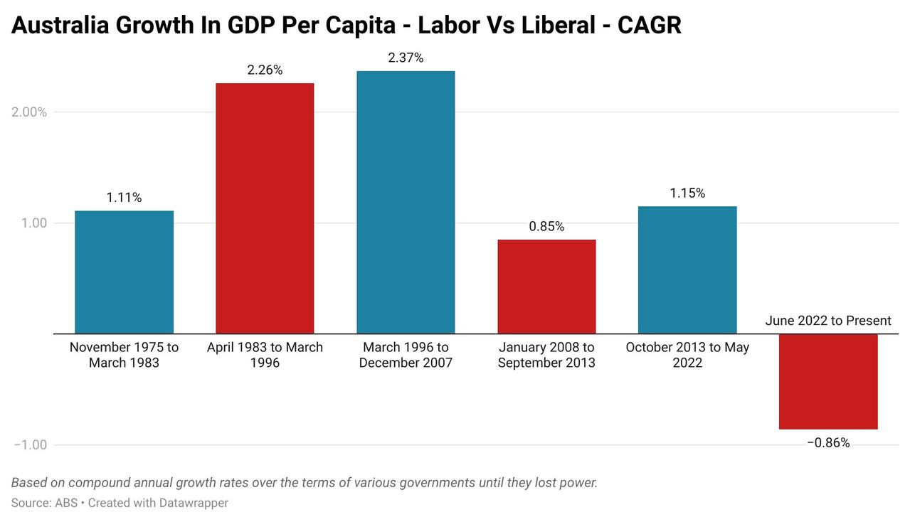
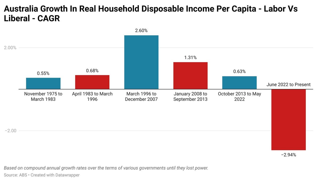
In order to quantify how households have fared under the two major parties in the decades since 1975, we’ll be looking at two metrics: growth in GDP per capita and growth in real household disposable income per capita.
An average slice of the pie
GDP per capita is a rather simple metric that takes the total economic activity of the nation then divides it by the population, providing a broad overview of the performance of the economy at a per person level.
Despite its imperfect nature, it provides a significantly clearer picture of economic performance than headline economic growth, which can easily be distorted by swift population growth.
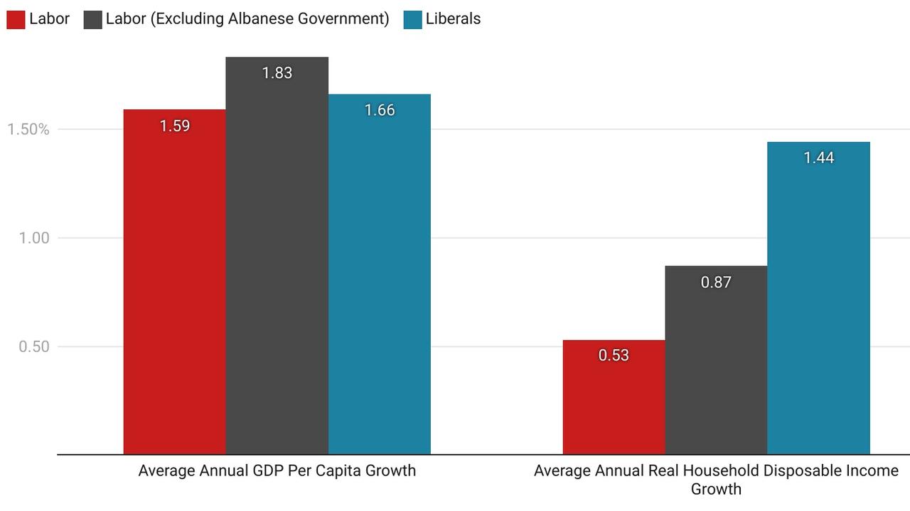
Over the almost five decades of assessed data, the Coalition emerges as having the strongest performance in aggregate, with an average annual compounded growth rate of 1.66 per cent vs. 1.59 per cent.
It’s here that something of a qualifier is required, prior to the Albanese government Labor’s performance was a much stronger 1.83 per cent growth rate.
In terms of the best performing period in government, the Howard government emerges as the strongest performer, seeing an average annual compounded growth rate of 2.37 per cent.
At the other end of the spectrum, the Albanese government with a growth rate of -0.86 per cent.
The take home
Real household disposable income per capita is somewhat similar to GDP capita, except instead of taking aggregate economic activity and dividing that by the total population to arrive at a per person figure, it instead takes total household disposable income in inflation adjusted terms and does the same.
Over the length of the almost 50 years of figures, the Coalition comes out on top with an average annual compounded growth rate of 1.44 per cent, compared with a figure of 0.53 per cent for Labor.
Once again, the Albanese government lets its side down, with the figure for Labor excluding the current government’s time in office coming to an improved figure of 0.87 per cent.
The best performing period in power was had by the Howard government, averaging a compound annual growth rate of 2.6 per cent.
At the other end of the ladder, the Albanese government with an average annual compound growth rate of -2.94 per cent.
It ain't what it used to be
In the long almost five-decade battle between Labor and the Coalition, in aggregate the Coalition has come out on top on every metric.
That is heavily down to the performance of the Howard government dragging the average higher.
But when the more recent performance of the Abbott, Turnbull and Morrison government is put into perspective, despite having the impact of pandemic driven stimulus at its back, real household disposable income grew by less than half the rate it did under the Rudd and Gillard governments.
It’s a similar story for the Albanese government, on every metric it is performing worse than all of its Labor government predecessors.
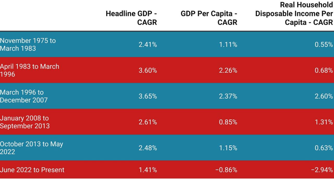
The divide that has emerged in the data excluding the Howard government is not so much one of party, but one of time.
Since the Howard government left office, growth on both metrics have been worse, regardless of who has been in power.
This suggests more of a failing of the broader economic strategy of the nation, which has been pursued by both party’s rather than a defining issue specific to Labor or the Coalition.
This raises an interesting question, what helped to propel the economy forward under the Howard government to such a degree that no government after has been able to achieve more than half that performance.
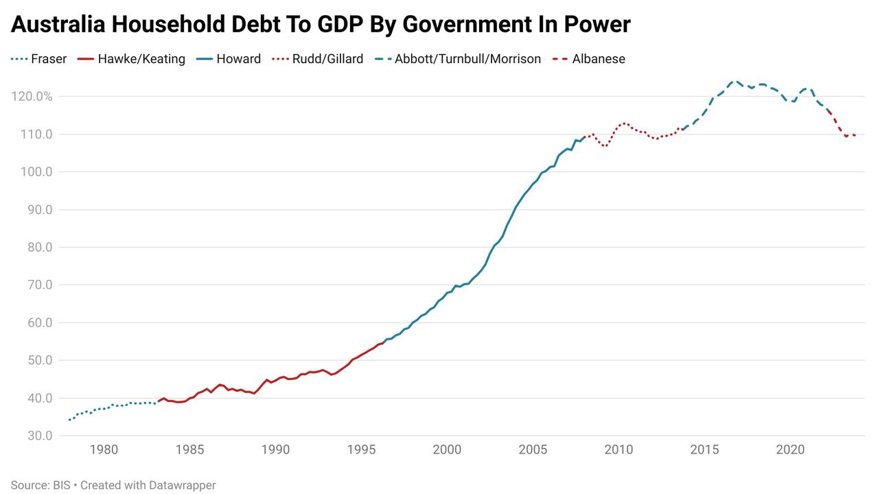
Part of the Howard government’s economic success was the growth in household debt which occurred during its time in power, some of which it incentivised through the introduction of the capital gains tax discount and $14,000 first homebuyer grant.
When the Hawke government came to power in March 1983, Australia’s household debt to GDP ratio was 39.3 per cent.
When it exited in March of 1996, the ratio had risen by 15.2 percentage points to 54.5 per cent.
In the almost 12 years the Coalition was in power between March 1996 and December 2007, the nation’s household debt to GDP ratio had risen by 54.7 percentage points to 109.2 per cent.
The second half of the Coalition’s time in power also saw the start of the huge windfall from the mining boom. Between 1996 and 2001, resources exports grew by 21.2 per cent.
But from 2002 to 2007, they grew by 152.5 per cent, providing a sizeable windfall for the Treasury and the broader economy.
It appears that the Howard government enjoyed something of a perfect storm of positive factors from demographics to household debt growth.
These tailwinds were also reflected in the performance of other economys with leaders from both side of the ideological divide at the time, from UK Labour’s Tony Blair to the US Republican Party’s George H. W. Bush.
Ultimately, the aggregate historical figures boil down to a Coalition victory.
Given the performance of the Albanese government at the start of its tenure, there was a broad-based belief that Labor were in the present better economic managers than the Coalition.
But now the country has experienced the poor performance of economic metrics at a household level, it’s perhaps unsurprising that the once strong lead has been forfeit.
Tarric Brooker is a freelance journalist and social commentator | @AvidCommentator


