Tactics shopping centres use to make us linger longer and spend more
Ever get lost at the shops? Lose track of time? Turns out shopping centres use a host of sneaky tricks to make you stay longer and pay more.
For Natalie, it’s Westfield Parramatta shopping centre, in Sydney’s west, that always gets her.
“I’m constantly getting lost in there. I just seem to go on walking for ever, deeper into it,” she says.
“I swear, I’ve never come out of the same exit twice.”
Many shoppers have similar frustrations about their local mall. Why is the shop you want always the furthest away? Why does time seems to stand still — only for you to find you’ve lost three hours in Chadstone, Chatswood or Chermside?
But there’s method to the mall madness — it’s to encourage us to linger longer and spend more.
“There is a whole lot of psychology involved and fundamentally the final shopper is not high on the list of concerns,” University College London architecture professor Alan Penn said.
Nevertheless, big changes in the way we shop are forcing Australian centres to adapt. If they don’t evolve, they could end up like the “dead malls” that litter US cities.
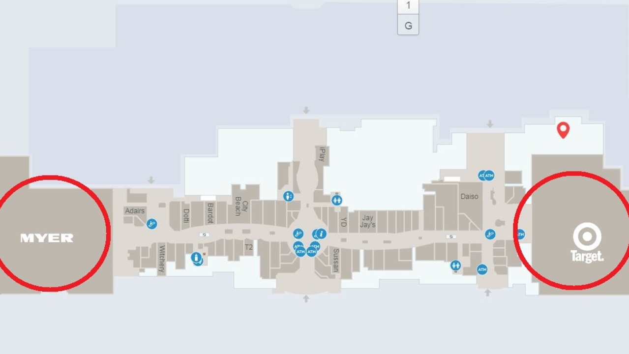
One of the main tricks shopping centres deploy is embedded in the way floor plans are designed. It’s called the dog bone.
DOG BONE DESIGN
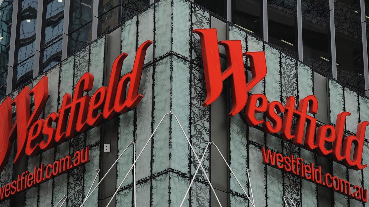
One of the constant annoyances of going to shopping centres is that the big popular stores — David Jones, Kmart, Coles — are so far from the entrance. But this isn’t clumsy design.
Prof Penn told news.com.au malls often have two larger anchor stores far from one another connected by a long corridors of smaller shops.
“The dog bone design for shopping malls comes from the US and is geared to a culture of car access,” Prof Penn said.
“The aim is to get people in and then to keep them in as long as possible wandering up and down the length of the bone between anchor stores.”
SMALLER RENTS FOR BIGGER STORES
This doesn’t affect shoppers directly but it certainly boosts the bottom line of big stores.
“What the shopping centre owners have to do is give retailers good reasons to rent premises in their mall,” Prof Penn said.
“Their prime way to do this is by securing the anchor tenants, sometimes rent free, and saying to a smaller store that a bigger one will be next door.”
RELATED: Inside China’s supermarket of the future
RELATED: Woolworths’ opens wellness only supermarket
RELATED: Bricks and mortar stores still lack ‘seamless’ shopping experience
Australian retail consultant Michael Baker told news.com.au that while smaller stores might pay as much as 18 per cent of their takings in rent, a department store or supermarket might only give up 4 per cent.
PLACING OF ESCALATORS
Ever noticed how the entrance and exits of escalators are hardly ever next to one another?
It’s a plan to get you to do a loop of each floor to get to the next escalator so you wander past more shops.
GETTING YOU LOST ON PURPOSE
If you know exactly where you are going, there’s a danger you’ll head straight there.
So malls can put in corners or curves so you have to slow down to find your way.
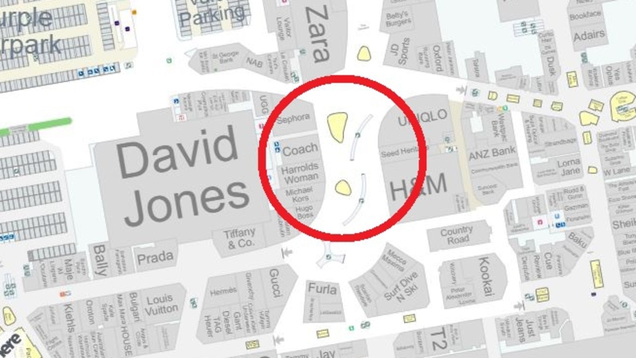
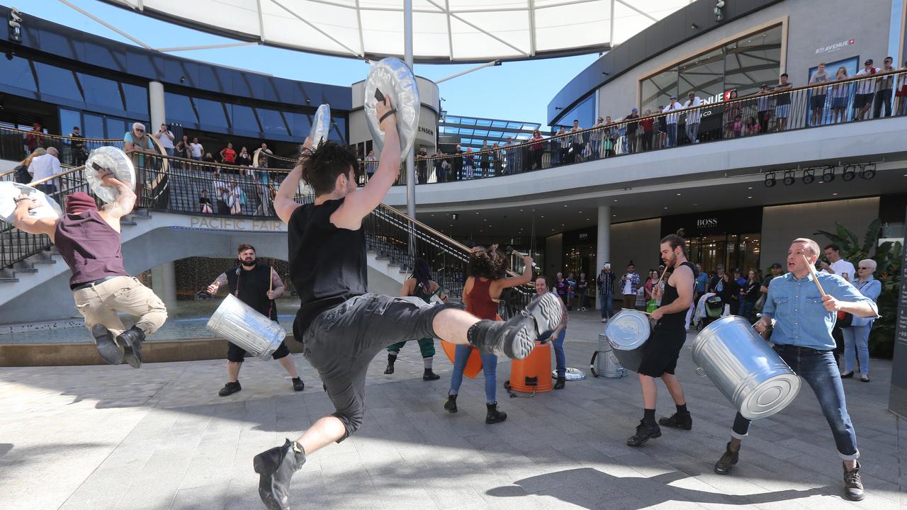
Shoppers at the Gold Coast’s Pacific Fair will notice the heart of the vast mall is a curved open area with lots of corridors leading away to stores. It’s a bright and airy, but ultimately not helpful for finding the anchor stores, few of which are visible from this space.
Prof Penn said this made malls less “intelligible” which was the plan as, “it removes your ability to act with intention”.
If you have less intention, you’ll pass more shops and could spend more.
NO CLOCKS
Clocks in malls remind us that it might be time to leave — that’s why you barely see them.
FOOD COURTS
“One of the only thing centres used to do to get people to stay longer was to have a food court,” said Mr Baker.
“But it wasn’t too fancy, just a place to refuel so people could go around again.”
However, the days of just a Macca’s counter and another serving vats of chicken curry are fading away as shoppers demand fancier fare.
LIKE BY LIKE, SIDE BY SIDE
Once, shops were scattered around the centre to get us to explore every inch. But shoppers would give up in exhaustion.
“So now they’re clustered together, which is called ‘precincting’,” said Mr Baker.
And often they’re around a complementary anchor. So near a Woolies you’ll find a fruit shop, near a David Jones a Country Road, while a Just Jeans might be lurking close to a Kmart or Big W.
The idea being if you’re in the market for some new jeans that are sub $50, the centre is more of a draw if you know you’ll have lots of choice in one place.
BUT IT’S ALL CHANGING
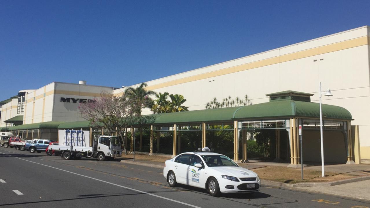
The decline of department stores has been a disaster for shopping centres.
Foot traffic at retail stores plummeted 15 per cent between December 2017 and 2018, a key month for malls, as people shopped online.
This calls into question the “dog bone” design as fewer people are bothering to walk past the smaller shops to get to the big ones. Department stores are axing floors or closing altogether.
Last week, AMP Capital — which owns centres including Brisbane’s Indooroopilly and Sydney’s Macquarie Centre — said retail hubs needed to evolve by including more health and education tenants to become “community hubs”.
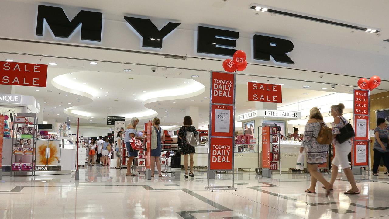
Mr Baker said centres were filling the department store gap by clustering mini majors together. So if Myer vacates a floor, H&M, and Zara may move into the space effectively creating a new anchor.
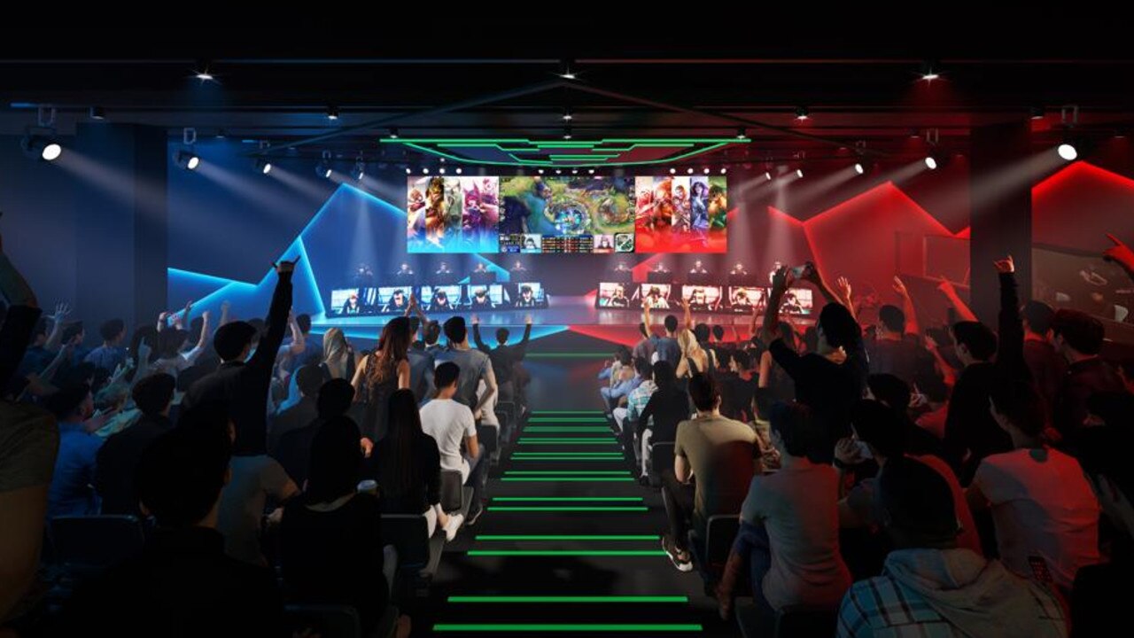
Cinemas, childcare centres — even esports arenas — were also being added giving more reasons to head to the mall.
Earlier this month, Scentre, which owns Australia’s Westfield malls, said non-traditional businesses such as gyms and food now made up 40 per cent of tenants in newer centres.
“Food is no longer just fuel, it constitutes an shopping centre anchor in itself,” Mr Barker said.
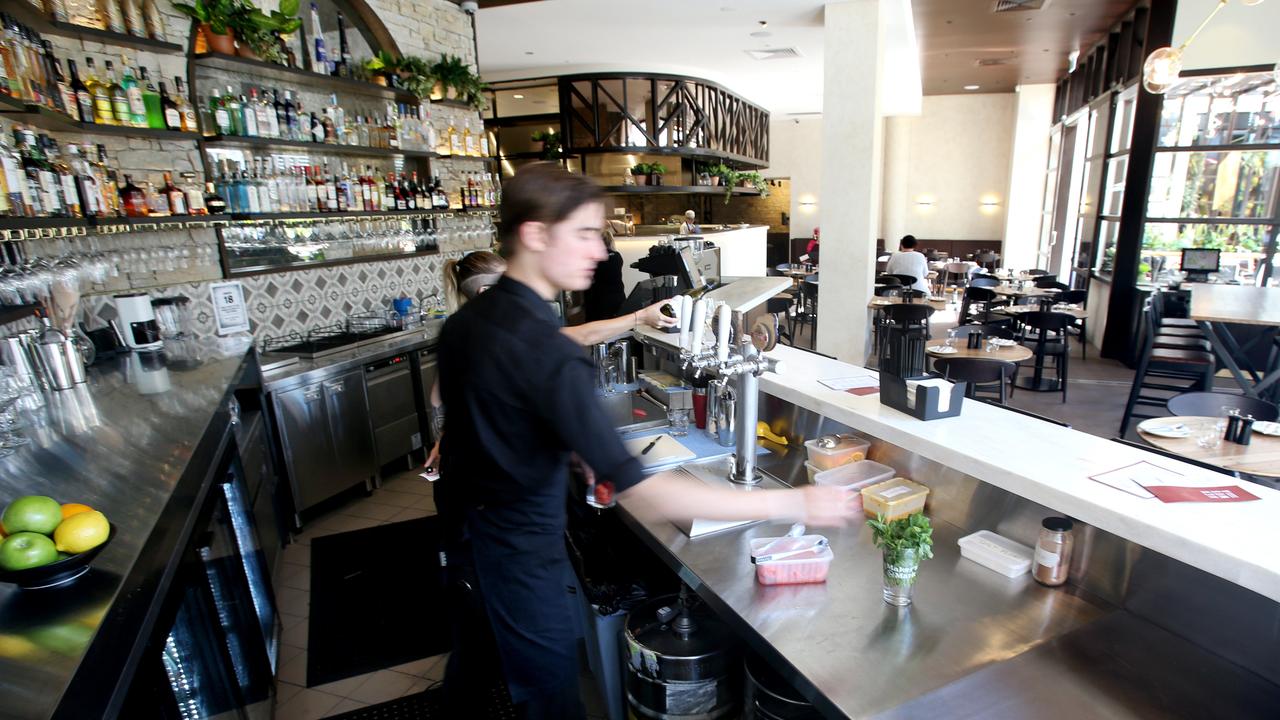
And as people look to eat in nicer surroundings, that’s leading to a fundamental rethink of malls.
“If you have al fresco dining then you need a very different design to the shoebox mall. You have to face outward to the streets, so expect more open air centres,” Mr Barker said.
Prof Penn said traditional mall design was “essentially an anti-urban concept” with little regard for people without a car. Newer malls might follow a more classical town design which brings people in and through the centre and back out again in several directions.
“Often (in a town) there is a dense grid at the centre — or a market square — and they are about accessibility rather than ‘keeping people in’,” he said.
“A street grid gives rise to a pattern of pedestrian flows, and these in turn attract land uses that benefit from passing footfall, shops, and the shops then attract further people.”
Melbourne’s CBD, which is thronged with shops, is one of the most successful examples of this.
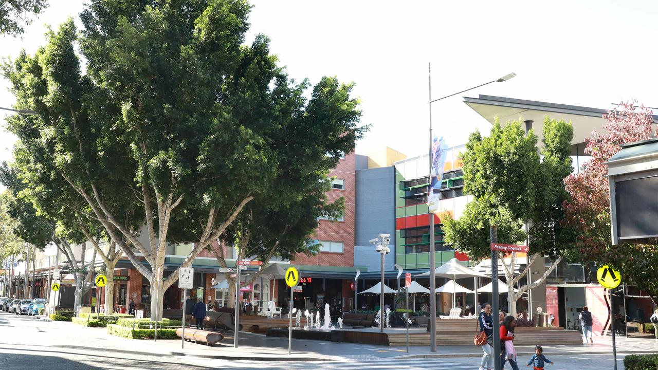
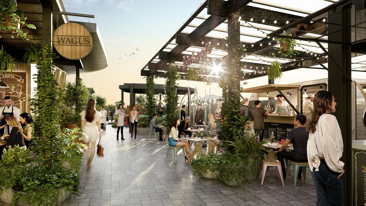
Some shopping centres, like Sydney’s Rouse Hill Town Centre, are open air and have been built with a town square and community facilities at its hub. Actual streets, with cars, are lined with restaurants.
Also in Sydney, Top Ryde City mall is built beneath huge apartment block so customers literally sleep on top of the stores that serve them.
The hope is a combination of dining, libraries, childcare centres and the like will insulate centres against the shoppers lost to online.
Nevertheless, technology will play a bigger role in shopping centre design.
Mr Baker said electronic way finding systems and targeted marketing were all tactics to help tech savvy shoppers.
“You might get marketing messages on your phone as you near a particular shop. So it’s not so much the design of the centre but technology that could bring in people.”
As for Natalie getting lost. Well, she got so frustrated, she left Westfield without buying a thing. So maybe the centres aren’t all that smart after all.


