Take a closer look at the best and worst AFL logos
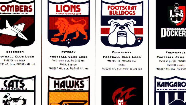
WHETHER it’s an eagle flying high or a plain G for Giants, AFL logos are a mixed bunch. Take a closer look at the best and worst badges in the competition.

WHETHER it’s an eagle flying high or a plain G for Giants, AFL badges are a mixed bunch.
With animals adorning the shirts of 10 of the 18 AFL sides, the Herald Sun takes a closer look at the best and worst badges in the competition.
HAVE YOUR SAY: Do you agree with Jeffo’s assessment? Add your comments below.
1. Hawthorn

Club President and former Premier Jeff Kennett launched the club’s fourth logo in 30 years at a function at Crown Casino in 2007.
The newer logo, which has striking similarities to the Hawk Head of the ‘80s and ‘90s was a project of Cato Purnell Partners.
In describing the logo, Cato has made reference to the eye and beak of the Hawk representing the “determination, pride and focus” of Hawthorn.
2. Western Bulldogs

Representing the positive and transformative change the club has experienced in the recent past, the new logo epitomises the character and spirit of the club, its players and supporters.
Formally introduced in the 1920s, the “full-bodied” bulldog appeared within the club’s emblem for over half a century until the 1980s.
Since then, the club has adopted three logos containing just the head of a bulldog.
The last change took place in 2014.
3. Essendon
The club sports a strong logo that is easily placed on club merchandise and uniforms.
The Bombers have had three logos over the years, with the latest introduced in 1997.
Even now, with the current logo ageing well after the almost 20 years it’s been around, there is still a Facebook group asking for the Bomber plane to be “flying up” to match the team song.

4. Collingwood

The choice of Collingwood’s nickname and emblem was an easy one.
The club’s decision to wear black-and-white jumpers meant that the team was always referred to in the media as “The Magpies”.
The club’s emblem and logo have changed significantly over the years — usually to better reflect marketing trends — but the image of a magpie looking back over its shoulder towards the left was present for 80-plus years.
That was changed so the magpie became forward looking, and to the right.
It is that version that remains part of today’s logo.
5. Carlton

The Carlton Football Club released its official 2014 logo to mark the 150th year of its hallowed existence, drawing on key elements in the design as it evolved over the decades.
The logo, nearly a year in the making, takes its inspiration from four of the club’s most successful eras — the ‘60s, ’70s, ’80s and ’90s — during which time Carlton landed eight of its 16 Premierships.
Above the logo, in silver tone, is a laurel wreath topped by a football into which its foundation year — “1864” — appears for the first time. The latest logo incorporates a plain CFC on a blue background.
6. West Coast

A team regularly required to fly to the east coast made a bird an attractive choice as the symbol. Eagles are strong, aggressive predators, all fitting qualities for a football team.
The West Coast Eagle always looks from the west to the east, in the direction of the competition. The colours reflect the colours of the name, blue for the water, yellow for the sand or coast line.
7. Richmond

The Tiger’s latest logo is a big improvement on the old Richmond Tigers brand, and offers a more professional image of the club.
The Tigers wording has been dropped to create a more corporate look.
The addition of the EST 1885 is a pointer to the tradition of the famous club.
8. Geelong
Launched for the 2008 season after a four-year rebranding process, the latest Geelong Cats logo includes a front-on cat in the shield.
One criticism is that the area at the top of the cat’s head with the ears doesn’t integrate well into the shield, where there’s a large chunk of navy blue remaining between the cat and “Geelong” text.

9. Port Adelaide

One of the unique logos of the AFL’s competition.
A subtle message of forward thinking, coupled with some strong imagery makes this logo a stand out.
In 2001, the lightning bolt was extended, the logo dropped references to Port and the hand was more defined.
10. St Kilda

A logo change before the start of the 1995 season saw the club make the decision to use the official club crest.
It had been on the club jumper since it was first designed in the 1930s, and was already an officially registered trade mark of the club — as the club’s official logo in the league.
The crest is an iconic feature of the club’s jumper — a well-known and recognisable symbol of the club.
The crest also includes the club’s motto, Fortius Quo Fidelius, which is usually translated as “Strength Through Loyalty”.
Despite their nickname, “The Saints”, the club crest has no religious associations.
11. North Melbourne
The latest logo was introduced in mid-2006, and signalled a message that by including the North Melbourne name, that this was the start of a new era for the club.
Since 1977, and across four logos, the Roos have always used the silhouetted profile of a kangaroo.


12. Melbourne

Melbourne Football Club has a powerful DNA — it wrote the rules of the game, it calls the MCG home and most importantly, it is the only club that can truly claim Melbourne as its home. In-house Melbourne graphic designer Dave Larkin said the club wanted an emblem that “transcended the ages”.
“Part of the brief was marrying the club and the city. We live in the greatest city in the world and there seemed to be no association with the city and the club — we happened to be a club in the city,” he said.
“We wanted something that potentially could be there for another 100 years, so we wanted to amalgamate the two anyway we could.
“We wanted the word ‘Melbourne’ to be more prominent in the emblem than it has been in the past — and that had to be loud and bold,” he said.

13. Fremantle


Fremantle’s new logo is inspired by traditional club insignias of days past and the pride they represent.
Strength, tradition and an acknowledgment of the club’s port heritage underpin the new design that is striking in its simplicity.
The complexity and confusing connotations of a “docker” holding the anchor have been replaced by a strong monogram that incorporates the letter “D”’ interlocking with a simple anchor design that was motivated by the monograms that both East and South Fremantle Football clubs have used over the past 100 years.
The logo also contains the words Fremantle Dockers, with Dockers occupying a prominent position.
The design is reminiscent of great sporting club symbols that have stood the test of time. The new logo represents the establishment of a symbol that will become synonymous with football in Fremantle and beyond for decades to come.
14. Adelaide
This has to be one of the least intimidating logos ever created.
A decapitated head of a bird that barely resembles a crow.

15. Brisbane

In 2009, the Brisbane Lions’ Fitzroy faithful were up in arms.
The AFL club had decided to change the logo it had adopted in a merger 13 years ago.
The emotional bond between fans in both states became strained.
And it was all over the club’s decision to switch its logo.
It changed from a side profile of the lion from head to tail, with its paw on a football, to one of a lion’s face.
16. Sydney

Previously known as the South Melbourne Football Club, the Sydney Swans made history by being the first club in the VFL to be based outside of Victoria.
The latest logo was introduced in 1996, after the club ditched the VFL template style design that had survived the AFL transition.
From a quick glance the logo appears rather bland featuring a swan and the sails of the Sydney Opera House.
17. Gold Coast Suns

There’s no doubt that this is a sunny logo, with bright colours and glow effects all pointing towards the fact that this is the Gold Coast Suns.
But the GC lettering in the football looks a bit amateurish, while the sun rays looks like it could be promoting a loaf of bread.
The awkward serifs on the U and N have also been executed badly.
18. Greater Western Sydney

The GWS Giants logo, created by Principals, obviously had a strategy to get the community and the team to think big.
It is a bold logo, but feels more suited to a North American gridiron club.
READ MORE
THE BEST AFL NICKNAMES AND THEIR STORIES
AFL NICKNAMES USED BY PLAYERS FANS DON'T KNOW ABOUT
WHAT YOUR FOOTY TEAM WAS ONCE CALLED AND HOW IT GOT ITS NAME
A HISTORY OF YOUR AFL CLUB'S JUMPER
THE HISTORY BEHIND THE AFL CLUB SONGS


