
Old Woolworths logo shocks shoppers on TikTok
The Woolies logo has changed drastically over the years and there’s one banner that customers wish the chain would bring back.


Real Life
Don't miss out on the headlines from Real Life. Followed categories will be added to My News.
The Woolworths logo has evolved enormously over the years with a nostalgic video showing just how much it’s changed from back when it was a bargain store.
In a TikTok that has amassed more than 110,000 views, staffer Liam Kirley, who runs the chain’s page, revealed all the different Woolies logos dating back to 1928.
He shared a photo of the current green-coloured logo that was unveiled in 2008.
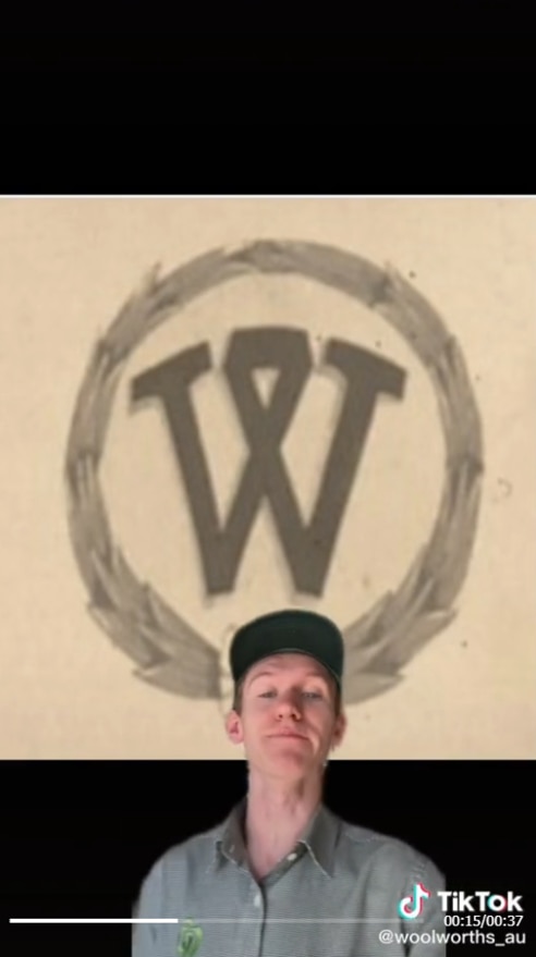
“But there has been many logos Woolworths has had,” he said before sharing a black and white graphic from the 1920s.
“This charming ‘W’ was introduced in 1928 at Pitt Street Mall (Sydney) when it was a bargain basement,” Liam explained.

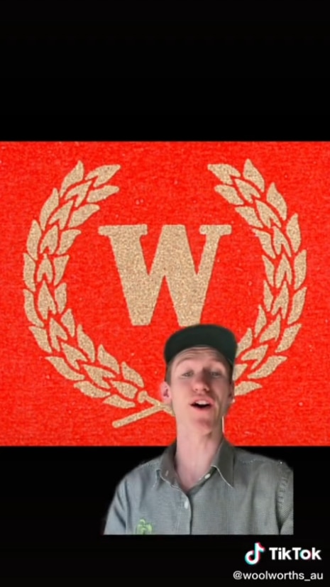
A few years later, the logo font changed with the retailer adding a red background.
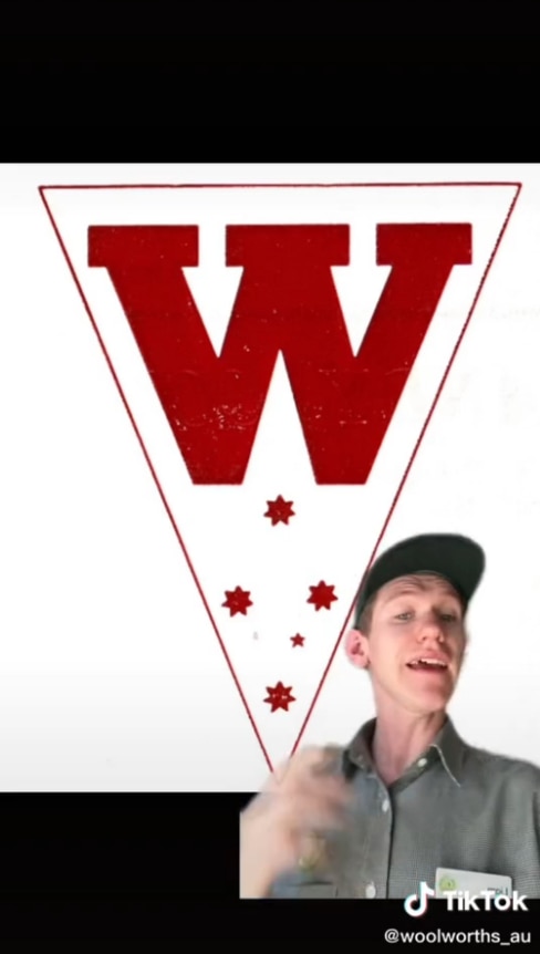
“Then 1930 to 1959 we had this logo,” Liam said about the logo. “In 1960 this was our new logo and that is the Southern Cross because Woolworths is in Australia and New Zealand.”
It shows it to have changed completely with a solid red upper case ‘W’ inside the upper part of a triangle, with five-star symbols scattered below it. The triangle was white on the inside and featured a thin black outline.
“In 1972 we had this ‘W’,” Liam said showing again how much the logo evolved since the 60s.
During this era, the ‘W’ icon appeared to depict two identical shopping bags placed side-by-side, according to the Woolies website.
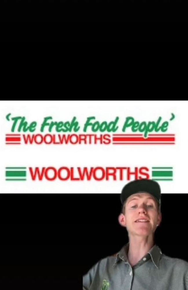
The year 1987 is when Woolies introduced its slogan logo ‘The Fresh Food People,’ which it still uses today in some Australian locations like Eastwood and Booragoon.
The design consists of the italicised phrase in green, placed above the red ‘Woolworths’ wordmark between three red-and-white bars.

“That’s when we started calling ourselves ‘The Fresh Food People’ and a new logo,” Liam said.
Hundreds of TikTok users have since flooded the comments section, shocked over the logo’s evolution.
“Bring back the ‘72 logo,” one person wrote.
“1972 is so iconic!! So nostalgic,” another said.
But if there was one logo shoppers loved the most, it’s the one from the 80s.
“I still remember the 1987 logo even though it was a few years ago until they renovated it was even on the trolleys,” one person commented.
“The 87’ logo is the greatest,” a second person wrote, while another agreed, referring to it as “the goat”.
“I use to be obsessed with this type of stuff and the 1987 logo will always be the best and good looking one. I personally don’t like the new one tbh,” one customer admitted.
However, some disagreed, saying the current logo “is the best”.
“Love the current logo but the W one looks OK,” one person wrote.


Originally published as Old Woolworths logo shocks shoppers on TikTok

Husband’s affair exposed by leaked nude
The 24-year-old shared the explicit photos on an escort site and added the phone number of the woman’s husband.

Judd cops angry note for son’s classroom act
Rebecca Judd has shared an angry note from her eight-year-old’s teacher after what he did in class.