‘Like a swish shopping mall or futuristic airport’: Controversial take on Sydney Modern
The building is designed to be gentle and assuming, but the artwork and views are spectacular.

QWeekend
Don't miss out on the headlines from QWeekend. Followed categories will be added to My News.
There’s a slight TARDIS effect happening at the spanking new Sydney Modern.
The Art Gallery of New South Wales’ (AGNSW) brand new building is, like Doctor Who’s time travelling phone booth, much bigger inside than it looks from the outside.
From the street it is positively discreet but once through the doors it’s an architectural layer cake fringed by glass and limestone with escalators and elevators transporting people between levels inside.
Designed by acclaimed Japanese architects Kazuyo Sejima and Ryue Nishizawa of SANAA with Australian firm Architectus as executive architects, it’s the most significant cultural development in Sydney in nearly half a century and is set to become a major tourist attraction. That will be helped by its location on Gadigal land in the Domain near the Royal Botanic Gardens, CBD, Circular Quay and those other two major icons – the one that looks like a coat hanger and the other with the sails.
“Move over Sydney Opera House – there’s a new superstar in town” trumpeted one headline when Sydney Modern opened in December.
But AGNSW director Michael Brand doesn’t see his new baby competing with the Opera House.
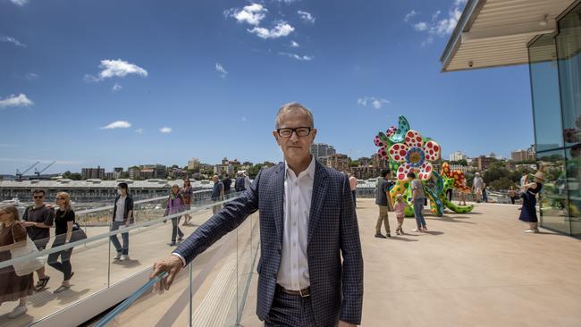
“We didn’t want a grand gesture,” Brand says when we meet for coffee overlooking the nearby naval dock and facilities at Woolloomooloo with the harbour sparkling beyond.
“We already have an opera house.”

“Now we have this art museum campus that is a seamless connection between architecture and landscape. We have a very beautiful site, great architects and, now, a very beautiful building. People are talking about how the building feels to them rather than saying how spectacular it looks. It feels beautiful to be inside and there is a gentleness and generosity about the design.”
The $344m project included revitalisation of the much-loved original building next door with its famed neoclassical facade. Australian architectural firm Tonkin Zulaikha Greer (TZG) were in charge of that.
There have been changes to the displays there with a complete rehang for the Grand Courts, 20th Century and Asian Galleries and a redesigned forecourt by American landscape architect Kathryn Gustafson including two black granite reflecting pools. The expansion, which makes it the first public art museum in Australia to achieve a six-star Green Star design rating, is next door and people can move seamlessly between the two. By the middle of the year an art garden designed by Wiradyuri and Kamilaroi artist Jonathan Jones will nestle between the buildings.
The entrance to Sydney Modern is a little piazza presided over by one of a number of major commissions – gigantic, fantastical sculptures by London-based, New Zealand artist Francis Upritchard. Her towering, friendly figures are inspired by mythology, folklore and surrounding Moreton Bay fig trees.
Once inside, the swish, new gallery store is to your left and the first gallery space you encounter nearby is appropriately Yiribana Gallery (Yiribana means “this way”) on the ground level, dedicated to Aboriginal and Torres Strait Islander art. Here several new acquisitions are displayed alongside collection highlights including works by Brisbane’s own Richard Bell, Emily Kame Kngwarreye, Reko Rennie, Yhonnie Scarce and Rover Thomas. Senior curator, Aboriginal and Torres Strait Islander Art, Cara Pinchbeck, says moving Yiribana from a lower floor in the old building has met with the public’s approval.
“We’ve had a lot of positive responses,” she says.
“It’s nice to see people taking time and reading the labels and there is a free guided tour by an Indigenous guide each day at 11.”
Deputy director and director of collections Maud Page (a former deputy director at QAGOMA in Brisbane) says people have embraced the new building, which is heartening considering the project has had its detractors over the years including former PM Paul Keating. Other voices have been raised against the project too.
“But what I’m hearing from people is absolute joy,” Page says.
“And people are surprised by it because from street level it’s a humble building. But people come inside and they go … wow!”

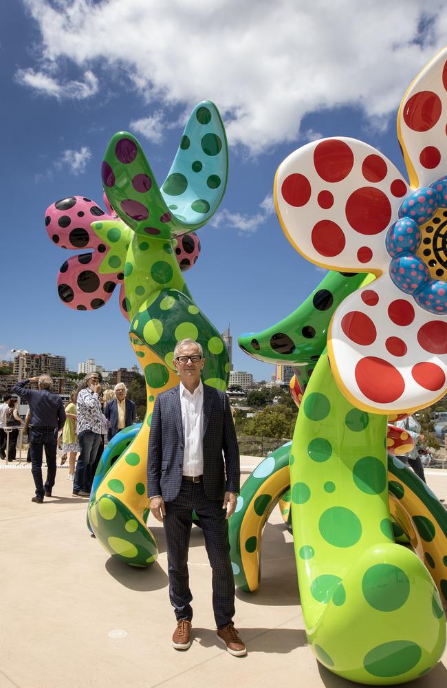
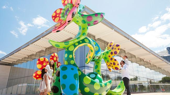
One of the major commissions is an incredibly colourful, floral sculpture by revered Japanese artist Yayoi Kusama, Flowers that Bloom in the Cosmos, on the North Building’s terrace overlooking Woolloomooloo Bay. (There is 3400 sqm of accessible roof terraces and courtyards).
The 93-year-old Kusama asked for information about local flora before creating her piece. “She wanted us to send pictures and was very interested in local flowers,” Maud Page explains.
“We sent her books too and we thought we might get a work that reflected that. In the end we got this.”
Not that she or anyone else is complaining because it’s gorgeous.
Walking around and transiting between various levels and spaces is easy and comfortable and there are tantalising vistas. The utilitarian nature makes me think of a rather swish shopping mall or futuristic airport and I mean that in the most complimentary way because I love malls and airports.
As you descend into the heart of Sydney Modern you see one of the most spectacular of the new commissions, a vast video work by Aotearoa Maori artist Lisa Reihana, a monumental moving image work on a giant screen that overlooks the central atrium.
This dazzling, visual sci-fi tale which Michael Brand describes as like “something out of Blade Runner” forges a new story of trans-Tasman connection built upon deep histories of encounter and exchange. It’s the hero piece. One of the more novel displays is a gallery known as The Tank. The gallery site included two vast underground World War II naval fuel tanks, one of which has been turned into an art bunker. You queue to go down into this little Hades in groups, entering a world of ambient lighting and sometimes total darkness.
The inaugural exhibition, on until mid year, is Adrian Villar Rojas: The End of Imagination, a site-specific piece by the Argentine-Peruvian artist whose work is a commentary on the state of the world. A more mellow experience is Lee Mingwei’s serene Spirit House, a contemplative space bordered by one of the gallery’s external rammed earth walls. Within it is an exquisite bronze Buddha. This is a place for contemplation and meditation and it is quite lovely.

There are multiple other spaces and exciting new work, as well as work from AGNSW’s excellent collection is on show with several new exhibitions featuring Australian and international artists. You could comfortably spend a half day here with little forays outside to take in the spectacular view.
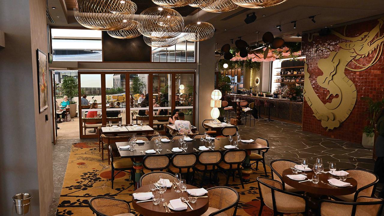
Punctuate your visit with a meal at MOD. Dining by Clayton Wells, an all-day diner featuring modern Australian dishes such as a fried prawn sandwich with old bay mayo; a wild rice bowl with red cabbage kimchi, tahini, pickles and pita or try some coconut sorbet with black sesame and freeze-dried plum. Or the cheese cake, which is what I had after my lunch.
Overall Sydney Modern is stunning and Michael Brand is thrilled despite the naysayers. He says he was “flabbergasted” by criticism by Paul Keating.
“But he seems to have accepted the design now.”
As for other more recent critics. “Don’t get me started,” he says. So I don’t. “All of us are happy with the outcome,” Brand says. “It makes us feel good.” Me too.


