
The Block 2020: Master bedroom reveal
One team created a beautiful master bedroom with everything a buyer could possibly want. But in a shocking twist it didn’t win.
Interiors
Don't miss out on the headlines from Interiors. Followed categories will be added to My News.
This week’s Block scores were more confusing than the four-step plan to get Melbourne out of lockdown. Let’s examine the wins and woes.
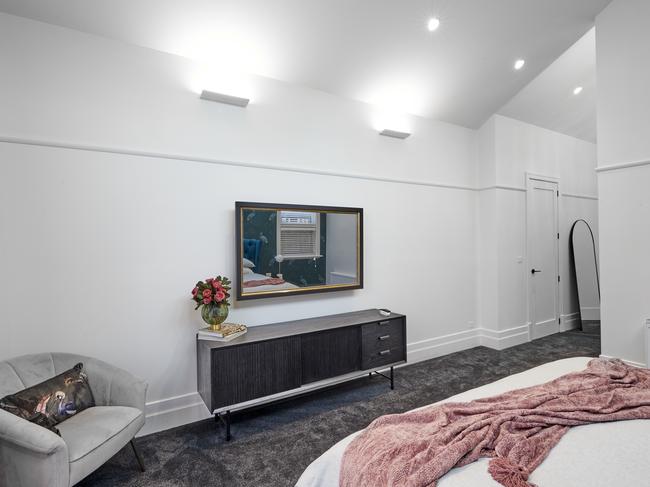
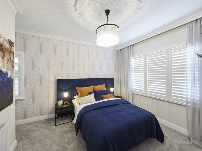
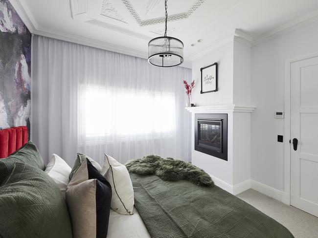
HARRY AND TASH CAME IN FIRST PLACE
In a twist more shocking than Honey Badger choosing himself on the Bachelor, Harry and Tash landed in first place this week.
Nothing takes away from the beauty of a vaulted ceiling and skylights quite like garish bird wallpaper. After a quick call to David Attenborough I can confirm that the species is prehistoric Bin Chicken, and sadly no amount of praise for it will convince me that a luxe Melbourne buyer wants this in their master.
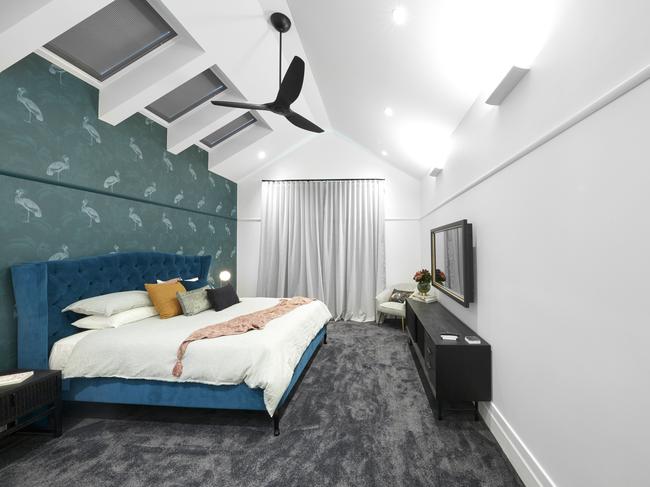
One side of the room was heavy, with a blue and green colour combo that felt anything but soothing, while the other side was so clinically white I expected Nurse Ratchet to emerge to administer my lobotomy. The bones of this room were divine but the colour and style choices were not first-place material.
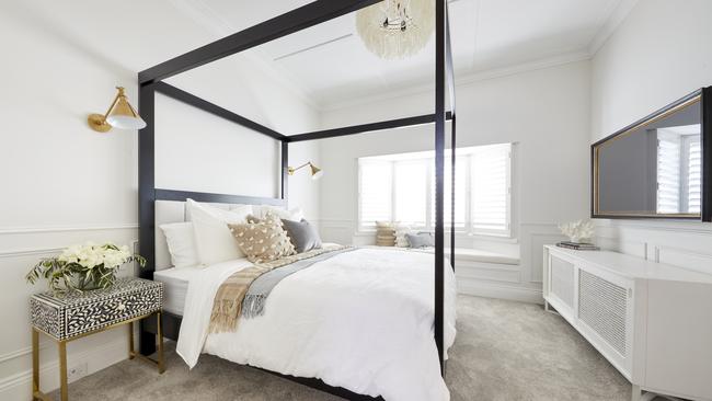
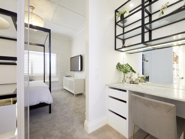
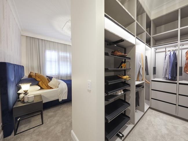
LUKE AND JASMIN SCORED JOINT SECOND
Luke and Jasmin are always the bridesmaid and never the bride. This is their second week on The Block where a win was fully deserved. This master bedroom is everything a buyer wants, and it also delivered design moments that were so delicious they couldn’t possibly be fat free.
Ceiling strapping, wall panelling, a four poster bed; all sitting against a soothing backdrop that screams understated luxury. Shut up and take my money! And can we talk about the window seat? This is an inclusion that sells the fantasy to a buyer, and Luke and Jasmine were wise to include it.
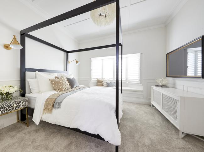
I do agree with the judges that the queen bed was a mistake. A buyer does want to know they can fit a king into the room. But that change is an easy one. Unlike ripping out wallpaper, which is more painful than a post-winter bikini wax.
RELATED: What Block judges got wrong last week
DANIEL AND JADE SCORED JOINT SECOND
We have to talk about the bedside lamps first, which were by far one of the biggest crimes of the season (so far). Sorry not sorry, but they’re not cute. Even if I stand a kilometre away, cover one eye and squint the other, they’re still hideous. I don’t know how Daniel and Jade got these from the old lady at the start of Titanic, but please return them.
Outside of that misfortune, the shell of the room was inviting. The ceiling rose and pendant were nice, the wallpaper was enjoyable (if not a bit expected) and the window treatments were both lovely. Although when it comes to shutters and sheers, you can’t have both. Unlike the men on Sister Wives, just choose one.
While the foundation of the space was successful, the colour palette of bold blue on top was a bit jarring. It was also missing the grandeur of a master bedroom. Put some pendant lights above bedsides or opt for wall sconces instead. It’s not fully resolved, but almost there.
RELATED: Big problem with guest bedroom room reveals
SARAH AND GEORGE CAME FOURTH
This room had the same problems as Harry and Tash’s. One side of the room was a colossal colour explosion (and not a good one) and the rest of the room was stark and sterile. The two sides of the room don’t go together.
I don’t even need to delve into how bad the wallpaper and bed combination was. The entire nation is behind me on that one. What I find most baffling in this room is that neither bedside table has a light on it or above it. Too bad if you want to read a book in bed (the book would be titled Easy Ways to Remove Wallpaper, btw).
The pendant was fixed too low in this space, while the fireplace was too high. The levels in this room are all over the place. It’s like when our nation’s greatest treasure Gina Liano told one of the women on The Real Housewives of Melbourne, “Your testosterone needs to come down and everything else needs to come up”. The fireplace is testosterone.
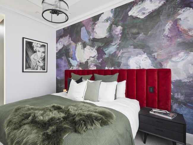
JIMMY AND TAM CAME LAST
Let’s start on the positives. The colour palette in Jimmy and Tam’s master bedroom was quite successful. A little on the warm side, but fresh and inviting. The wallpaper was a standout (far better than the one in their guest bedroom), and I too enjoyed the feature of the fireplace and exposed brick column. So all was not lost here.
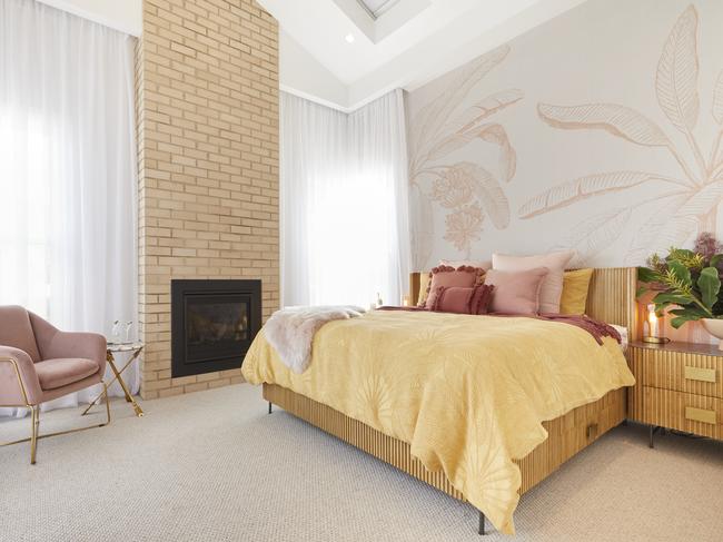
Sadly it was the layout that undid them. Not only with the walk-in-robe and ensuite, but the bedroom itself. There is no way you’d ever be able to have the fireplace on in that room with one side of the bed so close to it.
What makes it worse is that there’s no other way to lay out the room. A buyer would be forced to stick with the current floorplan or consider gutting it altogether. I feel for the duo, but they need a major rework here. And it’s more than just designer Botox. It’s the full facelift.
Chris Carroll is the Melbourne-based designer behind TLC Interiors; an interior design studio and home style blog that’s been helping everyday Aussies transform their spaces without breaking the bank since 2012. Follow him on Instagram
Originally published as The Block 2020: Master bedroom reveal