The Block 2020 recap: Big problem with guest bedroom room reveals
It might have earned top points from the judges but one design expert on The Block has spotted a glaring error during the first room reveals.
I’ve never been this excited for something to return since Cadbury brought back Caramilk chocolate.
And like with most seasons of The Block, we’ve got a mixed bag of room reveals and a stack of judging I don’t agree with. Time to rip off the Band-Aid and drop some truth bombs.
JIMMY AND TAM SCORED FIRST PLACE
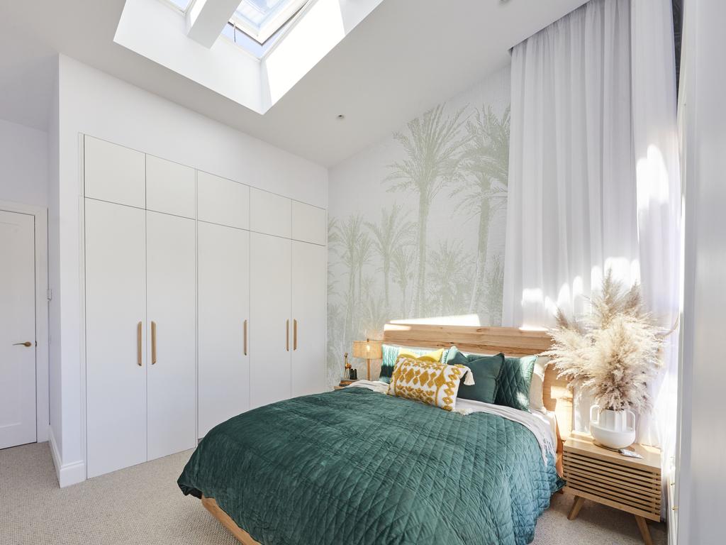
I like bold wallpaper as much as the next designer, but this one felt a bit literal. It’s something I’d expect to see on the set of Home And Away next to the hamburger phone and the ghost of Ailsa. If they had painted the entire room a pale sage green it would have been a more appealing space.
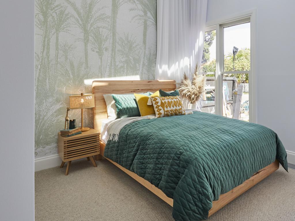
While the sheer curtains were a great choice and the overall colour palette was successful, functionality was an issue in this room.
The bed was squished into the corner like a child being punished on Super Nanny, and there was only one small lamp on the left bedside and some feather dusters on the other. Why does the person on the right of the bed get left in the dark?
DANIEL AND JADE CAME IN SECOND
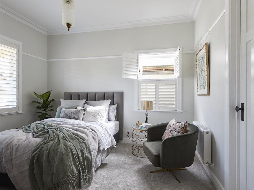
If I never see another velvet headboard on The Block it will be too soon. That repetitive element aside, the colour palette here was soft and soothing. They get points for that, but I’m taking them straight back for delivering a bedroom without two bedside tables.
A fiddle leaf fig bedside the bed? Everyone knows that the plant died before the judges even left the room. The other bedside was a round glass table with no storage to speak of and Nanna’s lamp popped on top. Not cute.
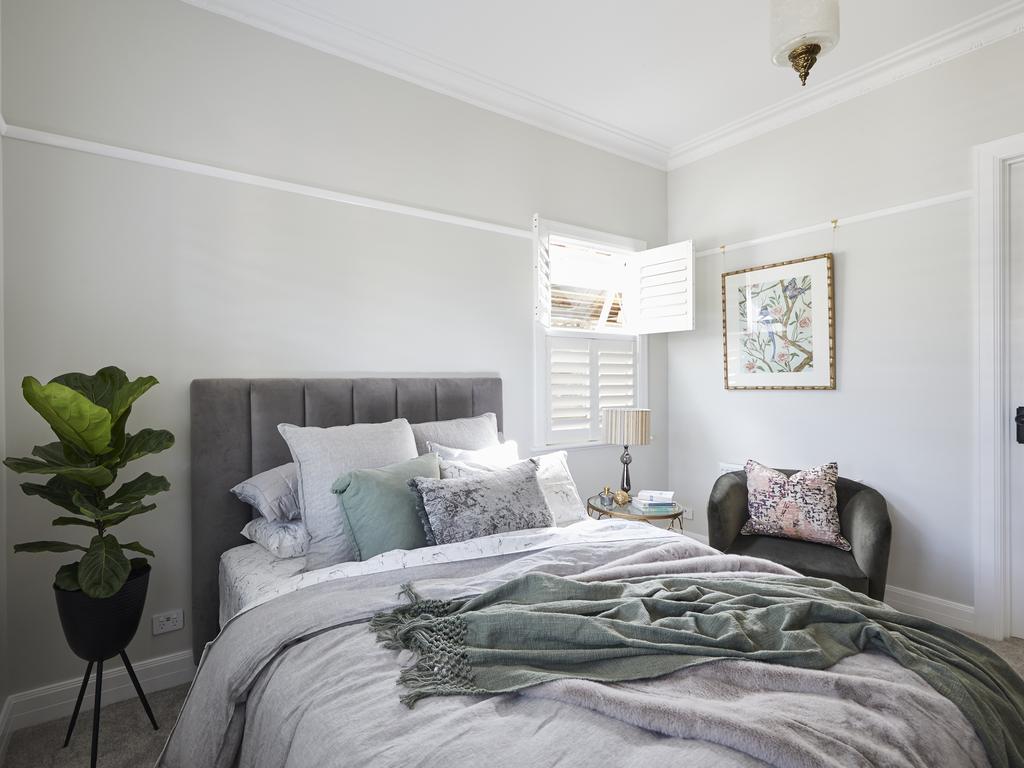
Overall the space was nothing we haven’t seen before, although I will agree that the marble bedding was a great idea; it’s the ultimate way to conceal drool patches. Don’t judge. I can’t control what my mouth does while I’m asleep!
HARRY AND TASH LANDED IN THIRD PLACE
I’ve not loved a father and daughter duo this much since Billy Ray produced Miley, and I’ve gotta declare Harry and Tash’s space the best of the week.
I’m going to forgive the velvet headboard because it delivered a welcome pop of colour, and overall the elements of the room were so well connected. The pops of black across the space were divine, and the soft grey paint on the walls was very charming.
This room was calming but surprising at the same time. I could have done without the fluffy slippers. Sure, they might be reminiscent of the 1920s, but so is Dame Nellie Melba. I’d prefer both to stay out of my bedroom. I do agree with Shaynna about the carpet colour though; it would have looked better darker.
SARAH AND GEORGE CAME IN FOURTH
Sarah and George bragging about their parmy pub lunch when some of us are in lockdown was the most emotional moment I’ve experienced watching TV since Patrick died on Offspring.
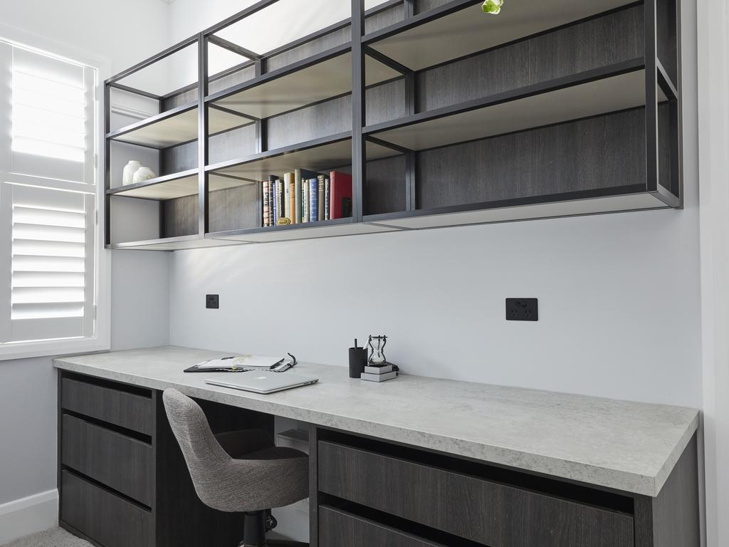
That aside, it’s fair to say that their room this week was plagued with issues. Sure, they gave us something unexpected with the guest bedroom and study combo. But like Janet Jackson’s boob falling out at the 2004 Super Bowl, it was not a welcome surprise.
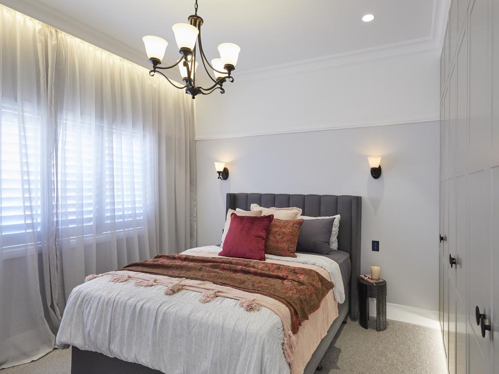
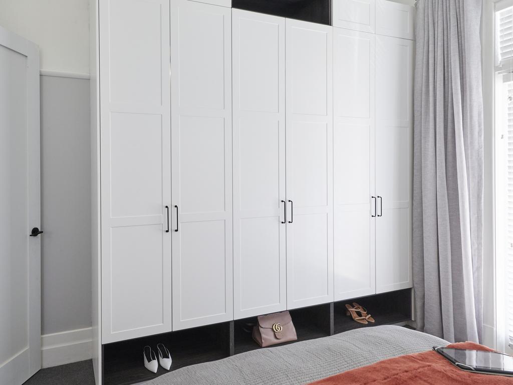
I have to agree with Shaynna on this one: A house in BRAH-TON would benefit from a walk-in robe far more than it would a study. And if you were hellbent on doing a study, with such a long desk, why only leave space for just one chair?
The bedsides were smaller than Danny DeVito, the wall sconces felt daggy and dated, and the pendant light was just as unfortunate. The door handles were nice though. I’ll give them that.
LUKE AND JASMIN LANDED IN LAST PLACE
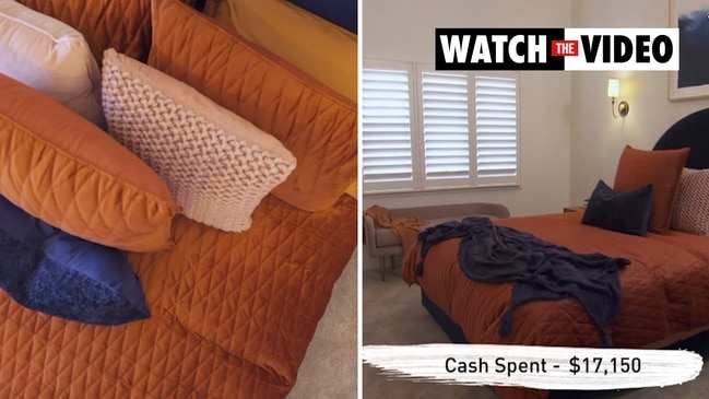
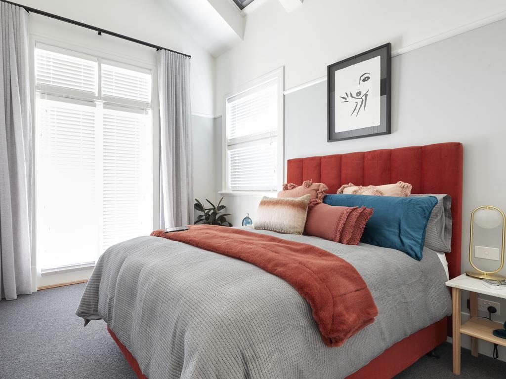
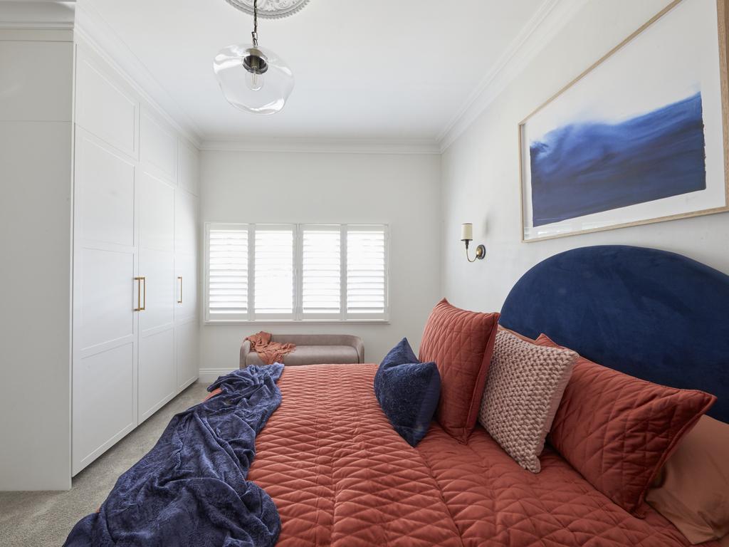
I’ve never been more attracted to a man than I was to Luke when he uttered my favourite five words: “the bed needs more cushions”. But in the end it turned out to be a total anticlimax.
The curved headboard was a nice idea, but it made the bed feel quite small and underwhelming. The art above the bed, like a pilar cyst on Doctor Pimple Popper, needed to be removed altogether, and the bedside table styling was rather underwhelming. A half-used tube of Dencorub is not a style trend I can get behind.
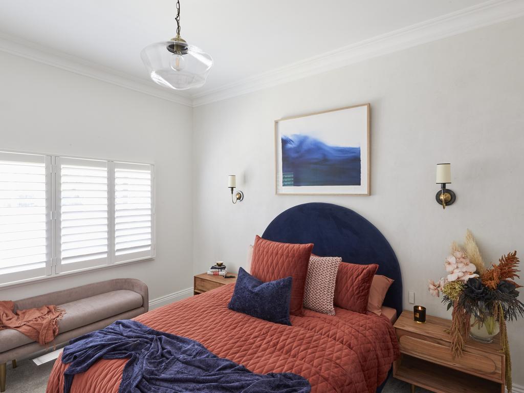
The floral artwork on the wall beside the bed was delicious though. I’ll take that to go. But overall the room was a cold and clinical shell with bold colour thrown on top. The contrast between the stark white walls and bright orange and blue bedding was just too big a colour jump.
Not many major design moments on The Block just yet. Here’s hoping next Sunday’s guest ensuite reveals deliver some gasp-worthy style wins.
Chris Carroll is the Melbourne-based designer behind TLC Interiors; an interior design studio and home style blog helping everyday Aussies transform their spaces without breaking the bank. www.tlcinteriors.com.au, Instagram

