
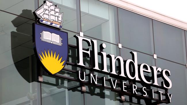
Flinders University reveals new $100,000 logo, without Matthews Flinders’ ship The Investigator
Flinders University’s logo has long featured the ship of the famous British explorer it’s named after – but its new $100,000 design has dropped it.

Education
Don't miss out on the headlines from Education. Followed categories will be added to My News.
Flinders University has spent $100,000 on a new logo – without the ship of the famous explorer after which it is named, Matthew Flinders.
Instead, the HMS Investigator has been incorporated into a contemporary design to be progressively rolled out across the university’s campuses at Bedford Park and Tonsley.
It also will feature prominently when the university becomes the main tenant of the new office tower being built on Festival Plaza behind Parliament House.
Flinders vice-chancellor Professor Colin Stirling said the new logo provided “a clean and modern take on familiar elements such as the Flinders’ sun, sea, sky, book and shield”.
“As such, this new aesthetic symbolises our progressive nature while honouring the past upon which our future success will be built,” he said.
Prof Stirling said the sun was intersected by three curved lines “intended to convey multiple meanings”.
“Firstly, they are the open pages of a book and echo the reference to Matthew Flinders’ famous ‘A Voyage to Terra Australis’ in our founding crest,” he said.
“Next, they represent the vast oceans explored by the Investigator and the boundless opportunities that exist beyond the horizon.
“Finally, they symbolise the many lands upon which Flinders University operates, across both South Australia and the Northern Territory.”

A university spokeswoman said including another illustration of The Investigator had been discounted during the design process because of its complexity.
The Investigator was referenced in the new logo as “the waves across which the vessel sailed”.
“The ship atop the former crest was extremely detailed and proportionally constrained our visual presence compared to simpler designs,” she said.
“Our new design has bold clean lines and a single shield with no external elements, maximising our visual impact and reducing complexity.
“It both captures our heritage and positions Flinders for the future.”
The spokeswoman said the costs of switching to the new logo would be “modest”.
Existing buildings would adopt it “in a staged manner with a focus on major external facing presences”.
“Considering this is our first significant change in more than half a century and we’re expecting a long lifespan for the new logo, the costs will be modest,” she said.
“But the return on investment of a bold and contemporary new look that elevates Flinders’ presence and identity are immeasurable.”
The spokeswoman said the new logo would be appearing by the end of the year and into 2023.
More Coverage


Boy allegedly left alone on locked after-school care bus
A childcare service has been named and shamed after a boy was allegedly left alone on a locked after-school care bus on Friday.

15yo girl raped on private school campus, mum says
An alleged rape on campus has raised questions about what students should have to declare when moving between schools.