This was published 2 years ago
The architectural ‘poets’ behind Sydney’s newest art gallery
By Julie Power
Mysterious, magical, relentless, driven to design and redesign until the very last moment, Japanese architects Kazuyo Sejima and Ryue Nishizawa – known as SANAA – blur the lines between indoors and outdoors and where a park begins and a museum ends.
After a 25-year wait, Sydney will join New York and Paris and have its own SANAA building when the new wing of the Art Gallery of NSW opens on December 3.
Doubling the gallery space, its four rectangular gallery spaces and an entrance pavilion are positioned at different angles and levels of the 19-metre drop from Art Gallery Road to Lincoln Crescent, Woolloomooloo.
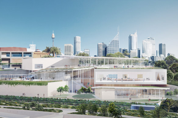
An artist’s impression of Sydney Modern, as it would be seen from Woolloomooloo.
With works across the world, SANAA are two of architecture’s “most compelling poets”, says Anthony Burke, a professor of architecture at the University of Technology and the host of Restoration Australia.
Many architects make pilgrimages to their buildings across the world including Nishizawa’s organic dome – with a window in the roof – at Teshima Art Museum, Japan. “Visiting Teshima was a wonderfully sublime architectural experience. It keeps drawing me back,” said Burke.
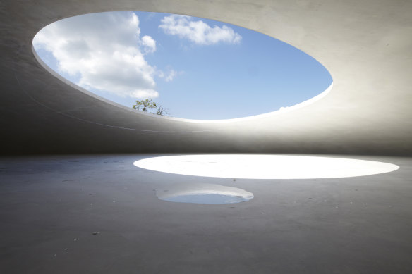
Visiting the Teshima museum is a sublime experience for many architects. Credit: supplied
Some critics say SANAA’s use of white rectangles, that are strewn on the landscape or stacked, lack local context. A Sydney architect, who didn’t want to be named, said they landed like alien spacecraft.
Known best for their white-on-white designs, SANAA’s first Sydney building – designed with executive architects Architectus, a Sydney practice – marks a subtle shift with its use of handcrafted elements and warm colours that pick up the tones of Sydney’s sandstone.
As much as they are known for their boxes, an increasingly recurring design theme for SANAA are the gentle curves of a river seen in its 2009 Serpentine Pavilion in London.
By 2015, this concept had developed into Grace Farms project in Connecticut, USA, where a series of round glass buildings are dotted down a hill connected by a meandering roof and external path.
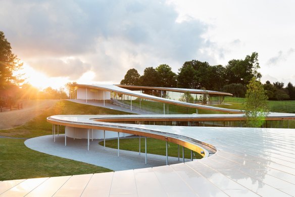
SANAA’s Grace Farms project in Connecticut, USA, meanders down a hill like a river. Grace Farms project in Connecticut, USA, where a series of round glass buildings are dotted down a hill connected by a meandering roof and external path.Credit: Dean Kaufman
In Paris, milky glass undulates across a contemporary facade of the newly renovated grand French department store La Samaritaine on busy Rue de Rivoli.
In Sydney, these curves have become earthy, organic and massive, with a 250 metre long rammed earth wall that winds through the building.
Working in a partnership known as SANAA for the past 30 years, Nishizawa and Sejima’s designs often provide a two-way view of the world – from outside in and inside out.
In Sydney, visitors don’t even need to enter the new gallery to enjoy some art. Lorraine Connelly-Northey’s Narrbong-galang (many bags) 2022 hangs in the wall of the new Yiribana Gallery in full view of anyone walking along Art Gallery Road.
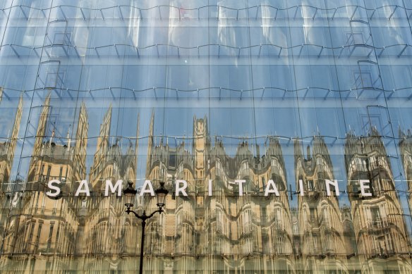
A wavy glass facade, designed by SANAA, reflects neighbouring buildings at the La Samaritaine department store in Paris.Credit: Bloomberg
SANAA don’t like traditional boundaries – the architects believe the gallery should become part of the landscape, not something separate. They avoid hard stops at entrances to rooms, and blur the divide between inside and out. The new wing has a curved rooftop terrace above the cafe, and other terraces provide views through the glass of the gardens outside and the views.
Expect some playful touches too. Inside the new gallery, a set of stairs appears to rise out of nowhere, like those in an Escher print. The entry foyer tilts slightly, on a 1:40 slope (one metre down for every 40 metres across), drawing visitors to the building’s centre. This mild slope is a toned-down execution of the curved floors and ceiling of the Rolex Learning Centre in Switzerland.
Sejima says frequently that she has been inspired to create places that were similar to public parks, which brought people who wouldn’t usually come together.
“Our design is not flashy architecture, but about the experience together with the art. I think the special feature is that you can enjoy Sydney’s natural beauty, these buildings, and the art all together,” she told DesignBoom.
SANAA has waited decades for one of their designs to be realised in Sydney. In 1997, they won an international competition to design the Museum of Contemporary Art’s new Mordant wing. That didn’t proceed.
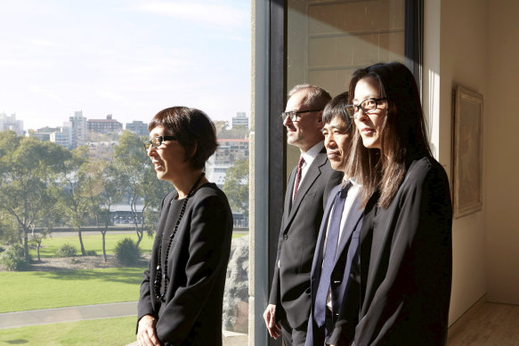
Gallery director Michael Brand with (from left) SANAA’s Kazuyo Sejima, Ryue Nishizawa and Yumiko Yamada, at the 2015 announcement that the Tokyo firm had won the international competition to build Sydney Modern.
Since then, though, their status has grown.
It was SANAA’s design for 21st Century Museum of Contemporary Art in Kanazawa in Japan, completed in 2005, that popularised their work internationally and took them to cult status.
The architects sought to reimagine and democratise the gallery, seeking to make it a new “town square” for the city.
Kanazawa was a “revelatory re-think of the white box gallery” said Dr Gene Sherman, a philanthropist and art critic who helped fund the new gallery after being inspired by their work for decades.
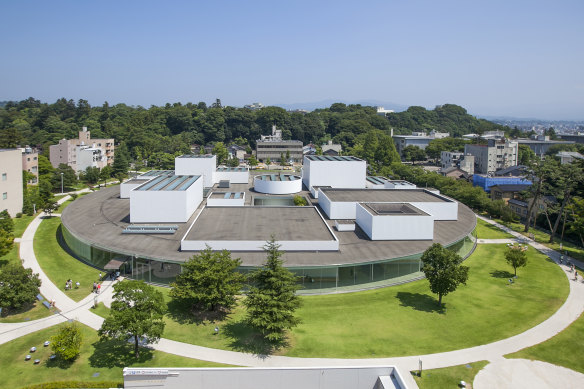
21st Century Museum of Contemporary Art in Kanazawa, Japan, was one of SANAA’s most important works.
A traditional gallery like the old wing of the AGNSW has rooms that run off a central corridor. In Kanazawa, an exterior corridor loops the circular building.
Sejima told Sherman that she was interested in creating “a moment, or a softly appearing and disappearing space, rather than an architecturally constructed space”.
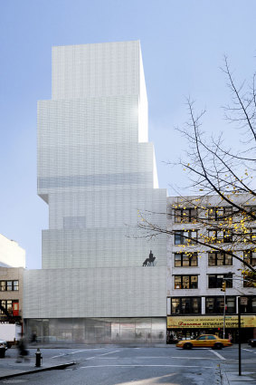
An artist’s impression for the for New Museum of Contemporary Art in New York.Credit: Christopher Dawsom
Under the headline “Disappearing Act”, a New York Times feature in 2005 by author and art critic Arthur Lubow pondered how their buildings provided so much physical pleasure. “This sorcery has helped propel SANAA over the past few years from cult status,” known only to a few architectural insiders, “to the winner of prestigious awards,” reported the Times.
Yet their design for New York’s New Museum of Contemporary Art, completed in 2007, was accused of being gimmicky. The New Republic described it as desiccated minimalism, lacking sunlight, with narrow corridors and slow lifts.
In 2010, the pair won the world’s most prestigious architecture award, the Pritzker Prize, joining the ranks of Jorn Utzon, Glenn Murcutt, Renzo Piano, Jean-Philippe Vassal and Anne Lacaton, and last year’s winner, Diebedo Francis Kere.
Lord Peter Palumbo, the prize’s chair, described SANAA’s work as “simultaneously delicate and powerful, precise and fluid, ingenious but not overly or overtly clever”.
SANAA is sometimes criticised for ignoring the context and failing to use local materials. Burke said the Sydney building won’t shout at visitors. “It is not conspicuous or flamboyant, it works on you gently, it is not all frill and baubles,” he said.
Commissioned by the AGNSW to write about SANAA’s design for a book next year, Burke said SANAA “gently, softly, opens up to the context” in Sydney. The rammed earth walls reflect the Sydney sandstone of the old wing of the gallery, the resin in the foyer bookshop glows a warm red. The concrete floor mixes these colours, combined with the pale sandy colour of the limestone.
The Morning Edition newsletter is our guide to the day’s most important and interesting stories, analysis and insights. Sign up here.