By Garry Maddox
The trophies have just kept coming for Fiona Crombie, the Australian production designer for the savagely witty royal comedy The Favourite. A British Independent Film Award, an Art Directors Guild Award, a BAFTA and now a very good chance of an Academy Award on Monday.
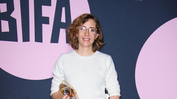
Oscar-nominated production designer Fiona Crombie with one of her trophies for The Favourite after winning at the British Independent Film Awards last month. Credit: Alamy
"It's pretty great," Crombie says with a laugh from London. And part of the fun has been meeting all the designers she has been "fangirling" since moving from Australian theatre into film less than a decade ago.
"I've totally forced myself on Eugenio [Caballero] who designed Roma," she says. "I've made friends with all the production design nominees, particularly those that were here for the BAFTAs. And I chatted to Melissa McCarthy."
Having trained as a theatre set and costume designer, Crombie moved into film with the 2010 shoot for the drama Snowtown and has since worked on eight films, including Macbeth (2015), Truth (2015), Una (2016) and Mary Magdalene (2018) as well as the TV series Top of the Lake (2013).
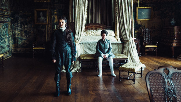
'Big rooms and little people was the plan': Rachel Weisz (left) and Olivia Colman in The Favourite. Credit: Twentieth Century Fox
What shifted her career into high gear was nailing a job interview with then rising Greek director Yorgos Lanthimos (Dogtooth, The Lobster) for a bold royal film set in the early 18th century. "I remember my hands were flapping," Crombie says. "I was so nervous. I was just trying to be brilliant."
Lanthimos liked her ideas for the look of The Favourite, which centres on two cousins vying for the favour of a frail Queen Anne. And after a year's delay for scheduling reasons, they shot a film that has 10 Oscar nominations including best picture, director, original screenplay for fellow Australian Tony McNamara, actress for Olivia Colman and supporting actress for Rachel Weisz and Emma Stone.
Crombie sees her job as translating both the director's and her own vision to the crew who build and decorate the sets.
"My main thing is I'm a communicator," she says. "I have to obviously be creative and I have ideas and I have my approach to how I imagine the film to look but I'm also sitting there between a director and a crew."
Some directors supply a production designer with a stack of references - photos, artworks and films they want to influence the look. But Crombie says Lanthimos did not explain the visual concept he wanted. Instead, he agreed with the concept she pitched using her own reference material after taking cues from the script.
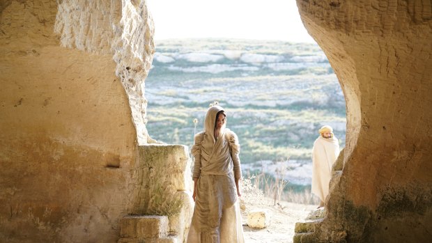
Crombie has worked on eight films, including Mary Magdalene (2018).Credit:
"It's a really intuitive process," she says. "There isn't a lot of explanation. But the words on the page were so strong and when you combine that with Yorgos' body of work, there was an immediate sense that this was a re-imagining of a period film, [although] he did tell me to watch [the 1972 classic] Cries and Whispers and [the 1982 comic drama] The Draughtsman's Contract as references of period films that have a modern sensibility."
For a production designer, every project is different.
The last Australian to win best production design at the Oscars was Colin Gibson for Mad Max: Fury Road three years ago - Catherine Martin won for The Great Gatsby two years earlier - and he sees the job as finding the right way of working for each director.
"All directors have different strengths and different ways of telling stories so you've got to tailor a methodology that you think will help them best tell their story," he says. "We're there to construct a space for grace."
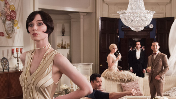
Catherine Martin won an Oscar for her work on The Great Gatsby.Credit:
Director George Miller already had 3500 storyboard panels - a black-and-white graphic novel - for everything that happens in Fury Road. "The colouring-in, the giving truth, the back building of anthropology and everything else to make sense of the tribes and the characters, that all needs to happen in the design process and through art directors and cinematographers and locations chosen," Gibson says.
Where he designed and oversaw the building of post-apocalyptic sets and 150-odd vehicles, Crombie had to create an extreme version of an 18th century royal court with a modern sensibility that would play up the comedy in the script.
"It's the royal court so it's the place of ultimate privilege and every single element had to be exquisite and the most beautiful version whether it's a tea-cup, a platter, a pillow or a rabbit cage," she says. "But we also wanted to make sure there was something spare about the way the film looks.
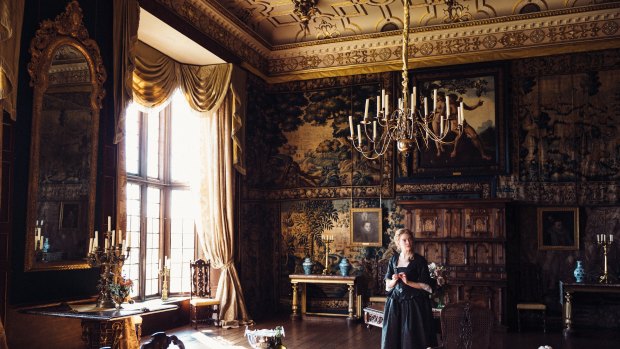
'It's the royal court so it's the place of ultimate privilege': Crombie about the set for The Favourite, which stars Emma Stone.Credit: Twentieth Century Fox
"It's not overstuffed with loads of furniture. There's actually something a bit cold about it. All the floors are exposed and it's shiny and there are lots of hard surfaces. Big rooms and little people was the plan."
While the costumes are all black and white, Crombie worked in what she calls a "very contained" palette of colours. "It's only gold fabric the whole way through," she says. "It's only wooden furniture. It's only blue-and-white china.
"It's really a concentrated repetition of elements and, of course, there are black-and-white floors. What that does is take [the film] out of naturalism. It gives it an abstraction, without becoming farcical or fantasy."
While they faithfully recreated carriages and the Queen's bed from the era, Crombie was led by the script when it came to designing elements that did not exist in the 18th century, including a wheelchair, a birthday cake and the Queen's riding outfit of calipers and a back brace.
"We knew we had to bend time in a way, creating versions of things that we recognise now but that sat believably in the period," she says. "I felt like I was making a playground, a playground for adults, where suddenly they turned around and said 'I feel like racing some lobsters'.
"Then we'd be thinking 'if you're improvising a lobster race in this room, how would you do it?'"
Camera tests on set revealed another challenge: cinematographer Robbie Ryan was planning to shoot extreme angles in the film.
"It was really informative to realise that we were going to see everything," Crombie says. "You're seeing the ceiling and the floor and absolutely everything then suddenly Robbie was going to turn [the camera] around and look in the opposite direction, which was amazing for us.
"More often than not, we make sets and the story dictates you shoot in a corner. But we just knew that we were being gifted with something because it's a real celebration of the design."
There was yet another challenge that shows the sophistication of Crombie's work: instead of banks of artificial lights on set, the production design team lit almost every scene.
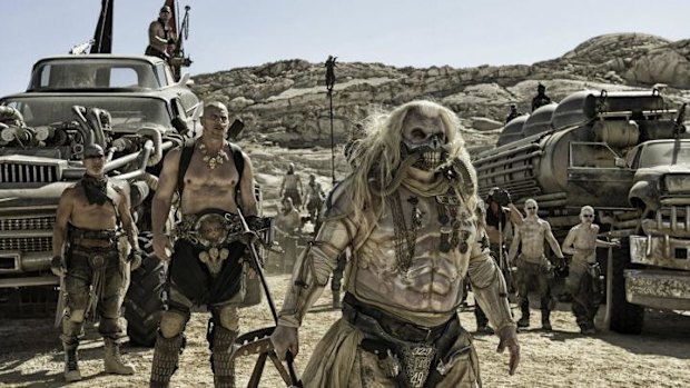
'A space for grace': production designer Colin Gibson's work on Mad Max: Fury Road won an Oscar three years ago.Credit: Warner Bros
"It's all candlelight and natural light so it was up to my department to bring in the candles to make sure it all looked compositional but was also serving Robbie and genuinely lighting [scenes]," she says. "The same with the natural light.
"A lot of the decisions we made about fabrics and surfaces were all to do with bouncing light. Because we were relying on the light that was coming through the windows, I was putting in mirrors and marbletop tables."
While Crombie has no sense of whether she will win - "that's what's a bit intense" - her design team has big plans for the Oscars.
"We have absolutely pledged to have the wildest night," she says. "Empty handed or not, we are going to have a really, really good time."
The 91st Academy Awards will be held on Monday.