
Vote: Which is the best Brisbane Broncos NRL jersey of all time?
From hoops to diamonds and teal to maroon, the Broncos have pulled off plenty of different looks over the years. But which is the best?

The Broncos claimed the 2025 NRL title – now they are owning a new look.
Brisbane unveiled its bold new jerseys for next season, adding to a legacy of redesigns that have kept them ahead of rivals as well as kickstarted talking points among fans.
We look back at the evolution of Broncos jerseys – vote below for your favourite >>>
1988–1991: Inaugural NSWRL home
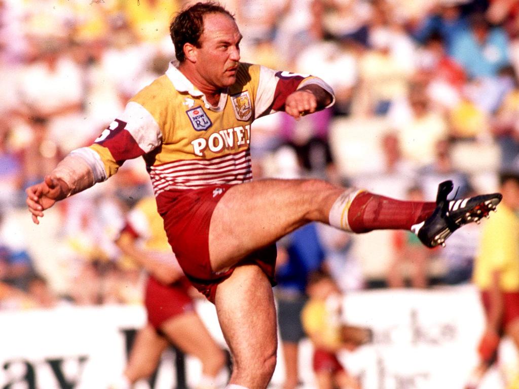
The first kit set the maroon, gold and white identity, with broad white and gold bands on a heavy cotton knit, drill collar and 3/4 sleeves.
Club and NSWRL crests were embroidered, with “Powers” branding front and back.
1992–1993: Back-to-back

The jersey kept the maroon/gold base with bold white chest bands and classic knit construction.
The 1993 strip was virtually unchanged from 1992 apart from numbering and minor details.
1994-95: Iconic diamond “night strip”

A radical departure, featuring maroon-and-gold diamond blocks across the body with an all‑maroon collar and maroon sleeves with yellow cuffs.
It’s remembered as the club’s inaugural night jersey and a fan favourite.
1997: Super League Nike set

Nike supplied streamlined maroon-and-gold designs with multiple variants (trial, home, Grand Final) during the SL season.
Owing to the SL–ARL dispute, some shirts ran “clean skin” or with reduced club/sponsor marks.
1998: Inaugural NRL premiership kit

A modernised maroon base with strong gold chevrons and crisp white accents delivered a bold, aggressive look.
It’s among the most celebrated Broncos jerseys due to the title win.
1999: Alternate “Daffodil” clash

A standout alternate with a maroon chest panel over a vivid gold body and contrasting white trims, worn to avoid a clash with Manly.
The striking colour balance earned it the “Daffodil Jersey” nickname.
2000: Triple‑V premiership home

Maroon anchored the kit, punctuated by a distinctive triple‑V motif with white striping for impact.
The Nike cut brought a sleeker profile befitting the champions.
2001: Nike diamond revival with blue

Angular diamond elements returned, with blue introduced alongside maroon and gold to reflect the city’s palette.
The set came via Nike’s Hong Kong design team and felt sharp and contemporary.
2002: Experimental teal‑accent era

Teal/green panels were integrated with maroon and gold in a more segmented, modern template.
It remains one of the club’s more divisive looks among collectors.
2006: Premiership home, refined panelling

A return to a more traditional maroon‑and‑gold balance with contemporary Nike panelling and updated placements.
It’s closely associated with the 2006 title, cementing a clean, professional aesthetic.
2017: ISC era begins

ISC’s debut brought a cleaner maroon home with simplified gold detailing and lighter, hotter‑weather‑friendly fabrication.
The unveil included away and a heritage diamond homage, with NRMA on the chest.
2019–2020: Kia era and cultural editions

Late‑ISC homes kept the maroon‑gold DNA with athletic necklines and fully sublimated sponsors, as Kia replaced NRMA on the front.
A powerful Indigenous jersey in 2020 showcased artwork representing community and ancestors.
2021–2022: Asics performance cut

Asics introduced a lighter performance polyester with a hex‑insert collar and embroidered crest, retaining the classic palette.
Kia’s refreshed branding continued prominently on the chest.
2023–2025: Heritage cues, chevrons and triple‑V nods

Bold chevron themes have featured strongly in recent Broncos women’s strips and inform the club’s broader visual language.
The 2025 home is explicitly inspired by the celebrated 2000 triple‑V premiership kit.
2026: Back to the future


As part of Brisbane’s first branding shake-up in more than two decades, the Broncos unveiled a new away jersey – a midnight blue strip that is a tribute to legendary scout Cyril Connell.
Originally published as Vote: Which is the best Brisbane Broncos NRL jersey of all time?

