
Revealed: Heat maps of SA coronavirus cases reveal council areas where the highest numbers of infected patients live
Long-awaited heat map data showing where patients with COVID-19 live in South Australia has been released.
SA News
Don't miss out on the headlines from SA News. Followed categories will be added to My News.
- See updated SA virus heat maps released on April 2, 2020
- National coverage: Vaccine could take 18 months
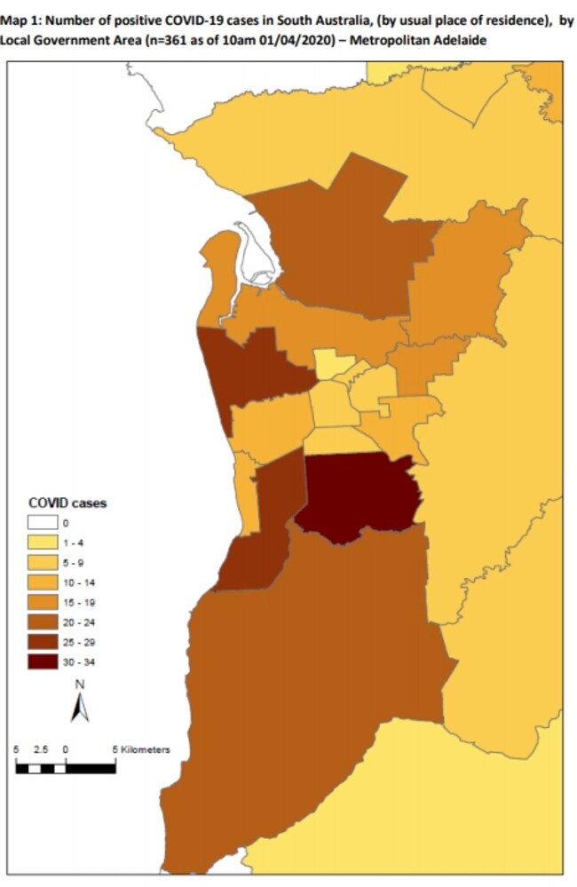
Mitcham council area has been revealed as Adelaide’s coronavirus hotspot, as the State Government for the first time releases local heat mapping of where confirmed cases live.
After sustained requests from The Advertiser, Health and Wellbeing Minister Stephen Wade has now released the detailed information that is likely to be updated each day.
The maps show in which council areas confirmed coronavirus cases are now living, rather than where they got it, helping people to make their own commonsense decisions.
Nonetheless, all known coronavirus cases have been ordered into self isolation to stop wider outbreaks.
Police are also making spot checks to ensure they do not go out and infect others.
Known contacts of coronavirus cases are also isolating, and SA is yet to record the same kind of wider community transmission that has been seen overseas and in eastern states.
The maps also only show total cases, meaning some will have recovered.
Similar localised data on coronavirus clusters this week led SA Health to crackdown in the Barossa, including strongly requesting no unnecessary travel in or out, as well as at Adelaide Airport where a breakout among baggage handlers forced isolation and cleaning.
The finding that Mitcham has Adelaide’s most cases follows evidence from NSW and Victoria where relatively wealthier suburbs were found to have the highest infection numbers.
That is believed to largely be due to their higher rates of overseas travel.
Separate SA Health figures show overseas travel is responsible for 70 per cent of our cases. Cruise ships, especially the Ruby Princess that docked in Sydney, have contributed dozens.
Mitcham has between 30 and 34 coronavirus cases, the heat maps show. Behind it are Marion and Charles Sturt, with between 25 and 29 cases. No metropolitan council is virus-free.
However, most country regions have been far better protected. The Eyre Peninsula and most of the Mid North are case-free. There’s small numbers through much of the South East.
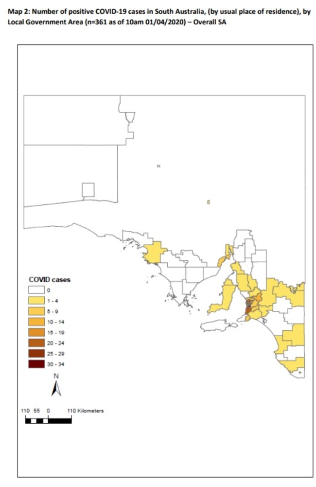
SA’s hot spots also lag well behind outbreak numbers in other states. In NSW, several regions in both Sydney and the regions are recording between 320 and 640 cases. SA is also testing at world-leading levels, helping to uncover cases that could otherwise go undetected.
SA Health Minister Stephen Wade said that the heat maps graphically demonstrated the threat that the pandemic poses to the health of all South Australians.
“The fact the virus is present throughout the state is not a surprise,” he said.
“The heat maps reinforce the importance of the State Government’s world class testing regime with more than 50 dedicated COVID-19 clinics around the state. “They also reinforce the Government’s message that South Australians should not be holidaying away from home.”
SA was slower in releasing heat maps than some other states. It is understood SA authorities were expecting the Federal Government to produce one uniform national set.
On Tuesday, Federal Health Minister Greg Hunt said: “Data is going in both directions, and then there is common work”.
“There’s a variety of jurisdictional reporting,” he said.
Originally published as Revealed: Heat maps of SA coronavirus cases reveal council areas where the highest numbers of infected patients live
Battle to save animals on the brink at Outback reserve
Conservationists are battling to save animals at an Outback reserve from the effects of the worst drought in recent memory, and have received a funding boost to redouble their efforts.
Country tradie to face court over incomplete work
A country tradesman will face the Elizabeth Magistrates Court over allegations he was not licenced and refused to refund money to clients.