
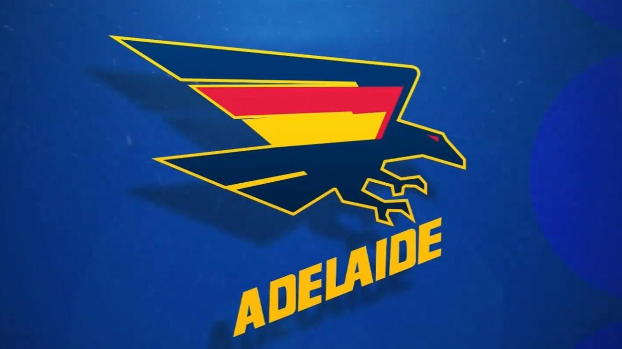
‘Hideous’: Adelaide Crows’ leaked new logo slammed by Kane Cornes, fans
Kane Cornes kicked off reactions to the Adelaide Crows’ leaked new logo — and it wouldn’t have been what the club was hoping for.

AFL
Don't miss out on the headlines from AFL. Followed categories will be added to My News.
If first impressions of a new logo are any indicator, the Adelaide Crows may want to go back to the drawing board.
Ahead of the club’s 35th season, the club announced it was going through a full rebrand as it prepares for a move to a new home base at Thebarton Oval by late 2026.
Watch the best coverage of the 2024 AFL finals, with expert analysis and every game until the Grand Final LIVE with no ad-breaks during play, on Kayo. New to Kayo? Start your free trial today >
The Adelaide Advertiser reported in August that the club had been investigating new branding for about 18 months to replace the blue Crows head, which has been the logo since 2010.
But a first leak of the logo has been met with some mixed at best — brutal at worst — reviews.
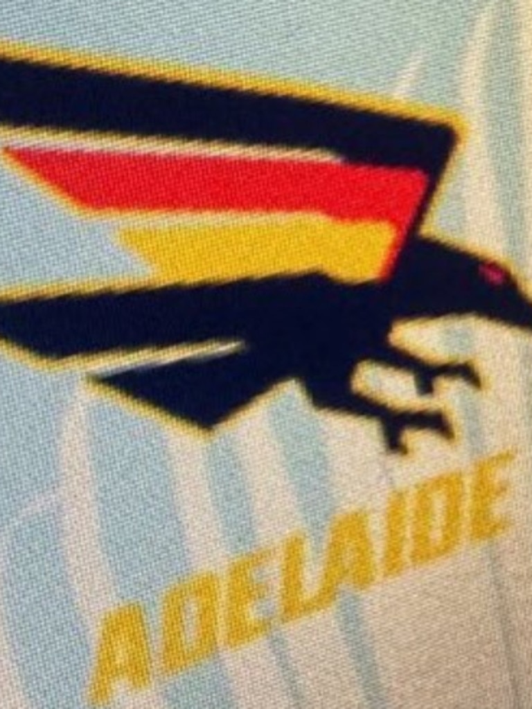
Port Adelaide 300-gamer turned media commentator Kane Cornes shared a grainy picture of a logo which has similarities to the club’s original logos, which it used but tweaked between 1991 and 2009, when the current logo came into use.
And he wasn’t sold one what he saw.
“New Crows logo? Hopefully not,” he tweeted, adding a nauseated emoji.
Nine Sports reporter Braden Ingram replied to the post, writing: “Not ruling out some late alterations but yes this is the Crows new logo due to be unveiled later in the year.”
The Sensible Crow podcast then responded to Ingram, writing: “It’s not the finished product”, before adding “thankfully lol”.
After another fan called it “f**king horrendous”, the account replied: “Haha it’s not great. The club that keeps on giving. But I have been told it’s not the final design.”
Unfortunately, the word that came to many people’s mind was “hideous”.
“This new crows logo looks hideous,” one fan wrote.
Another said: “New Crows logo? It’s hideous.”
A third suggested: “Stop asking ChatGPT to design logos.”
A fourth called it “the worst logo I’ve ever seen. Who on earth have they got running the club at @Adelaide_FC”.
Another said: “I will not buy any new merch with this logo on it.”
A sixth was a little more optimistic: “Don’t hate the concept of this design, but the way they incorporated the red and yellow into it looks ugly as hell and very sloppy.”
The Crows fan added the current logo “is a rip-off the Baltimore Ravens. This new one looks like a riff on the original one we had in the 90s.”
On Nine News Adelaide, Ingram reported it was “a working design of the Crows new logo. “There could be some alterations still to be made in the coming weeks before it is unveiled,” he added.
He also spoke with locals, with a mixed response.
“I think it’s quite amateurish,” one man said. “It looks like some Japanese art show type thing.”
A younger man called it “quite cool. Pretty retro. I like it.”
Another young bloke said: “You have the teenagers bringing up the retro sort of outfits so I think everyone’s jumping on board. I think it’s going a look good.”
Another man said: “I think it’s good that they changed it, I’m just not a fan. I think they should have gone back to the old original logo with the wings out, big bird in the middle of the chest. It would have made the jerseys look so much nicer.”
It was reported in June that the Crows’ $100m plan to establish a new training and administrative base as well as AFLW home ground at Thebarton.
The Crows have been looking to move out of their current West Lakes home but moves to North Adelaide and Brompton were rejected.


Originally published as ‘Hideous’: Adelaide Crows’ leaked new logo slammed by Kane Cornes, fans
Beveridge reveals what will decide Jamarra’s Bulldogs future
Western Bulldogs coach Luke Beveridge has spoken at length on Jamarra Ugle-Hagan’s future at the club. See what he had to say here.
Watch: ‘Frosty’ Bevo-Morris chat relives presser stoush
Tom Morris and Luke Beveridge have come face-to-face for the first time since their infamous press conference interaction three years ago.
‘Stop posting’: Star’s uploads cause concern
The ongoing saga surrounding a troubled Bulldogs star has taken a fresh turn with his social media activity causing major issues.
Dillon’s move to ensure the next generation of AFL leaders
A wealth of experience has departed the AFL landscape in recent years, and AFL CEO Andrew Dillon is determined to build up the next generation to lead the league.
Round 3 teams: Young guns firm for Saints debut, Dees injury latest
Fresh off its shock win over Geelong, St Kilda is poised to call on another two of its talented youngsters to debut against Richmond this week. ROUND 3 TEAM NEWS
Hawks’ best under ‘super coach’ enough to win flag
An AFL legend has branded his former teammate a “super coach” and believes his side can contend for the premiership.