
Gympie council adopts new branding
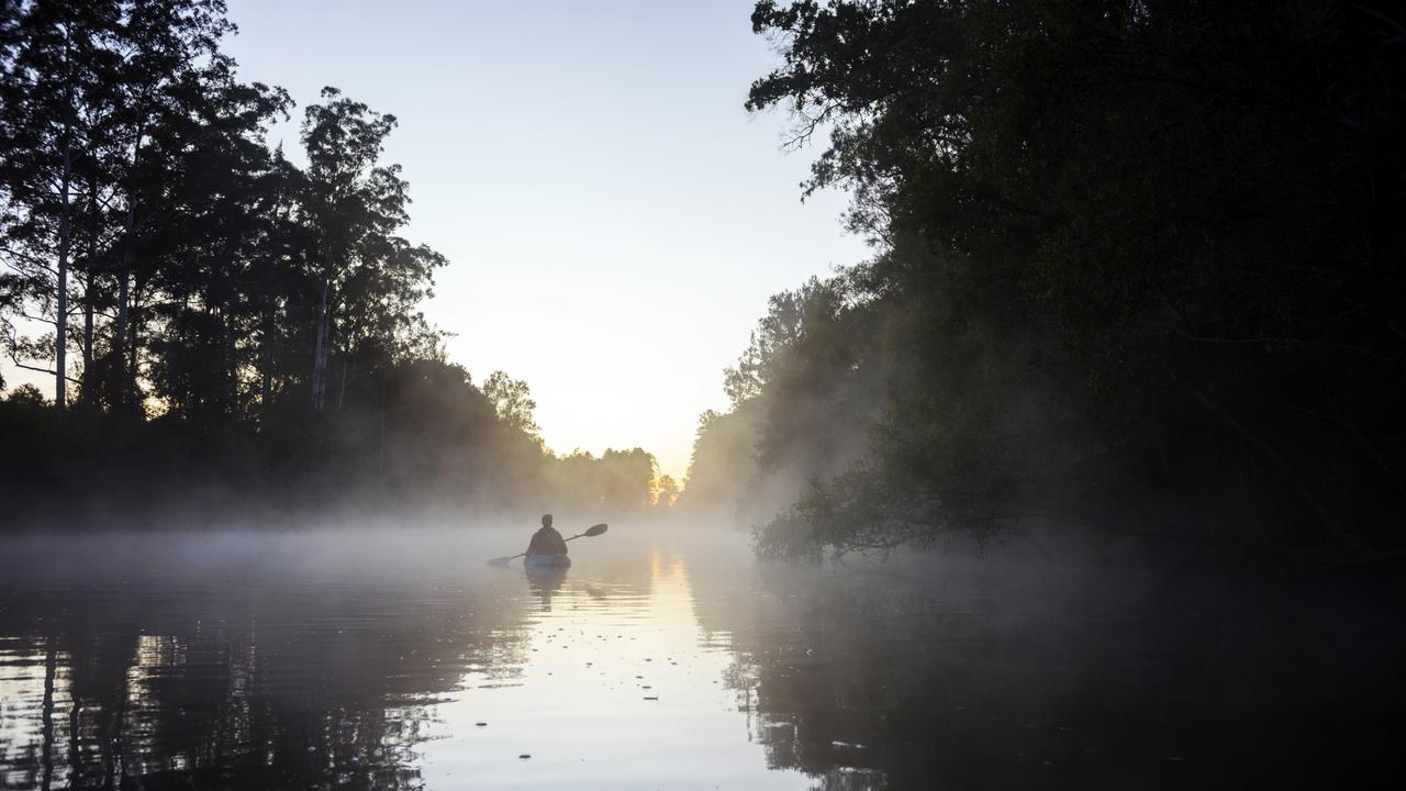
After decades of Gympie’s reputation being dragged through the mud, councillors are fixing hope on its subregions with a new brand attracting tourists to its mountains, rivers, valleys and shores.
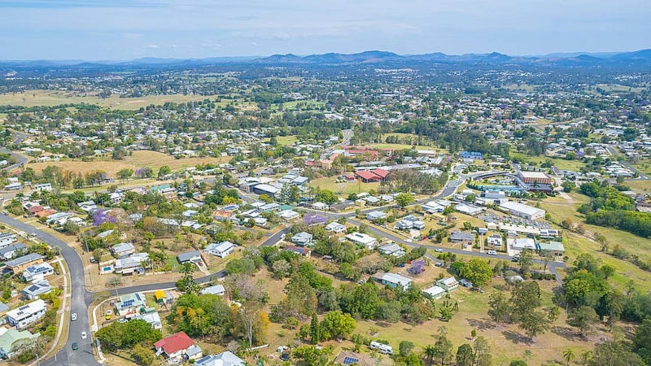
Gympie
Don't miss out on the headlines from Gympie. Followed categories will be added to My News.
The region of Gympie is to get a tourism rebrand with hopes it will lead to a fresh appeal.
The decision comes with the tension of trying to find a brand that matches the vast differences between the coastal, country, city and gentrifying southern areas which fall within the Gympie region.
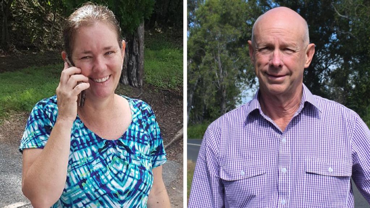
Councillor Bob Fredman said the current brand was “uninspiring” and asked if they could “selectively use the subregions, which quite frankly, do sound worth visiting.”
Massive new development planned for Rainbow Beach
He said the message to send should be “exciting, more appealing, and a place you’ve got to visit.”
“We’ve got the sea, we’ve got the trees and we’ve got whatever it is out west,” he said.
Councillor Jess Milne moved the motion and said she was glad to have a uniform approach to use collectively across the region as tourism played a continued role in the economy of Cooloola Coast.
Gympie’s brand and tourism falls under the peak tourism body of Visit Sunshine Coast, which also includes Sunshine Coast and Noosa. While it comes with marketing restraints, it provides tourism operators with a greater network of resources.
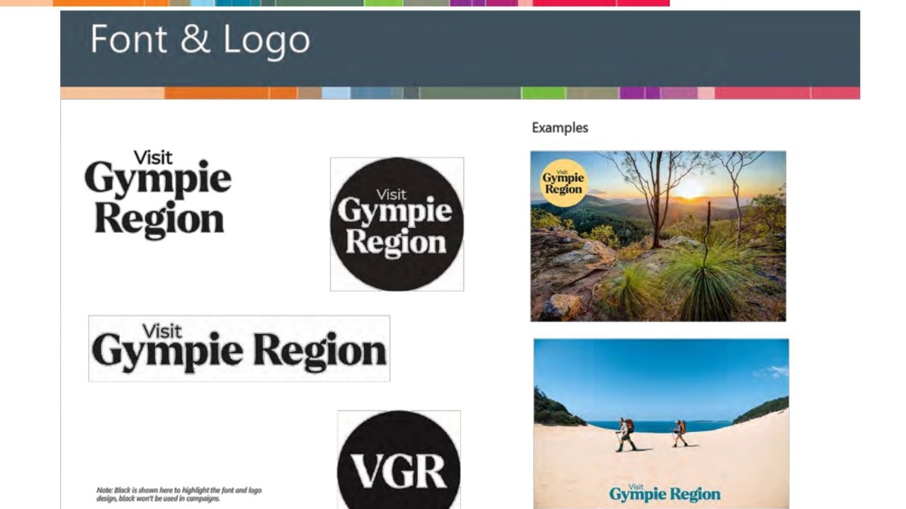
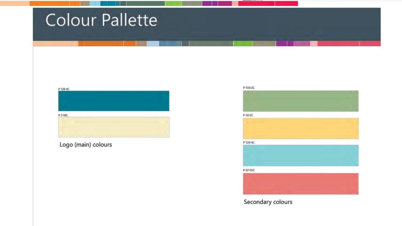
Gympie councillors unanimously voted to adopt a new font, logo, and primary colour palette composed of teal and crème, and a secondary colour palette of dark pastel green, yellow, blue and burnt orange.
The rebrand comes in time for the 2023 updated tourism brochure, along with the opening of the new Traveston Visitor Information Centre.
The next step is to decide on the rebranding of the sub regions around Gympie, which currently includes Cooloola Coast, Mary Valley, the West and Gympie CBD. This is scheduled to happen in July 2023.
Gympie, named after a painful plant, has often been the brunt of jokes after a 1997 Penthouse article labelled it “hell town” and shttowns of Australia recently unearthed alleged reasons to avoid the city.
But ‘the town that saved Queensland’ will soon have its shiny new tourism brand which gives a long list of valid reasons about why visitors should spend time and money in the picturesque region.
More Coverage


Originally published as Gympie council adopts new branding

‘Do something now’: Fire ants blamed for river banks collapse
Logan River residents want the state to investigate possible links between deadly fire ants and accelerating river bank erosion as property owners live in fear of landslips.
Gympie sale and auction results, week ending July 26
See the latest auction and sales results in Gympie for last week.

Qld’s hidden multimillion-dollar Native Title claims battle
There are calls for the state government to help cash-strapped Queensland councils deal with the costs of covering the multimillion-dollar Native Title claims. Vote in our poll.

Council plans crackdown on ‘illegal dogs’ in wake of rising attacks
With almost half the dogs in the Gympie region unregistered and therefore ‘illegal’ the Gympie council plans to visit every home to flush out ‘illegal’ pets, with certain neighbourhoods high on the list.

Rooted in red soil: Crumptons keep peanut legacy alive
As one chapter of the Australian peanut industry story faces uncertainty with the announcement of the closure of the Kingaroy Bega facility, the Crumpton family is helping write the next.

Shaved head, ‘pretend’ chemo: Cancer scammer’s Blue Card bid
A brazen Qld liar who scammed people out of money via a years-long cancer hoax wants the state’s administrative watchdog to allow her to look after children.