Burdened by brutalism: Why is Sydney plagued by so many eyesores?
How could a city with such a gorgeous natural backdrop end up with so many truly awful buildings? James Morrow delves into the ‘dystopian, brutalist’ concrete structures blighting Sydney.
NSW
Don't miss out on the headlines from NSW. Followed categories will be added to My News.
How is it that a city with such a gorgeous natural backdrop could wind up with so many truly awful buildings?
Particularly in the last 80 or so years it is as if we decided that, well, our harbour and beaches are already so lovely it would be unfair to stack them out with really beautiful buildings, too. Just think about how we almost lost the QVB and Paddington’s terraces.
Yet, some of that attitude is changing.
Some of our most unloved structures have lately met the wrecking ball (or, in the case of the old AMP Centre, have been “upcycled”) for something better.
But there is still work to do. To borrow from Kamala Harris, we are still burdened by what has been.
And we have finally started to see some change in leadership when it comes to our built environment. At last year’s Bradfield Oration, Premier Chris Minns even invoked the “b” word – beauty.
So, here’s someplace to start. Some buildings that should go, and other structures that stand as warnings about what not to do in the future.
SURRY HILLS POLICE CENTRE
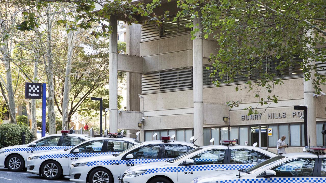
If there is one great thing about the Surry Hills cop shop, it is that unlike so many other modern structures, it looks like what it is.
These days a library may look like a church which may look like a dental implant clinic.
But the Surry Hills Police Centre looks not just like a police station, but a police station in Romania from the bad old days when you might get sent home in pieces. Built in the brutalist style, the name sure sticks.
OTHER BRUTALIST NON-BEAUTIES
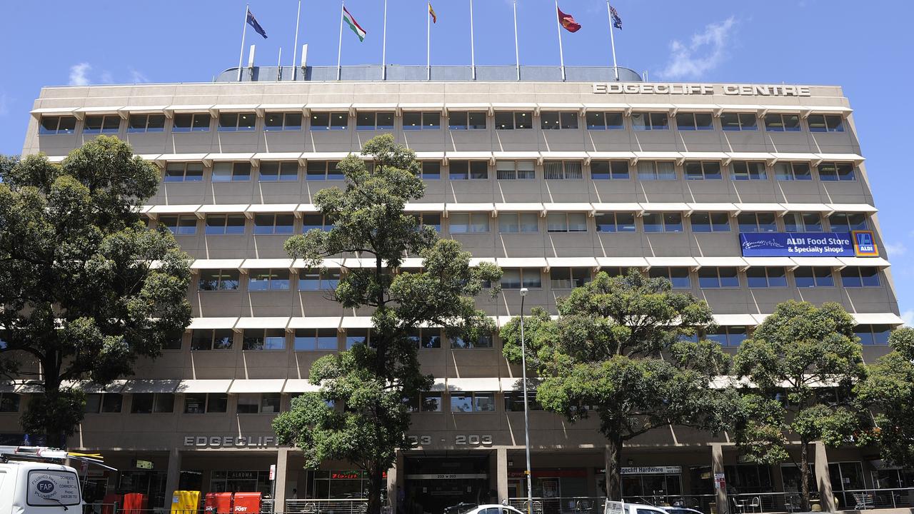
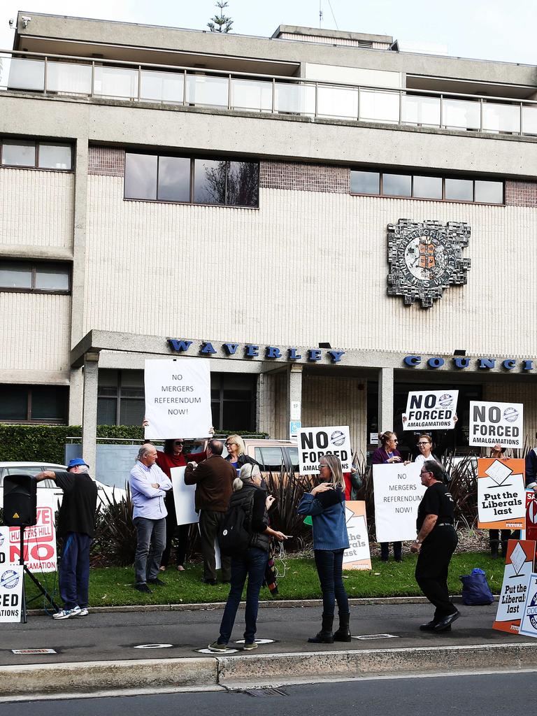
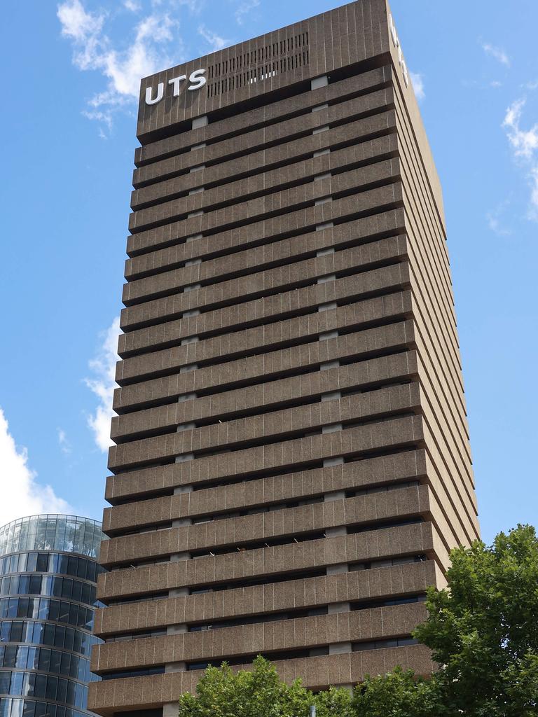
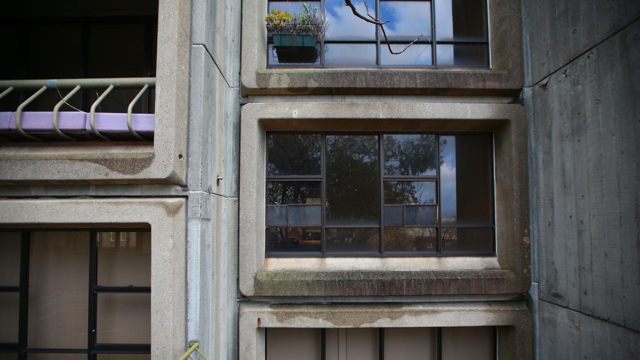
Speaking of brutalism, the east certainly has copped its fair share of the stuff. Edgecliff Centre? Waverly Council chambers?
And that’s before we head towards the city to clap eyes on the UTS tower or the Sirius Building, lately turned into luxury apartments after it was decided the Rocks needed character, but not the sort of character that came with long term public housing tenants.
DR CHAU CHAK WING BLDG, UTS
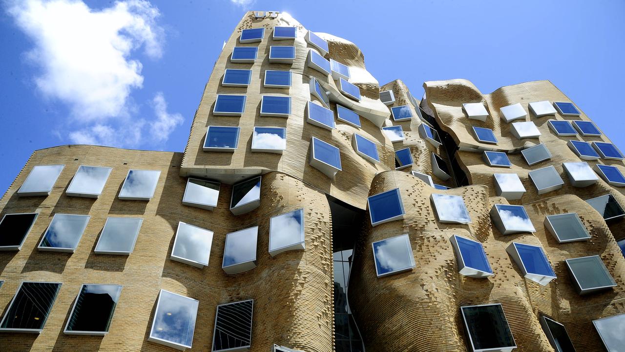
Does anyone aside from a free-associating toddler ever say, “I want to go to work in a crumpled paper bag”? No? Well, then just how did UTS wind up with this Frank Gehry structure?
Well, quite simply, it’s the power of the star-chitect. Just as the whole city is still littered with Harry Seidler’s wavy balconies, it seems any town that wants to be on the map has to get one of Gehry’s crumbly numbers.
Points for the architect’s somewhat humanising and textural use of brick but Sydney should be able to stand on its own without such faddishness.
SHERATON OVER THE OLD AUSTRALIAN HOTEL, BROADWAY
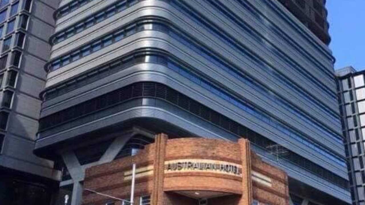
While we’re in the neighbourhood, of all the attempts to freshen up Broadway, the Sheraton that now towers over the old Australian Hotel may have to be the most dystopian.
If the Surry Hills cop shop is the secret police headquarters of the past, this looks like the sort of 21st century Ministry of Truth where you might get one day get hauled in for mean tweets.
ONE RAILWAY PARADE BURWOOD
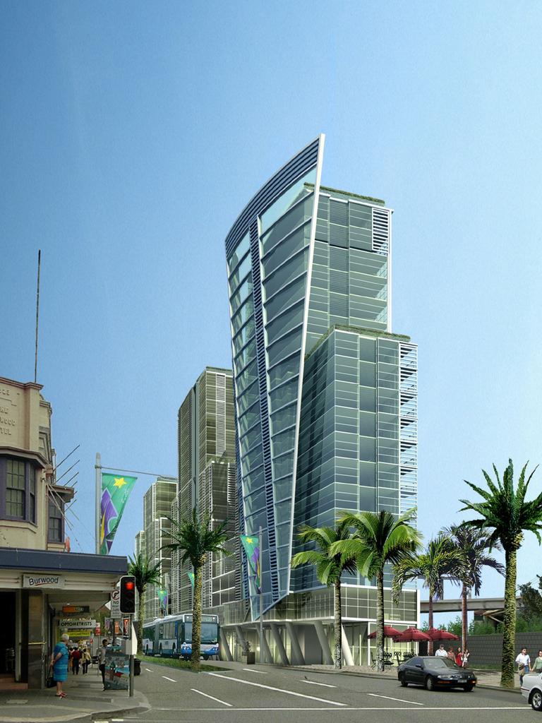
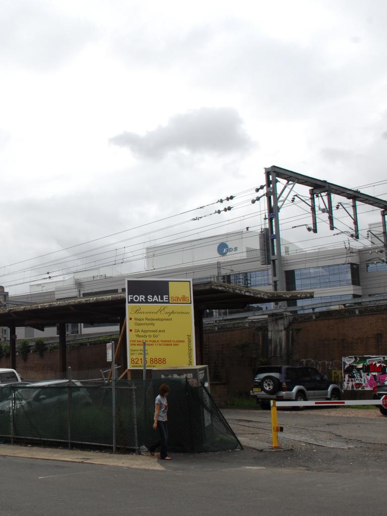
If Sydney’s YIMBY – Yes In My Back Yard – crowd had any sense, they would stop picking fights with Boomers and instead invent a time machine to go back and stop this monstrosity. While it’s unfair to pick on one apartment block in a city of doozies, this is one of those glum numbers that everyone immediately associates with “high density living” coming to their suburb.
Plenty of dishonourable mentions to go around, including much of what welcomes visitors to town heading up the Southern Cross drive.
ALEXANDRIA. SO MUCH OF ALEXANDRIA
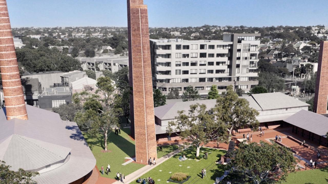
Look, there’s a lot we like about the suburb of Alexandria, which has come through some serious growing pains – the brilliant cafe Ellen among them – but so much of the suburb is an example of how not to build a lot of housing fast.
Much of what’s there feels crowded and cheap (though it certainly isn’t on the market) and it is an absolute hot spot for building rectifications.
WESTCONNEX VENTILATION STACKS
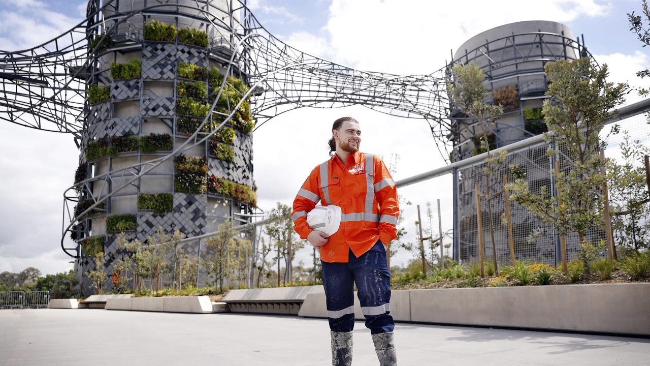
We love WestConnex. We really, really do. The M8? That’s our mate! But while we know all our exhaust fumes have to go somewhere, the stacks they’ve dropped all over the joint to vent them look like an architecture student was dropping peyote while looking at Jeffrey Smart paintings and reading a JG Ballard novel.
We are particularly allergic to the ones at the Rozelle Interchange that are all twisted metal and greenery, like a dystopian painting of overgrown ruins.
BLUES POINT TOWER
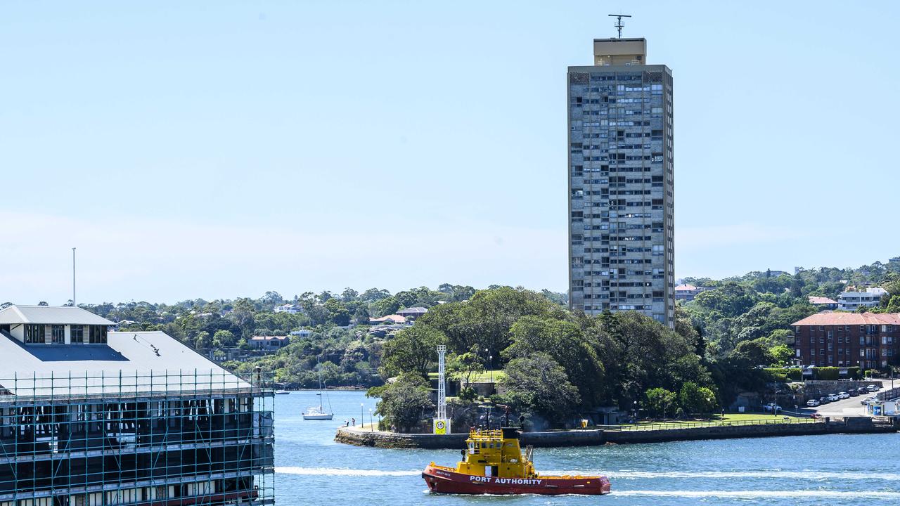
Do we need to even explain this one? Let us just make one point for all the urban planners and suburb designers out there: Buildings have to talk to one another. This one screams in the wilderness.
THE NEW SYDNEY FISH MARKET
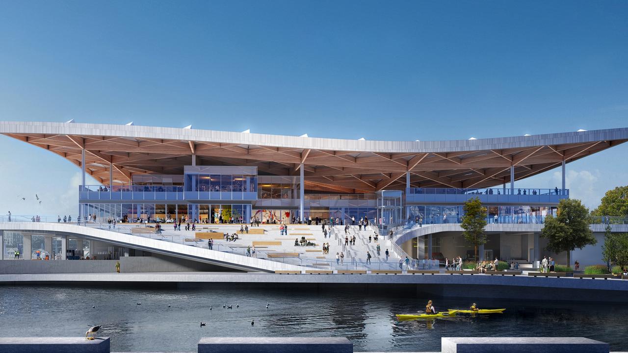
Yes, we understand that the ribbon hasn’t even been cut yet, but allow us to take the controversial position that Sydney will look back on the loss of its old, shabby fish markets with as much enthusiasm as a dodgy oyster.
Because while the new markets will surely be gorgeous complete with a roof that is (per the website) a “distinctive wave-shaped and scale-patterned roof that pays homage to the fishing industry”, this is to miss the point.
The current markets are enjoyably scuzzy and raw, the new one will be as clean and schmick as the Bondi Junction Westfield.
Originally published as Burdened by brutalism: Why is Sydney plagued by so many eyesores?


