‘Poor Kate’: Catherine portrait divides royal fans
A painting by Hannah Uzor is a ‘portrait of strength and dignity’ … but critics aren’t convinced on its likeness.

A newly unveiled portrait of Catherine, Princess of Wales, has royal fans divided.
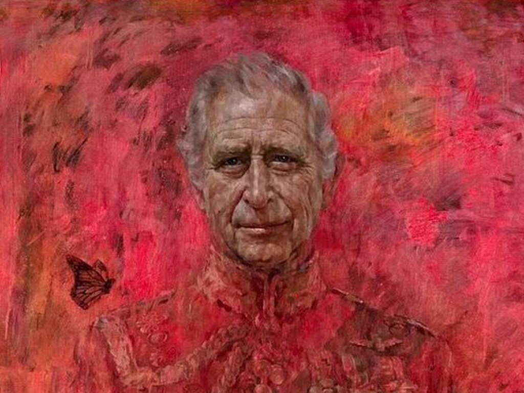
For those who are yet to recover from the chaotic crimson cloud of King Charles III’s official portrait, Tatler Magazine has proposed a sedative in the form of a benzodiazepine blue painting of Catherine.
Tatler Magazine commissioned the painting by British-Zambian artist Hannah Uzor for its July cover to honour Catherine’s “strength and dignity” following her cancer diagnosis.

Depicting Catherine at the first state banquet of King Charles III’s reign during the South Africa state visit in November 2022, the portrait shows her in a caped, floor-length Jenny Packham evening gown with yellow and sequined details on the shoulders and her tiara, the Lover’s Knot.
Catherine did not sit for the artwork; instead, Uzor painted it by looking at different photographs of her.
Uzor, the third artist commissioned by Tatler to paint a royal portrait, said that Catherine’s cancer diagnosis video gave her a new perspective for the portrait. “All my portraits are constructed from everything I can find about them,” she explained. “She has really risen up to her role – she was born for this,” Uzor said. “She carries herself with such dignity, elegance and grace.”
However, some royal fans criticised the artwork’s likeness to the princess. One commentator wrote, “Doesn’t look like Catherine at all.” Another remarked, “This is dreadful – it looks like a bad GCSE project!” Author Chadwick Moore added on X, “Portrait artist commissioned to depict Princess Kate Middleton ends up painting Queen Mary of Denmark instead.”
The television presenter Piers Morgan exclaimed, “What on earth is this??! Never seen a worse royal portrait, yet they still made it a cover?! Poor Kate.”


Laura Freeman, chief art critic of The Times, criticised Kate’s ‘puffy’ face and ‘uneven’ eyes, mockingly comparing the portrait to the cover of the royalist magazine Hello!: “A successful portrait needs some human contact. Otherwise, it’s just Hello! with oil paint,” she wrote. While Alastair Sooke of The Daily Telegraph called it “jaw-hits-the-floor bad”.
Other commenters compared the portrait to the one of Charles released last week by Jonathan Yeo, which was widely mocked for “resembling Dante’s Inferno”.
“Coming after the King Charles portrait debacle/ you’d think they’d make sure it was perfect,” a commentator wrote.
More Coverage

Add your comment to this story

The Israeli underground carpark transformed into a 2000 bed hospital
WATCH | Deep beneath a medical centre in Israel’s north, babies are being born in a carpark converted into an extraordinary world-class hospital that is running like clockwork as bombs and rockets rain down above.

Israel tracks mobile phones for assassinations
Israel has killed Iranian nuclear scientists and military chiefs by tracking their mobile phones, in the latest case of technology-driven warfare giving the Jewish state the edge over its enemies.
To join the conversation, please log in. Don't have an account? Register
Join the conversation, you are commenting as Logout