It’s logo-a-go-go as ‘corona’ crest canned
The controversial Australia logo, which was attacked for looking like the coronavirus, has been quietly dropped.

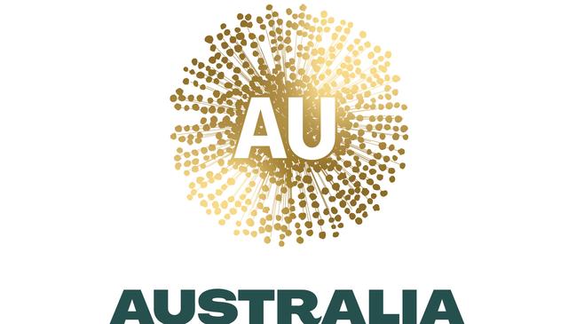
The Australia logo attacked for looking like the coronavirus has been quietly dropped and is being “redesigned” by the Morrison government.
After taxpayers forked out $10m for a design project overseen by a prestigious board of Australians, including mining magnate Andrew Forrest, Atlassian tech entrepreneur Mike Cannon-Brookes and Qantas CEO Alan Joyce, The Australian can reveal it is being “reworked” although it will continue to use the Golden Wattle theme.
The logo will be replaced with a different take on what the government describes as a “wattle glow” and will be used at international trade shows and exhibitions to promote Australian education, agriculture and tourism along with other key exports.
A proposal for the original wattle logo courted controversy in July for its resemblance to a deadly pandemic cell and led China to warn that the rebrand was a “sign of the growing anxiety” in Australia.
“To a certain extent, the use of the controversial new logo may underscore (the) Australian government’s eagerness to promote its profile in the global marketplace,” an editorial published in Chinese Communist Party mouthpiece the China Daily said.
“It is also a sign of the growing anxiety over its trade prospects amid its deteriorating relationship with China — its largest trade partner.”
The Nation Brand Advisory Council, established by former prime minister Malcolm Turnbull, made the decision to rethink the national brand after a 2017 foreign policy white paper recommended greater “consistency” for Australian businesses presenting themselves on the international stage.
Austrade allocated $3.2m for the “new national brand” in 2018-19, including more than $420,000 to a market research company called Fiftyfive5.
The wattle will replace the old “Australia Unlimited” logo, two orange boomerangs in the shape of a map of Australia, while the Australian Made kangaroo logo is being updated with a slighter darker version.
Trade Minister Simon Birmingham rejected reports the wattle was meant to replace the kangaroo design.
“The government remains 100 per cent committed to the Australian Made kangaroo logo, providing $5m earlier this year to increase its recognition,” he said.
The Australian understands there is “no way” the final logo will look as it did in the proposal although it will not be “completely different.”
“The initial work by business leaders to inform Australia’s overall international branding was completed at the end of last year,” Mr Birmingham said. “The impact of the pandemic will be considered before it is finalised.”
The National Brand Council called the now-scrapped logo “an optimistic burst of gold positivity” in its December 2019 report.
Add your comment to this story

Youth crime move nothing but a spit in the face of sense
Australia's tough approach to youth detention is creating career criminals instead of reformed citizens, with Indigenous children bearing the brunt of failed policies.

Gap targets no closer in most areas
New data reveals governments are failing on promised improvements for Indigenous Australians, with just four of 19 Closing the Gap targets on track as the NT falls further behind.
To join the conversation, please log in. Don't have an account? Register
Join the conversation, you are commenting as Logout