Scandinavia’s colour revolution
Even in Scandinavia, the birthplace of minimalism and muted tones, interior designers are coming around to a brighter palette.
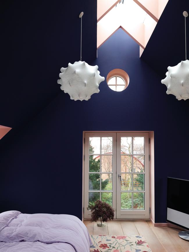
In the middle of November last year as the days got shorter and greyer, Sara Lysgaard packed up and moved elsewhere while her home was transformed with paint. The private investor and magazine publisher lives in a former barn dating from the turn of the century that is part of a historic summer estate north of Copenhagen. With high, gabled ceilings and tall, paned windows, it’s not short of character, but this was a total makeover to add warmth and personality through colour.
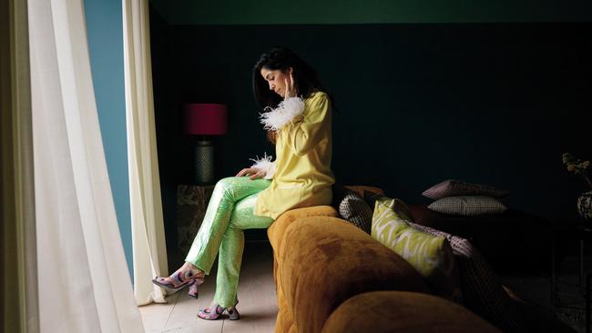
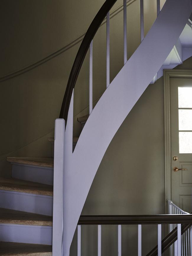
Lysgaard loves colour; when we talk she’s wearing two shades of lilac and lemon, including on her nails. But even for her the palette was astounding – a riot of vivid greens and deep blue offset by curry yellow, shrimp pink and Etruscan red, applied to walls, ceilings, doors, window frames and niches. “I moved out for 14 days and when I first went back I was like. ‘what the hell was I thinking?’,” she recalls. Once the furniture came out from under the dust sheets, the curtains went up and she started planning where she would place her multi-faceted contemporary art collection, she felt at home. “Now I love it,” she declares. Especially pleasing are the ceilings, vast spaces she felt needed drawing in, now painted mint green and serge blue.
Until 2016, Lysgaard, like most of her friends and neighbours, was living the whole Danish minimalist dream, with white walls, grey tones and forests of natural timber. A former gallerist, she’d been collecting art since she was 18, tending toward subtle, nuanced pieces that aligned with her domestic aesthetic. But a break-up with a long-time boyfriend led to the desire to change her home environment, and that in turn to a sort of personal renewal: in painting the walls, culling furniture and brightening her surroundings she realised she’d touched an emotional chord deep within. “The house and all the tangible things were like a physical gesture of how I felt on the inside, so suddenly everything connected inside and out.”
She became a beacon of colour. The barn is an enclave of six homes and she’s stealthily converting her more conservative neighbours to the joys of the colour wheel. “I have convinced two of the others so now we are three out of six,” she says with some pride. “People are inspired on much deeper and more profound levels but I will take it, even if it’s a small thing to get a good feeling from colour.”
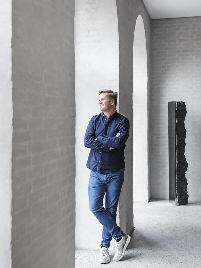
And she is spreading the word further afield. Her home is the showcase for the Nordic Edit, a range of colours released by the very British paint company Farrow & Ball, with the aim of inspiring people to step outside their comfort zone and create a “new Scandi look”. It’s a look that’s news to many Scandis but represents a more modern take, says its Danish editor Jannik Martensen-Larsen, who heads the Copenhagen-based design house Tapet-Cafe. “I think Scandinavia represents so much more than the greys, whites and colder tones we’ve been known for in past years,” he says.
Digging into Farrow & Ball archives, Martensen-Larsen rediscovered colours he gave such names as Danish Lawn and Copenhagen Roof. He and Lysgaard are friends and he had advised when she did her first makeover. When it was time for a revamp she turned to him again and they tuned into the new Nordic vibe.
Like a Spotify playlist, it is catching on around the region, as homes vibrate with colour not just on painted walls and ceilings but in textiles, homewares and that bastion of Danish modernism, furniture. Some trace it back to the emergence in the early 2000s of new Nordic affordable design brands such as Hay and Muuto, with their fresh colours and millennial appeal. But it’s also in some respects a re-emergence of elements of the gloriously colourful 1960s and 70s. The impact is such that even hallowed brands are being made over. Carl Hansen & Søn teamed up with London-based designer Ilse Crawford to “dress” its masterpieces – five iconic chairs designed by Hans J. Wegner in 1950. Crawford tinted their oak frames in muddy painterly tones of red, blue and khaki, describing it as a nod to the raw beauty of the Nordic landscape. “Colour is so closely tied to our emotions, to our mood, and we think these subtle tones will contribute to the creation of a warm, relaxed and natural environment,” she says.
It’s a sentiment echoed by Josephine Akvama Hoffmeyer, Copenhagen’s reigning Queen of Colour. She set up her homegrown paint and tile company File Under Pop in 2015, and has almost singlehandedly helped paint the town rustic red, virgin oil green and myriad other bold hues. “It’s really an energy field when you surround yourself with colour,” Akvama Hoffmeyer says, citing Louise Bourgeois’ “white means go back to square one”. File Under Pop is a reference to its founder’s musical background (Akvama Hoffmeyer once performed backing vocals for Joe Cocker), but it just as clearly represents her approach to the paint colours she creates and gives such names as I Shot The Deputy and Life Is A Rose. “When I create colours I work in an intuitive and emotional way, because it’s really as if colour can emphasise or create a tension or calmness or whatever you want to do in a space,” Akvama Hoffmeyer says. At home she’s painted the wall behind her bed in two intense purply-greeny blues divided by a light grey called Nights in White Silk. She says it makes her feel as if she is being sucked into a deep space, an effect she finds calming. Her office, on the other hand, is neutral to keep her thoughts on track.
As her confidence about using colour has grown over the past almost six years, so too has Akvama Hoffmeyer’s fan base. File Under Pop’s showroom, with its grand rooms painted in daring or intriguing colour combinations, is a design destination, so popular that she is opening a specialist colour shop for retail consumers down the road.
Akvama Hoffmeyer thinks Copenhageners stopped noticing the colours around them – the blues, ochres and reds of the old buildings immortalised in postcards of Nyhavn, or the green of patinated copper on the spires that break the skyline. “We are always in contact with the sea and the sky but I think we all felt we were just for the white, the simplicity, the Nordic philosophy,” she says.
This past year of being sequestered at home has, however, amplified a desire for individual expression and more colour. “People have gone crazy painting their houses,” Akvama Hoffmeyer says. “They’ve surrounded themselves with white walls and white ceilings and white wood panels, windows, doors and everything for 20 to 30 years and now they really want to live with colours again.”
Light, or the lack of it during Denmark’s seemingly interminable winter months, is a key factor. White is seen as reflective or brightening, even if it’s not especially cosy or hygge, as the Danes say of their preferred interior mood.
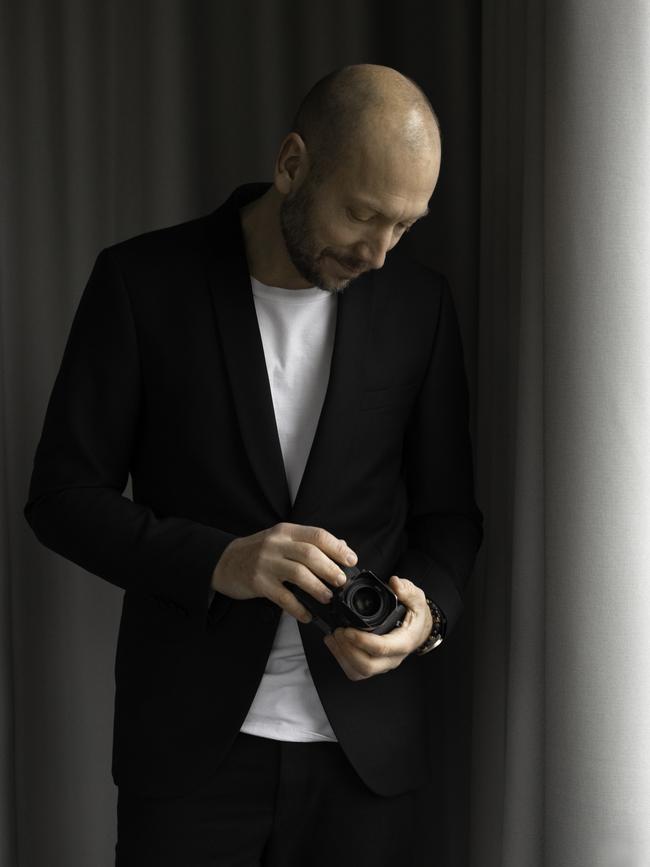
“I’ve never understood how white walls were ‘Scandinavian’,” says David Thulstrup, the designer architect famed for the hand-crafted interiors of Copenhagen’s Noma restaurant. “Even if you look at a John Pawson space, which is not considered Scandinavian but has a minimalism that people get inspired by, it has a warmth. But when you see some classic Danish apartments with white-painted walls and a stark blue sofa, they don’t have any warmth or cosiness and that’s what I miss when talking about Danish interiors.”
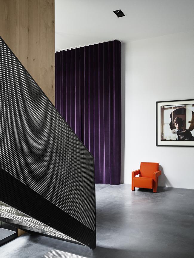
Liveability and comfort are the founding tenets of the Copenhagen-based studio Thulstrup set up 12 years ago, following an international career. Indeed it was a home designed for a photographer friend that caught the eye of Noma owner and chef René Redzepi as he was planning the new version of his restaurant. In that home, known as Peter’s House, Thulstrup combined raw bricks and heart oak planks with plush 4m long purple velvet drapes and classic chairs covered in orange or yellow textiles. Noma’s is subtler but no less rich, with the tones and textures of natural materials, such as the oxide red of a river stone in a terrazzo floor and the mellow oak lining the dining room.
Thulstrup says his views on colour are constantly changing – he even painted the walls of his renovated apartment matt white as a backdrop for a spare edit of soft and hard materials – but the one constant is that he rarely uses colour as a surface treatment. “When I use a red or a yellow it’s from fabric or a dyed wool, or it’s a one-off piece that stands in the room and has that boldness or vibrancy I always put into my projects.”
For a large design-focused store in Switzerland, opening later in 2021, he has lined an entire room devoted to selling knives in ash, dyed tomato red but still showing the grain so the colour becomes more about the essence of the wood. “It’s the honesty of how to use colour through materiality that I am obsessed about,” says Thulstrup. “Colour for me is all shapes, all nuances, all hues, even when you talk about a beige or a dark brown wood, that’s also a colour for me. I am very colour conscious and alert to how colour through materiality affects us.”
Thulstrup’s views on colour are featured in a book called The Touch, published by Kinfolk magazine and Norm Architects, a Danish architecture and design practice renowned for its retrained palette and precise iteration of what it calls soft minimalism. “I am on a mission to reconnect man with nature in a world of constant urbanisation and digitisation,” says founding partner Jonas Bjerre-Poulson of a design philosophy that emphasises natural materials, simplicity without monasticism, and architecture or interiors as a backdrop for human engagement. Colours in his world are the browns, greys, yellows, blacks and whites of wood, clay, linen and stone.
Bjerre-Poulson, who is also a photographer with a historian’s perspective on influences, says you can track the emergence of colour in Danish design this century from the New Nordic brands, which he argues were more inspired by Dutch design than traditional Danish. But social media has changed the path of influences so that inspiration is now coming from many different regions via a “rhizomatic network of parallel or even opposite trends”.
“I find it hard these days to detect real regional styles,” he says. “It seems more that pockets of believers in certain design approaches exist all over the globe, where they find and inspire each other easily through social media.” Instagram and Pinterest aside, it’s not that far removed from the mid-20th century when Danish modernists such as Finn Juhl and Verner Panton used bold colours that stood out from their peers, he says. “All these tendencies are reflected in the way people style their interiors.”
His own preferences are even more restrained than Norm’s. When Bjerre-Poulson renovated his home in a fishing village north of Copenhagen, the palette was so muted he joked that visitors asked if his children could suffer psychologically from being deprived of colour. “I say, but there are a hundred colours – you just have to look closely; there are nuances of brown and grey, there are so many differences,” he told me in 2017. As for what he’s done since, his idea of a makeover is warming up the grey scale.
“I have been so daring to paint my walls in a warm, light grey and a sandy colour with natural marble paint :)” he reports by email. “My home is still very monochromatic, but much warmer than last time and much richer in textures.” He says he’s tried introducing stronger colours by buying a painting or a pillow that pops, “but I simply get stressed within a few days and get rid of it. The only strong colours I appreciate indoors are from freshly cut flowers – maybe because they are natural and temporary.”
To join the conversation, please log in. Don't have an account? Register
Join the conversation, you are commenting as Logout