Instagram unveils new icon, gets rid of vintage camera logo
The popular image-sharing network has killed off its vintage camera icon, and some users aren’t happy.
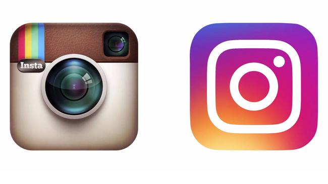
Instagram, the popular image-sharing social network owned by Facebook Inc., got rid of its vintage camera logo and redesigned its mobile apps with a simpler, whiter user interface.
The rebooted brand identity, rolled out to users on Tuesday, embraces the flat logos, gradient colours and minimalist design ethos that had been embraced by Microsoft, Google and ultimately Apple, with the launch of iOS 7 in 2013.
Ian Splatter, the head of design at Instagram, said the new app icon — a simple white outline suggesting a camera against a gradient of pastel colours — is a distillation of the original.
“As a part of our process, we also asked people at the company to draw the Instagram icon from memory in 5 seconds,” Mr. Splatter said in a blog post. “Almost all of them drew the rainbow, lens and viewfinder.”
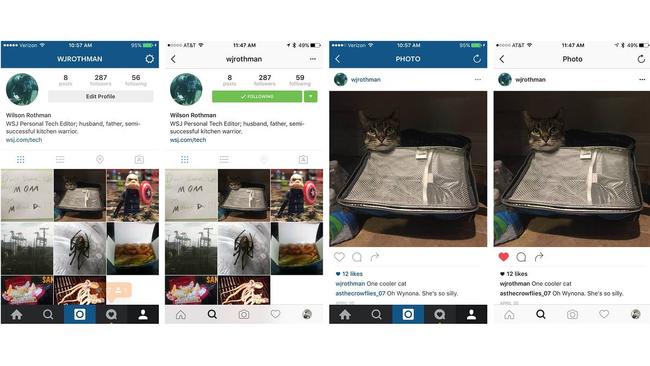
As for Instagram’s iOS and Android apps themselves, the interface changes are purely cosmetic. There are no new features or filters. Every button, menu and option is in the same place as before. The difference? The blue and black bars that made up Instagrams menus in the past are gone. Instead, there are plain white backgrounds, with minimalist black text and buttons.
Now more sparse, the interface is meant to allow shared content to stand out more. “We believe the colour should come directly from the community’s photos and videos,” wrote Mr. Splatter. “We stripped the colour and noise from surfaces where people’s content should take centre stage.”
Users tend to be divided whenever redesign fever hits their favourite site or app, so it is no surprise that Instagram’s new style has caused a split as well.
“It may well go down as one of the biggest design fails of the year,” Tim Nudd, the creative editor at Adweek magazine, wrote in his assessment of the reboot. “It’s a very forgettable image that will get lost on people’s phones amid the thousands of other similarly uninspired designs of most tech apps. … Can we change it back?”
Calling the original Instagram logo “a modern-day classic,” Armin Vit, in the respected design blog Brand New, says the new icon will suffer for simply not being its predecessor. (After all, users regularly baked desserts to look like it.) Still, Mr. Vit likes the new logo. “It has pleasant curves,” he wrote, “and I’ve rarely met a yellow-magenta-purple-blue gradient I didn’t like.”
Across Twitter, Facebook and of course Instagram itself, the jury is still out. The reaction from three users: “No, no, nooooooo. I’ll miss you, Instagram,” said Dalek.tardis; “The internals are better, but that icon needs to go,” wrote Dreldn; “Ok i love it,” said Johnyy.98.
Instagram isn’t the only popular name in tech to polarise users with a new look. A recent string of big tech names — Uber, Airbnb and even Google among them — have changed up their app icons and tweaked their interfaces, leaving good chunks of their users unhappy. So far, none of these companies have changed it back.
The Wall Street Journal

When play is not a game
Apparent addiction to video games may be hiding other issues.

Xi’s China fills void left by US
Moves in Europe highlight America’s fading influence.