Woolworths overhauls corporate logo to reflect its $10bn businesses following liquor and hotels business sale
The retail giant unveils new corporate logo to reflect the changing nature of the group following its $10bn demerger of its liquor and hotels arm and focus on new business areas.

Supermarket and general merchandise retail giant Woolworths Group is rolling out a new brand identity which it believes better symbolises its evolution as well as its what its collective businesses and platforms stand for.
The company, best known for its flagship supermarkets arm, has gone through a number of changes and restructures over the last few years as well as navigating the pandemic. It has sold its liquor and hotels arm Endeavour Group for $10bn, made an unsuccessful takeover bid for Priceline owner Australian Pharmaceutical Industries and invested further in its online platforms.
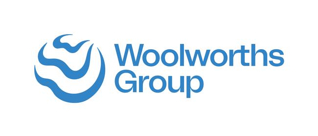
The new corporate logo, a blue colour scheme, showcases the impact Woolworths can have when it comes together in partnership with others to create change for a better tomorrow, the retailer said on Monday.
The corporate identity for Woolworths replaces the more formal design that features a line of coloured bars but is only for the ASX-parent company and does not replace the traditional Woolworths supermarkets branding.
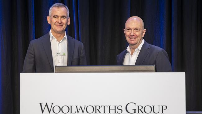
Chief executive Brad Banducci said the world is constantly changing and evolving, and the group needs to do likewise.
“The last two years have been a period of immense change. As a team we’ve not only had to navigate a pandemic, but we’ve also made significant changes to the shape of our group and the businesses and platforms within it,” he said.
“It’s been an era of care for people, as well as partnership, innovation, inclusion and sustainability and being connected by a shared purpose has never been more important.
“It is the power of ‘We’ in terms of creating better experiences together for a better tomorrow that is represented in our new group brand identity. It’s a symbol of the positive impact that we aspire to have and the purpose that unites us.”

Woolworths said the new logo has a shape that is fluid to capture the spirit of agility and adaptability while deliberately being an open shape to signal an expansive mindset welcoming partnership.
A “living blue colour scheme” is also symbolised by the waves and ripples, converging on a common point on the horizon as a reminder of shared commitment as a group to a better tomorrow, Woolworths Group said.
The new brand symbol and system was developed in partnership with Re, part of the M&C Saatchi Group.
Chief marketing officer Andrew Hicks said in designing the new symbol, it was important it represented what the company stand for as a group and how it will continue to act in the future.
“It all starts with ‘We’, with the multiple W’s embodying how together as Woolworths Group we can create positive impact.”
The group will keep its existing green logo for its Woolworths supermarket stores and online.


To join the conversation, please log in. Don't have an account? Register
Join the conversation, you are commenting as Logout