- Review
- Technology
- Phones
This was published 8 months ago
Apple Intelligence is a no-show, but the iPhone 16 lineup is fantastic
By Tim Biggs
Throughout the year, Apple’s 2024 smartphones have been anticipated as the company’s big leap into generative AI. Apple itself has presented them as such, even marketing them with the phrase “Hello, Apple Intelligence”. But while the iPhone 16 and 16 Pro may have the neural cores inside to power potential AI features, the features themselves (including a revamped Siri, notification summaries and ChatGPT integration) are still to come.
Australians will start to get these features in December, with most of them waiting until next year. Yet while we can’t evaluate the AI experience just yet, it turns out the new phones do pretty well without it. With powerful innards, fresh cameras, new buttons and great looks, they’re the most impressive iPhones in years, with or without AI.
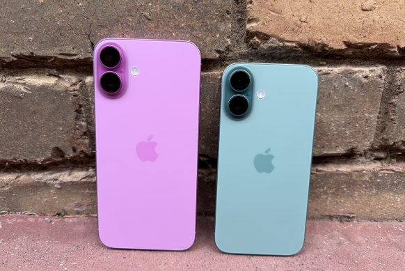
Some years, the standard iPhone feels like reheated leftovers from the previous Pro device, but this year, it’s a legitimate powerhouse with little to complain about. And, assuming you care what your phone physically looks like, that starts with an incredible colour selection. The pink and teal in particular are so bold and saturated, with the backs matched perfectly to the metal frames, that it’s practically criminal to put a non-clear case on one.
Inside, the A18 chip is a leap ahead of the A16 Bionic in last year’s device and, in almost all situations, gives the same performance as the more powerful version in this year’s Pros. All manner of high-end apps are no problem, including the smattering of console-level games now on iPhone, and you also get support for Wi-Fi 7. Even when I pushed them hard during testing, the iPhone 16s tended to make it through the day with quite a bit of battery left (though I did get one down to 5 per cent with a lot of gaming).

These are the best-looking iPhones in years.Credit: Tim Biggs
The new phones inherit the Action Button from last year’s Pros, which is a useful way to turn on the torch, start a voice recording, initiate a translation or start any app, shortcut or control centre toggle you like. Or, you can leave it on the default, and it will act like the old ringer switch. More interesting, though, is the “Camera Control” zone now on the phone’s right side.
This button is within reach of your thumb in portrait orientation and your index finger in landscape, the idea being to give you control over the camera without needing to touch the screen. It’s touch and pressure-sensitive, so a light press activates it, a double press changes tools, and you adjust the settings by scrolling. It takes some getting used to, and I don’t think it feels as intuitive as using the screen, but it is handy to be able to zoom or play with exposure without putting your fingers in the way.
In addition to being capacitive, though, it also functions as an actual button; click it, and you’ll take a photo. This is where my major issue with the setup comes in, however, because I just find it too difficult to press. Activating the button with my index finger invariably causes the camera to move, and the more careful I am, the more likely I am to accidentally zoom, so I ended up using the Camera Control for tools and the touchscreen shutter to take photos.
It’s also worth noting that the Camera Control adds an interesting wrinkle when considering phone cases. Apple’s official cases have a capacitive pad that means you can use it flawlessly, but I’m not sure how many case-makers will follow suit. The only non-Apple ones I’ve seen so far have a cutout, which I imagine does not make it easier to press the shutter.
Otherwise, the camera experience remains top-notch with a 48MP main shooter and a 12MP ultrawide, the latter of which has a larger aperture and the addition of autofocus versus last year, meaning the standard iPhone can now take macro shots. Apple has clearly heard the criticisms about its increasingly heavy-handed punching up of photos because its “Photographic Styles” feature has had a huge upgrade that lets you dial in exactly how you want colour and shadow to look or flick around between more than a dozen shades and “moods” inside the camera app itself. The only caveat is that if you want to adjust the styles after the fact, you need to be shooting in Apple’s preferred HEIF format (which it calls “high efficiency”), not the JPEGs that everyone else on the planet supports.
If there’s one area that the standard iPhone is still behind in, it’s the display. It’s bright and colourful and looks great with HDR video content, but it’s lacking compared with any other brand’s smartphone at this price point. It’s locked to 60Hz, so it doesn’t look or feel as smooth, and it lacks an always-on display, which is a big usability drawback.
The first thing you’d notice if you put down an iPhone 16 and picked up an iPhone 16 Pro is that those lovely colour finishes are nowhere to be seen. It seems to be an industry-wide conviction that high-end phones can only have muted colours, but this year’s iPhone is particularly committed. The new “desert titanium” offers the only real hue here, and while it looks gold in photos, it’s more of a metallic peach in real life. Obviously, I don’t understand the complexities of blasting pigments into aluminium versus titanium, but I’m sure colours are possible.
Some years the standard iPhone feels like reheated leftovers of the previous Pro device, but this year it’s a legitimate powerhouse with little to complain about.
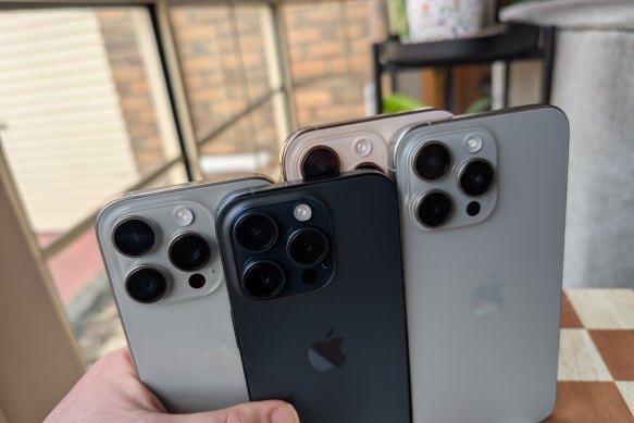
The Pro models also get a slight size change this year, with each screen going up by half a centimetre compared to last year’s (and this year’s standard phones), but I’m not super impressed by it. As someone who already thought Apple’s two sizes sat on either side of “just right”, with the smaller being too small and the larger being too big, this isn’t an improvement. It’s not enough to make the standard iPhone 16 Pro substantial, yet it slightly worsens the problem of the Pro Max being cumbersome and not fitting in jeans pockets. To be clear, this is a very small change, but it’s one that’s hard to draw a benefit from.

The 2024 Pro phones (back) are slightly larger than the 2023 Pro phones (front).Credit: Tim Biggs
Alright, I’m done grumbling. The iPhone 16 Pro is very similar to the 15 Pro, but it gains all the iPhone 16 advantages listed above (such as Camera Control and the new Photographic Styles) as well as a small handful of brand new Pro features. That makes it an incredibly powerful device that’s a joy to use, even though you’re probably not going to be rushing to upgrade from last year.
Video capture probably has the most exciting improvement, utilising its new 48MP main camera and the expanded graphics processing its A18 Pro chip. You can now capture in 4K Dolby Vision at 24, 30, 60 or 120 frames per second, with the option to adjust the playback speed later in editing. So, for example, if you film at 120, you can slow things down to quarter speed and still get a video at 30 frames. It’s a wild capability for a smartphone and comes in addition to the existing 240 frames burst slo-mo mode.
On the audio side, the phone records in stereo and surround simultaneously, and in editing you can adjust the video’s audio mix in an attempt to remove off-screen voices, dampen reverb or bring voices forward and push environmental sound back. This is something the standard iPhone can do too, but it seems like a more natural fit on a phone that lends itself to cinematic capture.
For stills, a new main camera lets in a lot more light, meaning you get clear instantaneous shots in a lot more challenging situations before the phone has to switch to night mode, which is a noticeable difference over the standard iPhone 16. Meanwhile, a new 48MP ultrawide also gives significantly better macro shots than last year, with ProRAW support. And while the 5x zoom lens hasn’t changed perceptibly from last time, it’s now available on both sizes, rather than just on the Pro Max.
In sustained gaming performance, it was hard to pick out much difference between the standard iPhone and the Pro, but with one extra GPU core, the potential is there for the expensive phone to handle more complex geometry or ray tracing at the same level of performance. One area that was noticeable though was battery life. Given the Pro phone has a larger physical battery and isn’t that much more powerful, it lasted hours longer than the standard phone before getting into critical battery territory.
And of course, the Pro retains one feature that will only make a difference for those truly trying to use it in professional workflows; USB 3 speeds that enable 10Gb per second transfers over cable, including the ability to capture directly from the camera to external storage.
Get news and reviews on technology, gadgets and gaming in our Technology newsletter every Friday. Sign up here.