This was published 3 years ago
Standard soars at the Portia Geach: the pandemic has its benefits
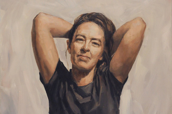
Marie Mansfield’s Tilly (Mathilda Mitchell, artist) entered in the Portia Geach Memorial Award.Credit: S.H. Ervin Gallery
Entering this year’s Portia Geach Memorial Award at the S.H. Ervin Gallery means being virtually assaulted by Janne Kearney’s There’s a rainbow after every storm (Tilly Baker, musician). There’s nothing subtle about this portrait, and it sets the tone for a show that greets the end of Sydney’s lockdown with a loud hooray.
I don’t know what sort of music Tilly Baker makes, but it’s probably not the ambient variety. When your dress, hair and glasses are in rainbow colours, it suggests loudness. Kearney has added the same colours to the background in case there was any ambiguity. It’s no mystery as to why this picture got the entrance to itself.
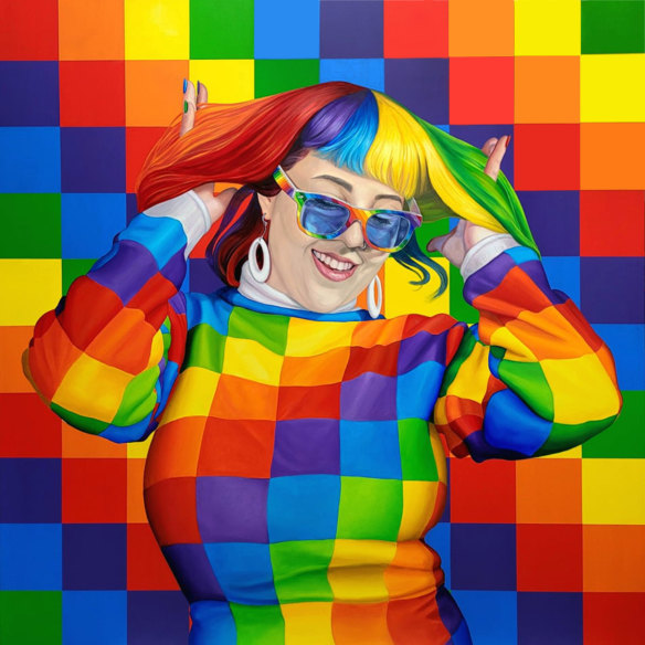
Janne Kearney’s There’s a rainbow after every storm (Tilly Baker, musician). Credit: S.H. Ervin Gallery
The Portia Geach is Australia’s premier award for female portraitists, resembling a women-only version of the Archibald prize. Like the Archibald, it’s an inconsistent affair, but this year the standard is higher, presumably because artists have been able to put more time and thought into their work during lockdown. When it comes to the visual arts, the pandemic has had its benefits.
The strong colour continues in Joanna Braithwaite’s Aficionado, a portrait of art writer Chloé Wolifson. The simplicity of composition is offset by a bold colour scheme that shows Wolifson in a bright orange top against a turquoise background. I’m not quite sure about the goldfish bowl balanced casually on the subject’s head. Braithwaite sees it as “a thought bubble”, but few people would view “goldfish” and “thought” as a natural pairing.
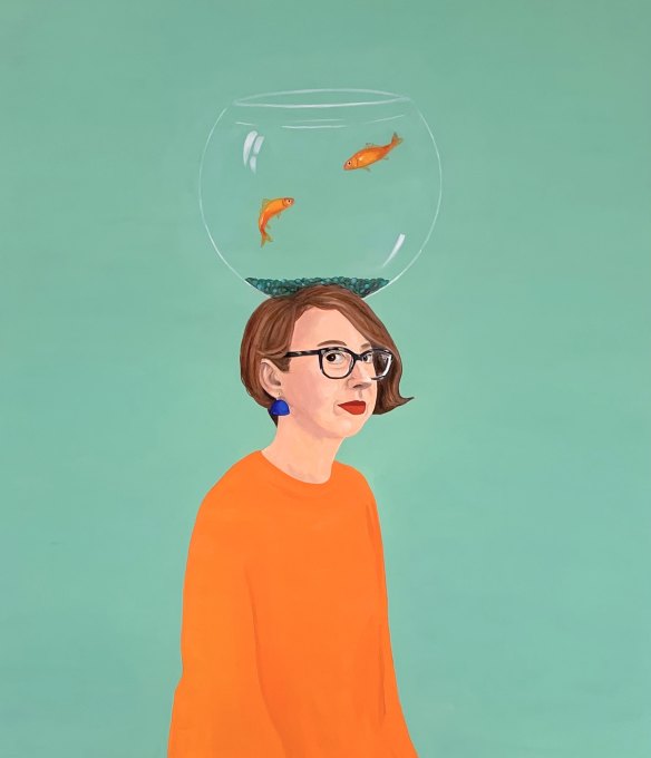
Joanna Braithwaite’s Aficionado (Chloe Wolifson, independent arts writer, researcher and curator).Credit: S.H. Ervin Gallery
There’s also a remarkable amount of colour in Jo Bertini’s portrait of her mother, Anne Ferguson. The soft pinks, reds and yellows are surprising because the subject is a sombre one. Anne is suffering from dementia, with all the ravages that entails. Not long ago, she was a sculptor of some distinction, but the disease has taken away her ability to work.
Bertini’s statement describes the discussions about art she still manages to have with her mother, which seem more precious because they are moments of lucidity snatched from the encroaching fog. There’s a desperate sadness in Anne’s face, but the painting is radiant, the warmth of the palette reflecting a daughter’s love for her mum. There’s nothing else in the exhibition that’s so heartfelt, so genuinely touching.
Could the judges be hard-hearted enough to award the prize elsewhere? Yep. This year’s first prize of $30,000 went to Marie Mansfield, for Tilly, a portrait of artist Matilda Michell, who is also represented in the show with a painting of wordsmith David Astle.
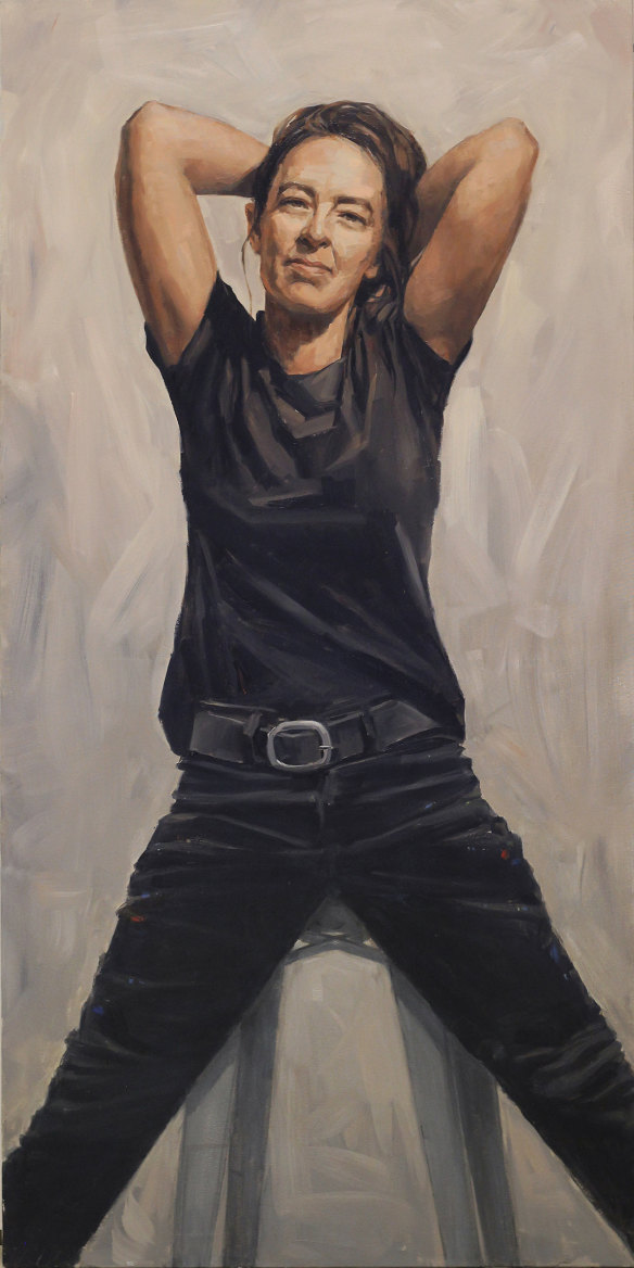
Marie Mansfield’s Tilly (Matilda Michell, artist) was entered in the Portia Geach Memorial Award.Credit: S.H. Ervin Gallery
Mansfield has appeared in this exhibition on many occasions. Her perseverance has finally been rewarded for a picture devoid of games or gimmicks that shows Michell dressed in black jeans and T-shirt, obviously her working togs. She is perched on a stool, her legs splayed out in front, hands tucked behind her head. Mansfield says the pose is “unencumbered, open and natural in the moment”, but it’s also full of physical tension, as if the figure were strapped to a rack. This is the ambiguity of the studio, where artists are simultaneously energised and tortured by their work.
It’s a crisp, assertive piece that does a lot with the most economical of means. If a portrait is primarily a likeness that gives us a sense of the personality and character of the sitter, Mansfield has fulfilled that task with great skill.
If a portrait is a likeness that gives us a sense of the sitter, Mansfield has fulfilled that task with great skill.
John McDonald on Marie Mansfield’s winning portrait
There are 57 finalists this year, so if I only discuss a handful of paintings that doesn’t mean the others are without interest. For those looking for a superior brand of realism, Tsering Hannaford’s portrait of farmer Jim Litchfield is a stunner. This bloke looks like he’s about to speak to you. It’s the hands, the eyes and the turn of the mouth that give this picture its spark of life.
Rachel Perrin’s portrait of this year’s Archibald prize-winning artist, Peter Wegner, loses very little in comparison, although it’s worth considering whether the elaborate background adds or subtracts from the overall effect. Perrin even includes an element of pokerwork! It’s an unwinnable argument: whether the best portraits concentrate solely on the sitter or if background detail is essential. Filippa Buttitta, for instance, has pushed the limits in her portrait of artist Tony Costa. She’s captured an excellent likeness but filled the canvas with too much distracting information.
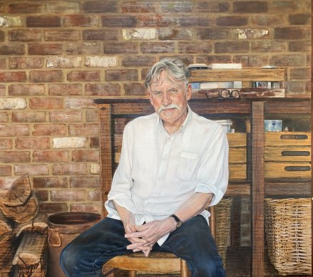
Rachel Perrin’s One painter, two painters (Peter Wegner, artist). Credit: S.H. Ervin
Pam Tippett, known as a painter of still life, might be expected to include a few significant objects in her portrait of Amanda Bell, former principal of the Women’s College at Sydney University. A vase, a bunch of azaleas and an antique photo have been chosen to provide insight into the subject’s interests and achievements. Bell looks mildly amused by the process.
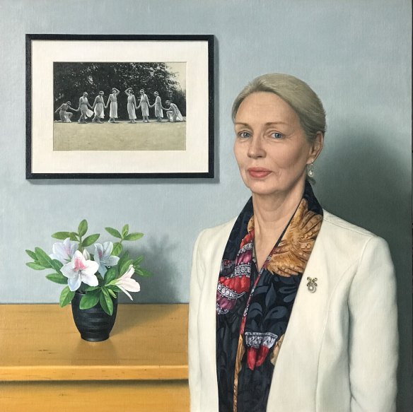
Pam Tippett’s Together (Amanda Bell, AM).Credit: S.H. Erwin
Deborah Walker has taken a more adventurous approach with The suitcase (autobiographical memory), a portrait of her step-daughter Stephanie Griffin. It depicts a moment of departure in which each detail is given a mildly surreal twist. Griffin is barefoot. Her tears are echoed by large droplets that seep down the wall. A dog and a looming green form (which may or may not be a tree) on the left side on the canvas act as disjointed presences in the picture. Rather than too much information, Walker withholds vital data, turning this “autobiographical memory” into a metaphysical puzzle.
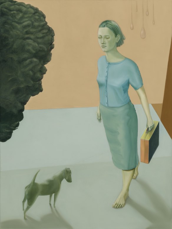
Deborah Walker’s The Suitcase (autobiographical memory).Credit: S.H. Ervin Gallery
Finally, two paintings that left me completely bamboozled: Zoe Young’s The beauty of resilience, a portrait of Kylie Moore-Gilbert, the academic who escaped imprisonment in Iran; and Tianli Zu’s Dr. Gene, which must be the strangest vision of philanthropist Gene Sherman ever committed to canvas.
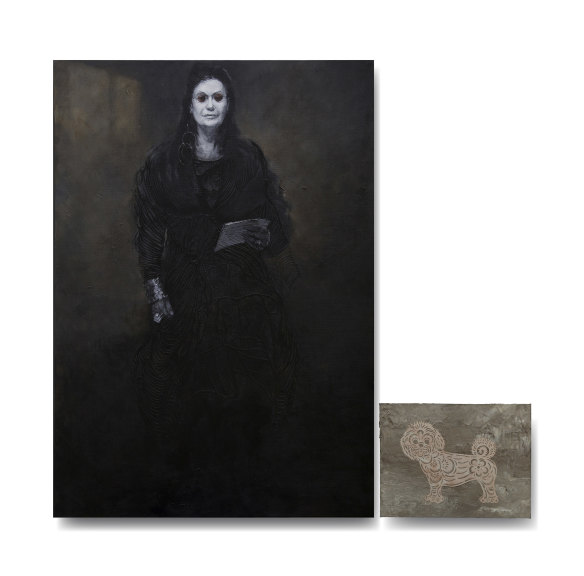
Tianli Zu’s Dr. Gene (Dr Gene Sherman, AM).Credit: S.H. Ervin
I know Zoe believes, in the style of Oscar Wilde, that it’s better to be noticed than not noticed, even if it’s not exactly a favourable notice. But it’s unclear what she was intending in this severely distorted picture in which Moore-Gilbert’s lower half seems disproportionately larger than the top, while her hands resemble skeletal claws. It’s as if the kilim on which she sits has exerted a malign influence over the figure, making everything rough and choppy. The image remains awkwardly realistic while flirting half-heartedly with a more expressive style.
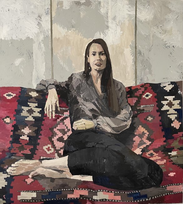
Zoe Young’s The beauty of resilience (Kylie Moore-Gilbert, academic).Credit: S.H. Ervin
As for Dr. Gene, Zu has made her subject look so scary that she could have stepped out of a Hammer Horror. All that’s missing is a set of fangs. The black dress, the deathly white pallor, the dark glasses and the enveloping blackness produce an alarmingly sinister impression. The stylised little dog on a supplementary panel makes the portrait seem even more ritualistic.
I don’t know what’s on the piece of paper Sherman is holding, but perhaps it’s her proposal for turning the Powerhouse Museum into a fashion hub – an idea that many see as genuinely sinister. One thing I can say with confidence is that Zu has shown us a side of Gene Sherman we’ve never seen before, although I’m not sure that this counts as success.
The Portia Geach Memorial Award is at S.H. Ervin Gallery until December 19.
The Booklist is a weekly newsletter for book lovers from books editor Jason Steger. Get it delivered every Friday.