This was published 1 year ago
More social space, less traffic noise: The award-winning reno on a busy intersection
With a series of strategic courtyards merging indoor and outdoor spaces, this transformation of a Federation-era home in St Kilda has won a slew of gongs.
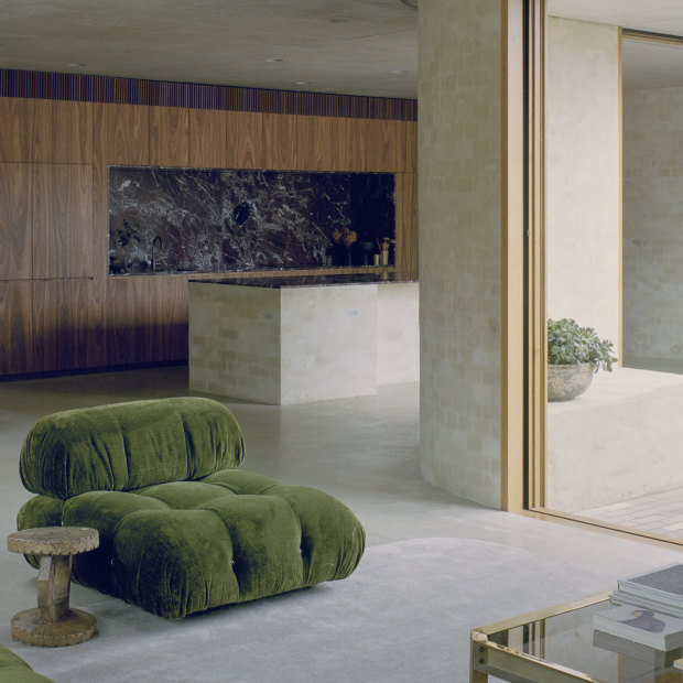
The residents wanted “a home that felt open and connected to a series of outdoor spaces ... that would allow their boys to play while also creating social areas for dining and entertaining.”Credit: Rory Gardiner
This St Kilda renovation’s accolades include a gong for Residential Architecture – Houses (Alterations and Additions) at the prestigious Victorian Architecture Awards 2023, and a silver for architecture at the Better Future Melbourne Design Awards. Its architects, Kim Bridgland and Aaron Roberts of Melbourne’s Edition Office, talk through the project.
Who lives here and what was their brief? Danika and Lyndon Galvin, a social policy adviser and accountant respectively, and their three boys Archie, 15, Munroe, 12, and Elliot, eight. The Galvins bought the house in 2017 and were looking for a cost-efficient renovation that maximised the whole block to create more usable family space and a better connection to the neighbourhood, making it less closed off and more inviting. In terms of living space, they wanted a home that felt open and connected to a series of outdoor spaces – a pool, a veranda and a courtyard – that would allow their boys to play while also creating social areas for dining and entertaining. Other items on their wish list included private spaces for them as a couple, including a bedroom retreat and a quiet studio which could double as a guest sleeping area.
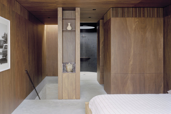
The bathroom in the main bedroom features a skylight above the shower.Credit: Rory Gardiner
The house sits on a busy intersection. Was that challenging? Yes. The house had three very different frontages: the tree-lined primary street face, a rear laneway and a long-side boundary that’s exposed to a noisy main road, all of which provided clues for how we might proceed. The new undulating brick walls that emerge from the interior continue around the boundary to form the protective side wall, sheltering the home from the traffic noise while gently embracing the side of the original home.
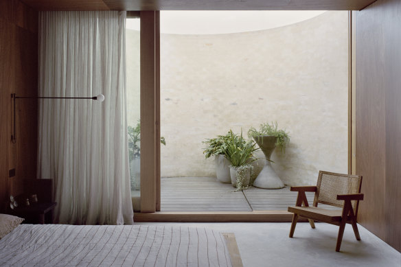
The main bedroom’s enclosed courtyard enables the owners to rest “with views of the sky”.Credit: Rory Gardiner
The typical addition to a heritage home is a box at the back; this design is more holistic. How did you decide on this approach? Our design allowed the original home to be restored but remain intact, with a transition created between the old bones and the new spaces, featuring design treatments that gradually reveal themselves as you move from the front door towards the new, contemporary parts. We looked at the design language of the original Federation house – the proportions, scale and decorative motifs – which we then gently softened and contemporised, starting from a rolled arc of concrete behind the traditional heritage plaster arch. We thought carefully about how to bring the two parts of the house together – as if the original was slowly learning a new tune.
The materials and their treatment have been key to the design’s success. Tell us about them. We used sustainably-sourced recycled bricks for the walls and coated them in a textured mortar made from sand, lime and cement. We like to work with materials that are resilient and gain some level of grace with age, and by using this brick and mortar treatment inside and out, including for the kitchen bench and around the perimeter walls, it gives the home a unified look. We also used Australian spotted gum, for its warmth and cocooning feel; concrete for its longevity; and Rosso Levanto marble [in the kitchen] for its naturally decorative patterning.
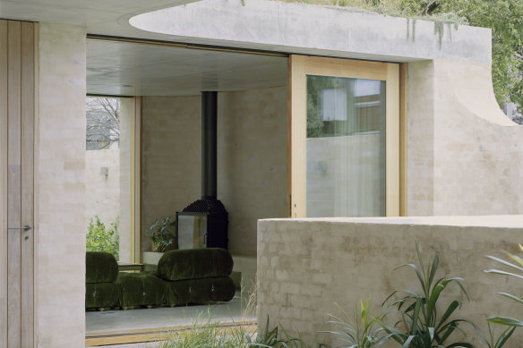
Large sliding doors leading to two courtyard gardens expand the home’s indoor “social areas”.Credit: Rory Gardiner
You’ve introduced two new spaces on the first floor, the main bedroom and a studio. How do these differ to those on the ground floor? If the lower spaces are the social heart of the home, these two first-floor additions are its more intimate, private zones. The principal bedroom (with a bathroom, robe and small private courtyard) is in one structure, the studio retreat in another. The bedroom’s semi-circular courtyard and bathroom skylight allow the owners to sleep and bathe with views of the sky and the canopies of a tall eucalyptus.
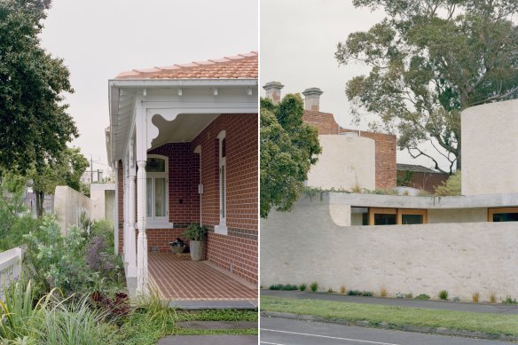
Bagged brick walls encase the edges of the existing Federation home; this helps buffer traffic noise.Credit: Rory Gardiner
There’s a lovely merging of indoor and outdoor spaces – there’s even a small pool next to the living room. How did you fit it all into the site? While not overly large, the site was generous enough in its own way. To help increase the sense of openness and spatial generosity, we connected each of the social spaces to a pair of courtyard gardens, themselves considered outdoor rooms of the house.
You talk about reframing the house as an object in the round. What has the community response been like? Every time we visit and we’re lingering in the front garden or on the porch, we end up in a conversation with a neighbour who calls out or stops for a chat over the low front fence. Whether the person knows we’re the architects or not, they tend to let us know how much they enjoy the house and the joy, or spark of curiosity, it gives them.
To read more from Good Weekend magazine, visit our page at The Sydney Morning Herald, The Age and Brisbane Times