This was published 8 months ago
Opinion
A critic’s pick of the best and worst of the Archibald Prize portraits
John McDonald
Art criticIn Dante’s Inferno there are nine circles of Hell, each reserved for a different kind of sinner. The lustful get thrown about by storms, the gluttonous wallow in icy slush, heretics are trapped in flaming tombs … But try as I might, I’ve never been able to locate the particular niche in which the sinner is obliged to review the Archibald Prize for all eternity. Maybe there’s a small annex next to the heretics because it’s a local article of faith that the Archibald is a great Australian tradition, loved and esteemed by all.
Heretic that I am, I don’t think I’ve ever seen a really good Archibald Prize exhibition. Some years are better than others, but my first impression was that this year was one of the worst. After the initial shock, a few pictures began to stand out from the crowd, including the eventual winner, Laura Jones’ Tim Winton, while others receded into oblivion.
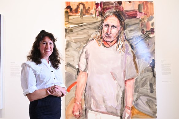
Laura Jones has won the Archibald Prize with a portrait of Tim Winton at the Art Gallery of NSW.Credit: Janie Barrett
Most of the trustees who judge the prize are not art professionals, but they usually manage to choose a credible candidate. Last year’s winner upset that complacent assumption, making me wonder about the judges’ criteria for excellence.
Are they really trying to give the prize to the best picture? Perhaps they’re fixated on an artist who is young and emerging, or some other extra-aesthetic category. That idea is supported by this year’s choice of 57 finalists, which seem to be selected for variety rather than quality. I can only discuss a small number.
The show reflects a cross-section of Australian society, our current fads and preoccupations. There’s a persistent sense that the Archibald is as much a sociological exercise as an artistic one.
There is no right or wrong way to paint a portrait, but it’s uncontroversial that the best examples hold the viewer’s attention by bringing out some crucial aspect of the sitter’s personality using pose, expression or composition. Think of Velázquez’s famous Portrait of Pope Innocent X (1650). When the sitter saw the painting, he is said to have cried: “It’s too true!” and never let it be shown in public. Looking at the work today, we don’t see a devout man of the Church but a rascally politician.
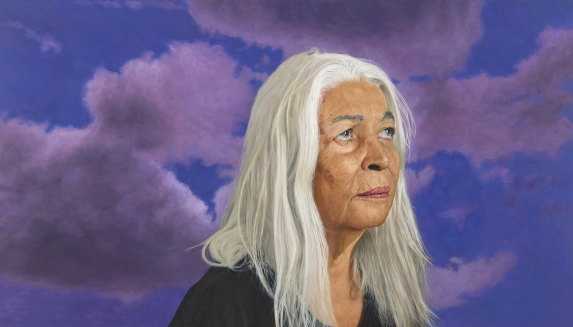
Angus McDonald’s portrait of Marcia Langton.
Two standouts among a host of near-photographic realist pictures are Angus McDonald’s portrait of Marcia Langton, and Tsering Hannaford’s Meditation on seeing (portrait of Dad), which features 27-times Archibald finalist, Robert Hannaford. Both have subtle touches that bring these paintings to life whereas most of the other realist portraits fall flat.
It would have been almost unfair to give Tsering the prize her father has been denied on so many occasions, but that was never going to happen. It’s another Archibald syndrome that a technically excellent painting will be included only as a concession to public taste. One could barely imagine a more honest picture than Hannaford’s portrait of her dad, who sits with his arms folded, his head angled slightly to one side, as if he’s sizing us up for one of his own paintings.
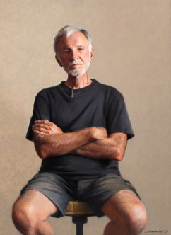
Tsering Hannaford’s “Meditation on seeing (portrait of Dad”.
McDonald’s portrait of Indigenous professor and activist Marcia Langton is equally striking in the way he’s given the work just enough of a twist to prevent it from being a purely academic exercise. Langton is shown with her eyes gazing upwards towards a cloudy sky. She looks decidedly rueful, perhaps contemplating the defeat of the Voice referendum, for which she was a leading advocate.
By contrast, Ben Howe’s Kylie and Sami makes little attempt to disguise its reliance on photography. Kylie Moore-Gilbert and Sami Shah pose stiffly for the camera, looking like a display at Madame Tussauds. So too with Matt Adnate’s Rhythms of Heritage, the work that won the Packing Room Prize, which feels more like a Bollywood poster than a portrait. Baker Boy’s face has that tell-tale posing-for-the-camera expression while the background, painted in discordant slashes of red, blue and black, suggests that the artist should never abandon figuration for abstraction.
For Nick Stathopoulos, painting David Stratton in shades of grey was intended as a reference to the veteran film critic’s problems with his health and eyesight but the overall effect is not melancholy but cold and depressing. There’s a similar failure in Ben Smith’s near-photographic portrait of Darren Dale, in which a row of flowers placed at waist level gives the impression the film producer is hiding in the bushes trying to look inconspicuous. The most memorable aspect of Tim Owers’ portrait of Matildas striker Cortnee Vine is the title: On the bench. The picture itself is nicely painted, but uninspired.
Zoe Young’s portrait of food writer Jill Dupleix is one of the more arresting entries, notable for its bright yellow tonality and a composition with so many zigzags it’s almost Futurist. A haptic distortion, whereby the sitter’s feet and legs loom larger than her head and torso, makes it seem as if the artist painted the work from under a nearby cafe table. Details are fudged, but the glare of sunlight provides a partial excuse for what is more likely a matter of style and haste.
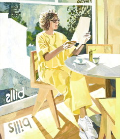
Zoe Young’s “Jill’s at Bills”.
Caroline Zilinsky can already proudly vaunt a whole batch of ferocious putdowns from the London tabloids for her portrait of screen heart-throb Jacob Elordi, which has been repeatedly described as “abstract”. I’ve got my reservations about Zilinsky’s mannered, graphic style, but when the tabloids call it “abstract”, it’s a terrible revelation of the level of ignorance and visual illiteracy in the media’s approach to the visual arts. The artist, reliably bullet-proof, appears to be enjoying her moment of international notoriety, as well she might. No one need ever be offended by the comments of half-wits.
Among the works that felt too gimmicky for comfort, Shaun Gladwell’s Julian Assange must top the list, with the subject’s face turned into a hot air balloon, emblazoned with the stars and stripes, peace doves, helicopters, rows of waving figures and what I take to be an image of the late Queen Elizabeth. Allegedly sketched with a piece of chocolate on a banknote, the portrait put the trustees on the spot, inviting them to use the prize to make a statement of support for Assange, who was recently released from a British prison after avoiding extradition to the United States. While not wanting to miss out on the publicity opportunity, the judges stopped short of further honours.
Other over-the-top novelty pictures include Drew Bickford’s “portrait” of artist duo, Soda Jerk, which looks like a poster for a slasher film, with little evidence of the subjects. Meanwhile, Yoshio Honjo’s Akira Isogawa is a skilful pastiche of traditional Japanese painting, but it’s not easy to identify the fashion designer in the midst of armour and dragon. At least it’s well executed, which is more than one could say about some of the other entries. Whitney Duan’s Fluffy (Jordan Gogos), made me think of an old rug destined to become a dirt magnet. I don’t know what this – or the title – says about Jordan Gogos’s fashion designs.
It was a big year for Queer. Jaq Grantford’s painting of ABC Classics presenter Ed Le Brocq as a centaur, and Natasha Walsh bringing us fashion duo Nicol & Ford in the nipple-tweaking pose of a famous painting from the School of Fontainebleau could hardly be more different in terms of scale and style, but they share a defiant “Look at me!” attitude.
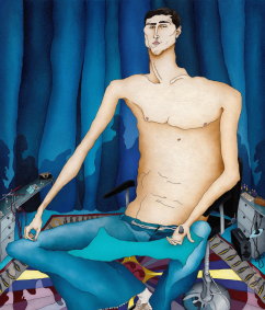
Caroline Zilinsky’s “A lucid heart – the golden age of Jacob Elordi”.
It’s the overt, attention-grabbing aspect that mitigates against them as potential winners. Alongside Jones’ sullen, lumpen portrait of Tim Winton in a T-shirt, the theatricality of such paintings hits us like a blast on a trumpet. Where Jones imbues her subject with a sense of interiority, Walsh and Grantford opt for spectacle.
There are four finalists from the collective Studio A, a social enterprise that works with artists with intellectual disabilities. The best is Thom Roberts’ Big Bamm-Bamm, a riotous portrait of Ken Done with four eyes, a rainbow-striped jumper, and pink and yellow cats’ ears that resemble the sails of the Opera House. Roberts has out-doned Ken Done.
The Wynne Prize for landscape has become a virtual prize for Indigenous art, but two Indigenous artists included in the portrait prize are far from impressive: a ragged daub by Adrian Jangala Robertson, called Jumpin’ Julie, Yuendumu, which at least boasts one of the show’s best titles; and a strange work by Robert Fielding that makes artist Tuppy Ngintja Goodwin look ghostly and fiendish. All those words stencilled on the picture don’t add to its appeal.
As one Archibald subculture rises, another is pushed aside. A few years ago, the show was full of Chinese emigres, most of them possessed of painting skills that put the rest of the field to shame. It can’t be that these artists stopped entering, or started to make bad pictures. One hopes they are merely victims of fashion rather than politics. Either way, at a time when the Art Gallery of NSW is desperate to cultivate private donors, this sends a discouraging message to a Chinese community notable for its wealth and willingness to spend. Gina Rinehart may be richer, but as we’ve seen, she has more exacting requirements when it comes to portraiture.
The Archibald, Wynne and Sulman Prize exhibition runs until September 8 at the Art Gallery of NSW in Sydney. It then tours to regional NSW and the Northern Territory.
correction
This article has been corrected to reflect the fact that Julian Assange has been released from prison.