
Melbourne proves less is more with perfect ANZAC jumper design
AFL clubs have long battled to create guernseys to properly honour ANZAC Day. The Demons nailed it this year.

AFL
Don't miss out on the headlines from AFL. Followed categories will be added to My News.
NAILING the design of an AFL guernsey is never easy.
Hawthorn has barely put a foot wrong on and off the field in recent years, but somehow still managed to think this jumper was worth draping on its players.
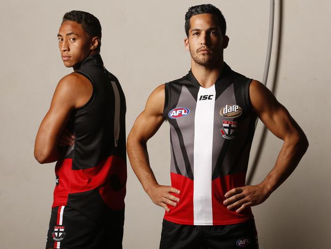
Delivering a design to honour the special occasion of ANZAC Day comes with even more pressure. We won’t poke fun at these guernseys like we did with the Hawks strip above — after all, everyone enters the process with the right intentions — but it’s fair to say there were some hits and misses last year.
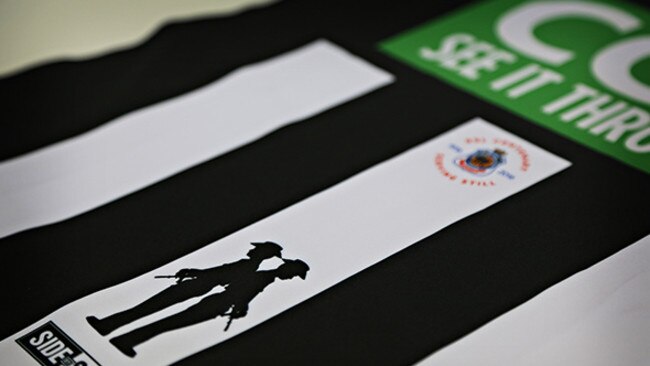
Collingwood will today unveil a special ANZAC Day guernsey that includes a poppy with ‘Lest We Forget’ printed on the left chest, the names of fallen Collingwood players printed on the inner back of the neck, and the silhouettes of two soldiers standing back to back on the bottom of the guernsey.
Which brings us to this year’s Melbourne guernsey. For the second year in a row, the Demons have opted for a more is less approach.
While last year’s design — which featured the Southern Cross printed over the club’s home guernsey — wasn’t bad, this year’s is absolutely perfect.

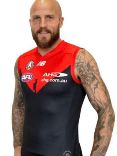
Based heavily on the club’s traditional strip, the design features a moving silhouette of a soldier positioned against the red yolk of the guernsey.
“This yolk represents the going down of the sun, while the blue of the guernsey represents the ground upon which the soldier stands,” the Demons website states.
The design also sees the phrase ‘Lest We Forget’ watermarked on the back of the guernsey, while the ANZAC emblem is featured on the left hand side of the guernsey’s front.
The design has already received strong support on Reddit and is sure to look resplendent during Melbourne’s Sunday night clash against Richmond.
We’re waiting to hear back from the Demons about who is responsible for the guernsey, but it appears they may have drawn inspiration from last year’s Greater Western Sydney design, which was on the right track with the silhouette of the soldier but probably spoiled it with camouflage.


Originally published as Melbourne proves less is more with perfect ANZAC jumper design
Early Tackle: The young Don finally fitting into No. 31
Zach Reid has been the poster boy at times for the Bombers not nailing their high draft picks – but he’s well and truly put that argument to bed, writes Scott Gullan. See the early likes, dislikes.
Fev, Guy spark absurd 229-point turnaround
AFL legend Brendan Fevola and music icon Guy Sebastian have done the unthinkable in the wake of an investigation into a footy game.