
The realistic US election map that shows the country isn’t a ‘sea of red’
A look at the presidential vote has confused many given how much support Trump seems to have. But this map paints a different picture.


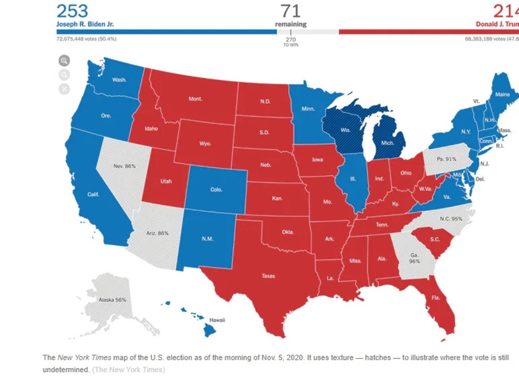
As results of the US election flowed in, people were eagerly checking electoral maps to see how states were tracking.
But doing so left many confused, with most maps showing a sea of red for the Republicans, indicting President Donald Trump would remain in power.
Even now with Joe Biden declared the winner the final maps showing red and blue for each state won seem to show Mr Trump has the majority of the country.
The reason for that is using a typical election map, states usually get assigned red or blue based on the total vote.
If you look at the results by population – which Karim Douïeb of data science company Jetpack has done – you get a completely different map.
That’s because large chunks of the country don’t have a much of a population.
The typical maps make it look as though most Americans voted Republican but the country was very much divided, with about 74.5 million votes for Mr Biden and 70.3 million for Mr Trump as of Saturday evening.
The country isn’t predominantly Republican after all, as Mr Douïeb pointed out in 2019 after Lara Trump tweeted an electoral map from 2016 showing the familiar sea of red.
— Lara Trump (@LaraLeaTrump) September 28, 2019
RELATED: Why Trump’s lead in Michigan, Wisconsin and Pennsylvania collapsed
Mr Douïeb, a Belgian designer, said the map bugged him because it made it look like a bunch of empty land had voted for Mr Trump and didn’t represent the few people who lived in certain areas.
“I told myself, this is completely wrong in terms of data visualisation,” he said.
“I’m not so into politics or anything, but I had to correct this visual mistake.”
He created a GIF that showed Lara Trump’s map transitioning to a more accurate one.
Her tweet has again been flooded in recent days with comments on how the map should look based on population.
As one person on Twitter pointed out, “Simple. Democracy = Power of the people, not empty space. Other first world counties understand that.”
I am not the first one and I surely won't be the last one to point out that traditional electoral maps are a misleading way to represent the outcome of an election. This is something you can't stress enough: https://t.co/euqDAvTvmU pic.twitter.com/KCEGigmaZu
— Karim Douïeb (@karim_douieb) February 22, 2020
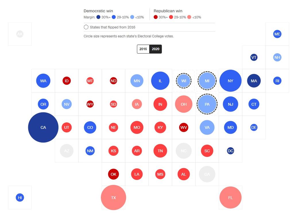
The map depicts the actual count of red and blue votes in counties as simple circles with their size proportional to the number of votes.
Versions of his map have gone viral again in the last week as an instant retort to Republicans who claim the election is being “stolen”.
“The GIF was making the point, it’s not just about a system – it’s about people,” Mr Douïeb said.
“That’s what’s most important. It’s an insult if you just say, ‘This is our country, and it’s all red.’ It doesn’t represent anything. That was the point.”
CNN showed how Mr Biden’s win was more decisive than what people think with comparisons of how the electoral map changed between 2016 and 2020.
“Trump’s defeat is a clear victory for Democrats even if it is not the blue tidal wave that had become a pre-election expectation of some … they expanded the electoral map, proving that a younger and more diverse electorate has new priorities,” they wrote.
They said Mr Biden had rebuilt the “blue wall” and expanded the map.
“The point here is that the country is clearly changing,” they concluded.
“It’s changing around our political parties and re-forming our understanding of the country.”
RELATED: Newspapers savage Trump tantrums
Eric Nost, Assistant Professor in Geography, Environment and Geomatics at the University of Guelph, tracked 10 election maps from Canadian and US news outlets such as the CBC, Maclean’s, the Globe and Mail, Fox News and The New York Times.
He said they were, at best, partial representations of reality – statistical and design choices about what to illustrate and how.
“The most common American election maps overstate results from rural areas because these consist of large but relatively unpopulated counties and states,” he wrote for The Conversation.
He said Fox news was the only outlet he reviewed that allowed readers to look at results based on population.
“Interactive web maps offer readers a sense of commanding results in real time,” he concluded.
“But they don’t always tell their readers much about the veracity of those results or how to understand them.
“Web maps – whether of elections or pandemics – are not going away, so we would do well to better understand how to make and read them.”

‘It’s a mess’: White House in chaos
Insiders have revealed US President Donald Trump could be about to resort to some vicious measures as a major scandal grows.

‘Terminated’: Trump’s brutal China move
Some positive signs are beginning to emerge for every nation on earth after a torrid few weeks. But one country is feeling Donald Trump’s wrath.

Economists panic: ‘Trump burnt it all down’
Economists around the globe are circling around the dumpster fire, warning that America’s new policies risk a lot more than a shaky week for the markets.