This could be the coolest boarding pass ever
WHY are airline boarding passes so awful and complicated? A passenger has come up with this awesome idea for a pass that actually makes life easier. Believe us, you'll want to check this out.
IT'S an idea so simple yet so inspired that it has left us wondering, why didn't anyone think of it before?
Fed up with constantly being handed confusing and poorly designed airlines boarding passes, a traveller decided to make his own. What he ended up creating could be the best boarding pass ever and has grabbed the attention of passengers and airlines.
The idea came to UK designer Peter Smart when he embarked on a flight marathon as part of his project 50 Problems in 50 days, which explores social problems and how design can assist. After boarding 14 planes in two months, he had seen a LOT of boarding passes.
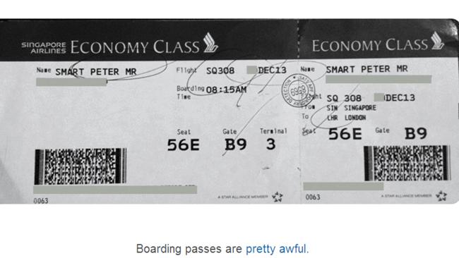
"Somewhere between check-in and boarding, I realised something: Boarding passes are pretty awful," Peter Smart said.
"Take a look at your boarding pass. You want to know where you need to be and how to get there - your boarding pass should quickly and simply communicate your next steps. The problem is, it doesn't. What you're looking at is a collection of strangely ordered acronyms, oddly formatted times and numbers and sequences that demand significant attention to decipher.
"You're feeling jet-lagged, you start to feel uncertain and you're not sure where to head amongst the thousands of other passengers trying to reach their gate. Surely something so crucial should be simpler?"

What's more, when you tuck away your boarding pass into your passport, it extends out both ends, often getting bent or sometimes even falling out.
"Boarding passes need to be kept safe," Smart said. "Their current format makes this difficult to do."
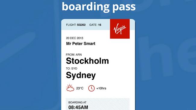
Instead, this is what he came up with: a pass stripped of all the clutter, that actually makes life easier for passengers.
Smart said the pass fits easily into a passport when folded, while leaving crucial information sticking out of the top, such as the flight number and gate.
The information is displayed vertically and is listed logically and in chronological order. It even lists the weather forecast so you'll know whether you'll need to keep your coat within easy reach.
Even better, the ticket tells you what kind of seat you'll be in (e.g. aisle).
It's also the same, standard dimensions of the traditional boarding pass, so airlines won't have to get new printers or cards to switch to the design.

When asked if they'd consider using the design, Australian airlines were enthusiastic.
@alexwain Hi Alex, it's definitely interesting and something to consider. Thanks for passing on :) Kristen
— Qantas Airways (@QantasAirways) January 20, 2014@alexwain It's an interesting suggestion. I'll certainly pass on to the IT team responsible.
— Virgin Australia (@VirginAustralia) January 20, 2014Passengers have embraced the design.
Well researched article on rethinking the airline boarding pass... http://t.co/d7RZGCxhl5
— Peter Trigar (@PeterTrigar) January 21, 2014One of the better boarding pass redesigns we'll never see. (via @danielbru h/t @KuraFire) http://t.co/ZzdOBSONSc
— Matt Kump? (@kump) January 14, 2014What if a boarding pass made things simpler? http://t.co/dxdDKN6Spp #UX @petewsmart
— Ryan Kirkman (@ryankirkman) January 20, 2014So this is pretty epic. A guy redesigns the airline boarding pass and makes it so much better. http://t.co/iqeMDu6LgH
— Jacob Lovie (@OhHeyJacob) January 14, 2014Airlines: Here's the Boarding Pass Design You Should Be Using http://t.co/TITt1IKIUH
— Satish Kanwar (@skanwar) January 20, 2014Here's hoping the airlines listen.

