
New York’s most iconic logo almost didn’t exist
IT WAS first scrawled on the back of an envelope by someone in a taxi. But there were some major problems with this simple slogan.
A LOGO that almost didn’t exist is now one of the most iconic in the world — thanks to a chance visit to the holiday island of Bermuda.
The “I [heart] NY” emblem turns 40 this year, and its creators, including graphic design guru Milton Glaser, told the New York Post about the origins and enduring legacy of their symbol — believed to be the most copied in the world.
Back in 1977, the logo was commissioned as part of a larger advertising campaign by New York State’s Department of Commerce. It was meant to lure out-of-state travellers to a place then beset with problems: a bankrupt government, high crime rates, a drug epidemic, a homelessness crisis, abandoned buildings, raging fires and a major blackout.
Governor Hugh Carey gave Commerce Commissioner John Dyson the go-ahead to try to change New York’s image. With his deputy, William Doyle, Dyson tapped advertising firm Wells Rich Greene (of Alka-Seltzer’s iconic “I can’t believe I ate that whole thing” fame). Creative director Charlie Moss came up with a slogan, “I Love New York.” Jingle writer Steve Karmen set it to music. On a shoestring budget, the team started to create ads touting Broadway shows and upstate’s natural beauty.
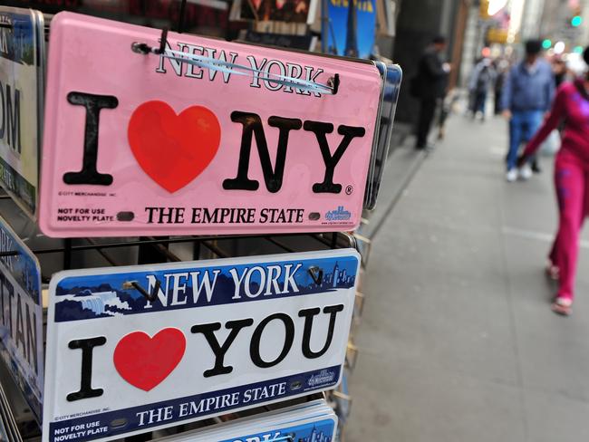
Visually, though, the campaign was lacking. Dyson and Doyle selected Glaser, a South Bronx native who had co-founded New York magazine nearly a decade earlier.
That summer, Glaser’s first attempt resulted in a lukewarm response from the team. So during a cab ride a few days later, he took a red crayon and scribbled down four characters on the back of an envelope: “I,” a heart, “N” and “Y.” (It’s now on display at the Museum of Modern Art.)
“The big secret of that is replacing a verb with a noun. Change the language and make people solve a problem,” Glaser, 88, told The Post.
“The ‘I’ is a complete word, the heart is a symbol for an emotion, and NY is the initial for a place. So you have to figure it out, otherwise it’s impenetrable. It’s a puzzle that is easily solved.”

Moss and the advertising team, however, believed the design was too abstract and cryptic. Doyle disagreed and had two T-shirts with the logo mocked up on his own dime, which he and his then-girlfriend (now wife of 39 years) wore on the beach in Bermuda during a long weekend trip.
“People came up to us on the beach and said, ‘Oh, my God, I love it’,” Doyle said. “I can still see the ladies. It brought huge smiles, and people’s eyes were glistening. It really worked.”
Armed with eyewitness evidence, he returned to the city and insisted the logo be used. It was immediately tacked on to ads that were already running, and so began the journey toward ubiquity.
“That was the moment of truth, I think,” Doyle added. “Had there been no trip to Bermuda, there wouldn’t be any logo.”
This article originally appeared on the New York Post and was reproduced with permission.
Why Aussies are tracking this US flight
A highly anticipated first flight from Texas to a major Aussie city touches down on Monday morning and eager planespotters can watch all the action live.

Site of Hollywood’s biggest secrets
If the walls of this iconic and luxurious Los Angeles hotel could talk, they’d have plenty of jaw-dropping tales to share about Hollywood’s biggest stars.

Qantas’ bold move not seen in a decade
Legendary Aussie filmmaker Baz Luhrmann has stepped in to create a new ad campaign for Qantas with megastar Chris Hemsworth.