
This is the font that can’t be forgotten
AUSTRALIAN scientists have claimed small changes in the words you read can improve your ability to retain information. But does it work?

A GROUP of Australian scientists claim to have unlocked the secret to improving human memory retention.
And it’s hidden in the words you read on your computer.
If you’re anything like me, then you rarely switch up the font you use for emails, essays or when you’re cramming for an exam.
Humans are, after all, creatures of habit.
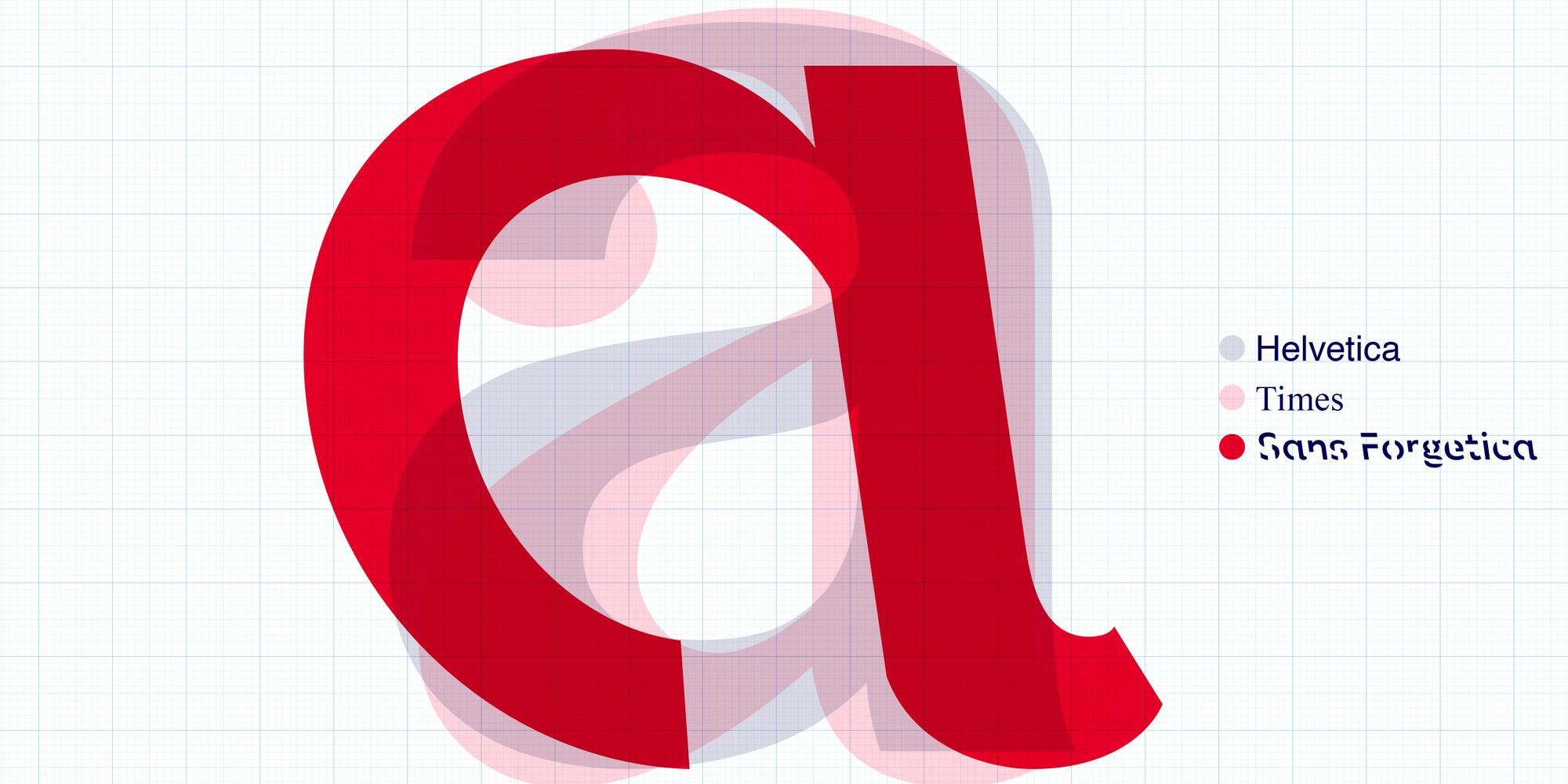
Your “go to” fonts would probably be Times New Roman, Arial or Helvetica if you’re feeling extra adventurous.
But scientists from Melbourne’s RMIT University say these sorts of fonts make it too easy for your brain to skim over the important stuff.
They have developed a brand new font, called Sans Forgetica, which they claim will improve your ability to retain written information.
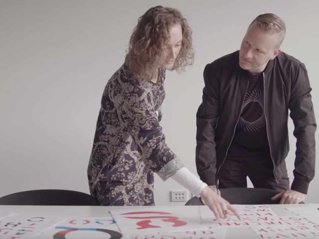
Sans Forgetica was developed using the very big brains of typographers, designers and psychologists all connected to the RMIT Behavioural Business Lab.
The trick behind this magical font is that it forces our brains to slow down and work harder to process the words in front of us.
When that happens, our brains are more likely to remember the information we have read.
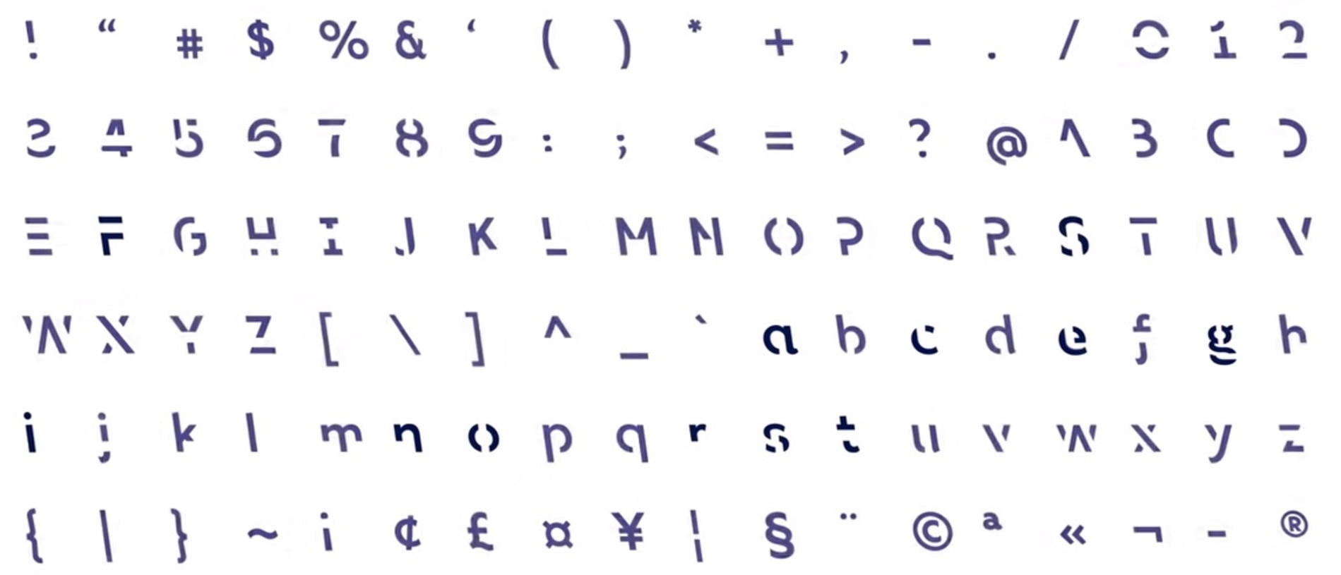
RMIT typography lecturer Stephen Banham said humans read words using general outlines, instead of letter by letter, so the designers attempted to force readers to “fill in the spaces” by using two methods.
They made each letter slant backwards, and cut bits out of them.
“We’re very used to seeing italics slanting towards the right so it is very unconventional to have a back slant in the type face,” Mr Banham said.
“Back slants are generally only used in maps to indicate the position of rivers so it's a very specific and unusual typographic voice.”
Designers also produced physical gaps within each letter to make it just that bit harder for us to read what is on the screen.
“These gaps are actually anticipating the process of how people read type,” Mr Banham said.
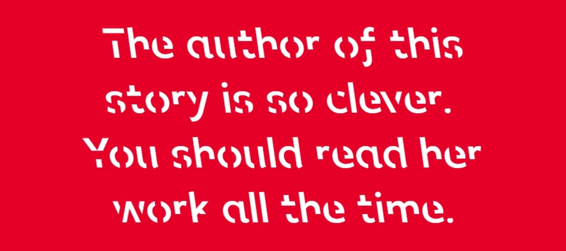
The idea here is that readers will take slightly longer to fill in the gaps and read each word which, in turn, will give their brains more time to engage in deeper cognitive processing.
RMIT senior marketing lecturer Dr Janneke Blijlevens said typical fonts are too familiar to make a lasting impact on our learning.
“We glance over them and no memory trace is created,” Dr Blijlevens said.
“On the other hand if a font is too different our brain can’t process it and no memory trace is created either.”
This is where Sans Forgetica comes in.
“Sans Forgetica lies at that sweet spot, where just enough obstruction has been added to create that memory retention,” Dr Blijlevens said.
Sans Forgetica was tested against 400 Australian university students in laboratory and online experiments as well, so they’ve released it with some pretty solid evidence that it works.
And while Sans Forgetica — which is free to download here — was mainly designed with students in mind, it could easily be used to assist young or elderly readers, or even patients suffering from brain injuries or Alzheimer’s disease.


