Kmart shoppers slam annoying checkout layout at all stores
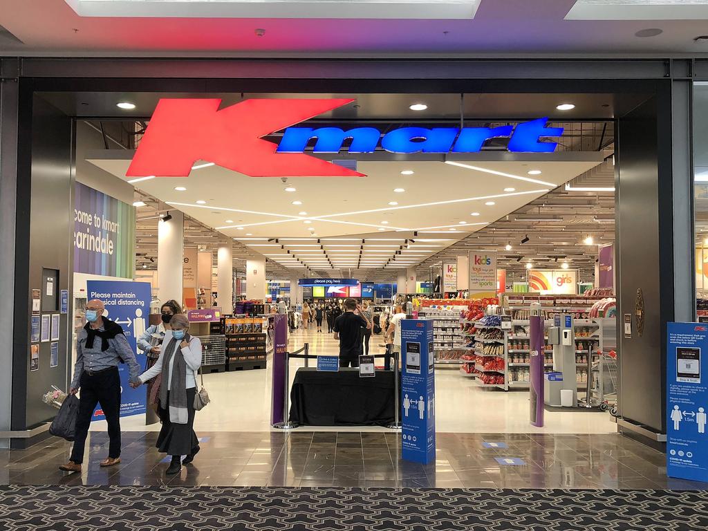
It’s a feature of the stores that has been around for a decade. But Kmart shoppers continue to see red, slamming the retailer for treating “every shopper like a shoplifter”.

Customers of Aussie department store Kmart are not getting tired of voicing their contempt of the retailer’s checkouts, with more slamming the fact you have to pay for your purchases in the centre of the store.
It’s a decade since the store’s unusual format began being rolled out, yet shoppers are still fed up, blasting Kmart for treating “every shopper like a shoplifter”.
“Dear Kmart Australia, why put the checkout area in the middle of the store if you’re going to treat every shopper like a shoplifter on the way out?” one social media user asked.
“Instead of treating all your customers like criminals, there are a few things that you can do to change this,” another said.

The shopper suggested moving the checkout’s placement, ditching self-serve registers and rostering on more staff.
“I have sent many emails to management which always seems to go without reply, thanks. Nice to know that you got my messages and appreciate my feedback,” the social media user said, sarcastically.
“You just lost thousands of dollars a year from us as we won’t be shopping at your stores again unless your system changes.
“We will be shopping where we are treated with respect and not criminals.”
Many commenters jumped in to agree.
One social media user said: “I’m with you mate. It’s the dumbest idea they’ve ever had.”
“It’s so frustrating. Then they put 15-year-old kids on the door and expect them to be security.
It’s horrendous on both sides of that transaction,” another said.

One shopper defended the layout, saying while they used to think it was a poor move, they now believe it makes sense to avoid a bottleneck at the store’s entrance.
The social media user also suggested it might make the retailer more money as people are forced to walk back past things they were in two minds about.
A Kmart spokesperson told news.com.au: “At Kmart, we strive to deliver an enjoyable and convenient shopping experience to all our customers whether they choose to shop with us in-store or online.
“The decision was made several years ago to place Kmart registers in the centre of the store to make shopping more convenient, ensuring store entrances are free of queues and clutter, and allowing customers to enter and exit with ease.
“This current layout is more open and more spacious without having the registers up at the front of the store, which can get congested during busy times of the year like Christmas. Like many retailers it is also a condition of entry across all our stores that if requested, customers present any bags and receipt for checking before leaving the store.
“This is standard procedure that occurs regardless of how a customer makes their purchase, whether it be from our service desk, self-service checkouts or if they have been assisted by a team member. We look forward to continuing to service all our customers in the many different ways they like to shop.”


