
The six paint colours of 2018
PREPARE to see a lot of green and terracotta walls in homes around Australia. These are the six on-trend paint colours of 2018.

WANT to know the colours you’re about to see in homes EVERYWHERE?
Picture yourself in a dreamy hammock, looking out at a pretty-as-a-picture sunset — gorgeous greens, subtle pinks and earthy terracottas. And as day becomes night, cloudy greys and confident charcoals create monochrome heaven.
They are the expert predictions for the paint colours of 2018 — and here’s why.
SNOWDOWNIA — THE PERFECT SHADE OF JOMO
The need to slow down in such a hectic, fast-paced environment is becoming a welcome focus — and design is reflecting that, according to Wattyl colour manager Sarah Stephenson.
“Using our home as a retreat is becoming more of a focus and the design style is all about hominess,” she said.
“Now it’s the Joy of Missing out rather than the Fear of Missing out.
“There is a Nordic style that is being picked up around this trend, called ‘Hygge’ which is all about respecting what life gives you and making the most of this.
“This is a simple, homely look that focuses on natural materials such as linen, wool, wood and stone.
“The colour palette is a mixture of earthy and mineral tones that include clay and ore.”
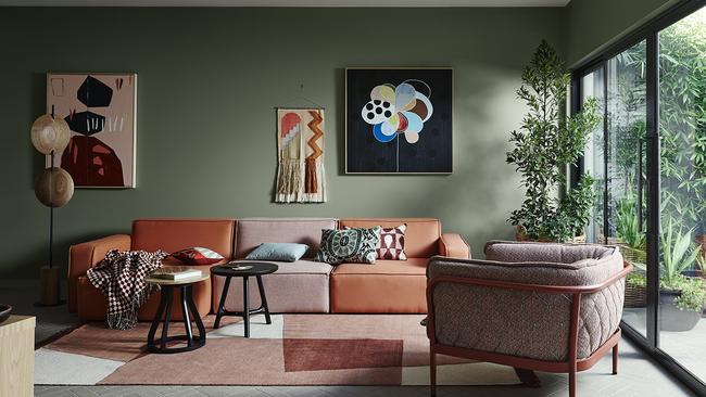
TERRACOTTA — TAKING THE OUSIDE, IN
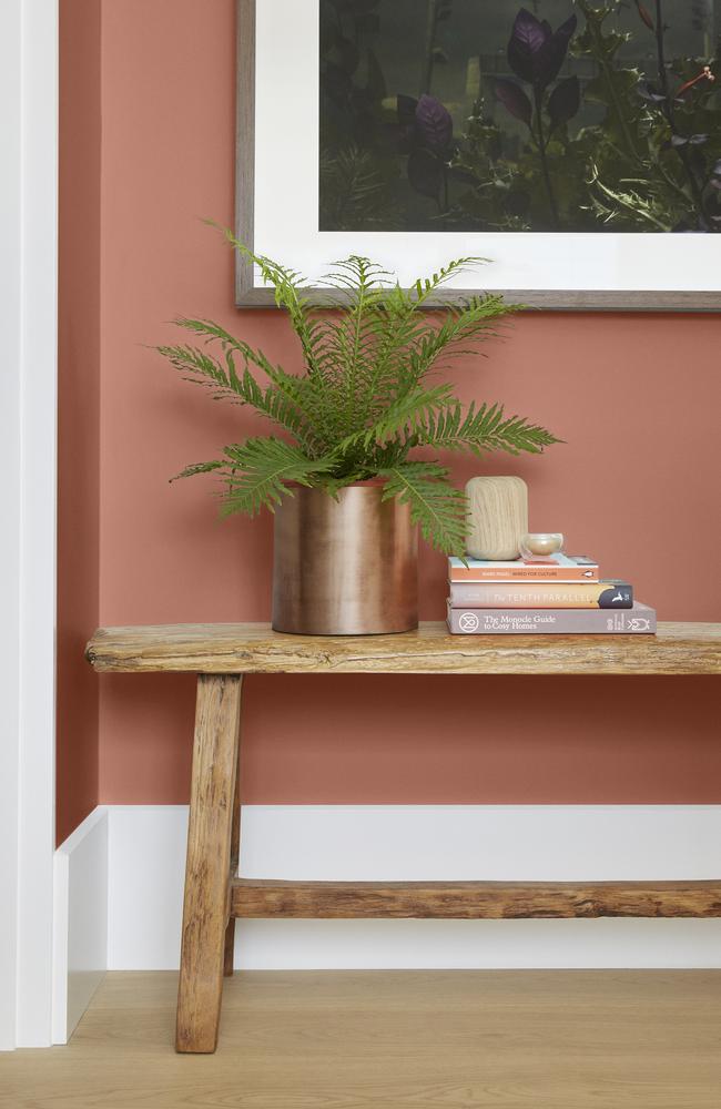
Wattyl’s Ms Stephenson said that the current gardening boom is having a lot to do with the terracotta influence in style trends.
“I think this is because of the way it can make you focus on the simple things and provide tactility and a hands-on activity that is meaningful,” she said.
“I think also because we’re becoming nervous of where our food products come from, and homegrown is the ultimate it nurture and organically grown. “With this sustainable way of living becoming so popular, we’re seeing plants move inside the home and the colour palette taking on the shades of foliage and terracotta.”
BLACK FLAMES ON FIRE
The Taubmans 2018 colour of the year has just been announced a ‘Black Flame’ — and brand manager Fiona King said the dark shade represented a confident homeowner.
“Taubmans is predicting a trend for simpler interiors starting this spring and continuing into 2018 — instead of a kaleidoscope of colours, simple and sharp palettes with contrasting blacks and whites will dominate,” Ms King said.
“A perfect example of an on-trend shade is Taubmans 2018 colour of the year, Black Flame.
“A statement-making black, infused with an undertone of the deepest indigo to create an unashamedly chameleon-like colour, a trend which Taubmans is noticing develop as consumers become more colour-confident.
“Black Flame is the perfect base for textured and aged leathers, paired with tans to create a rich look that works in a multitude of environments.
“Using Black Flame with blonde and walnut timbers will add contrast, whereas rose gold and black and white accents will give a contemporary feel.”
THE BEIGE AND THE BEAUTIFUL
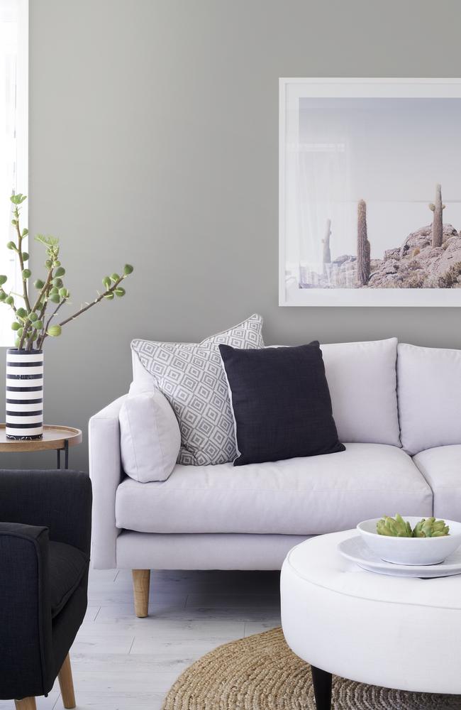
The use of beige, all too often accented with deep browns, used to make many interiors look tired. But teaming beige with soft greys and greenery really brings it to life, if you ask Taubmans brand ambassador Shaynna Blaze.
“Beige is also a very flexible colour — try adding more bold touches of navy and black for a really dramatic take on colour schemes that used to send you to sleep,” she said.
“Some of Taubmans best beiges are Fossil Find, Taupe Stone, Tenacity and Portland Stone.
“Grey is also a chameleon and will take on aspects of the colours around it, so work with grey as a texture rather than a feature.
“Select a grey that has a warm undertone, such as Taubmans Stormy Shadow, add tones like Whisper White, then layer with oak timbers and softly accented accessories to bring a sense of calm to a room.”
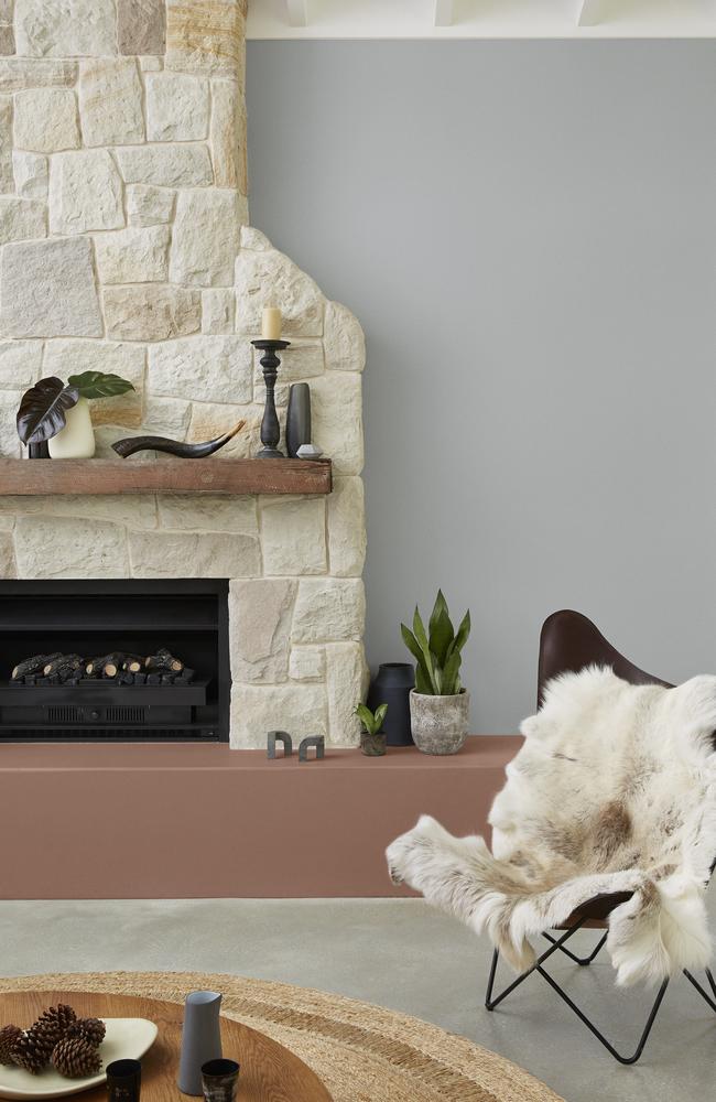
PERFECT PINKS
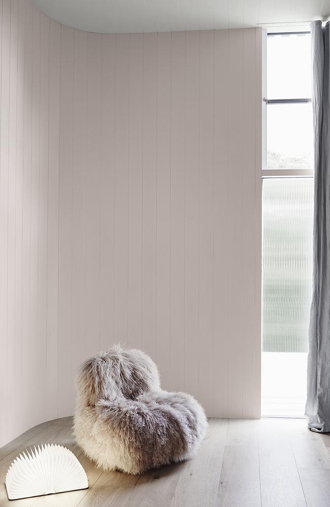
For tranquillity, peace and subtle warmth, Dulux colour expert Andrea Lucena-Orr said ‘Mornington Half’ was her top pick.
“I feel Dulux Mornington Half will be increasing in popularity as we are seeing so much more in the millennial pink arena, which this perfectly falls into with the subtle neutral pink tones,” she said.
“These soft pinks are so easy to scheme with, and as greys and greiges are becoming more popular, these pinks scheme so beautifully with these shades. “They are not restricted to one area of the home as they are so neutral, and pinks are so welcoming and inviting in a home.
“I adore this image as it exudes tranquillity and peace.
“The subtle warmth of the neutral pink, Dulux Mornington Half, along with the soft grey, Dulux Terrace White, creates the perfect balance in this space.
“You can just imagine snuggling up in this chair with a great book.”
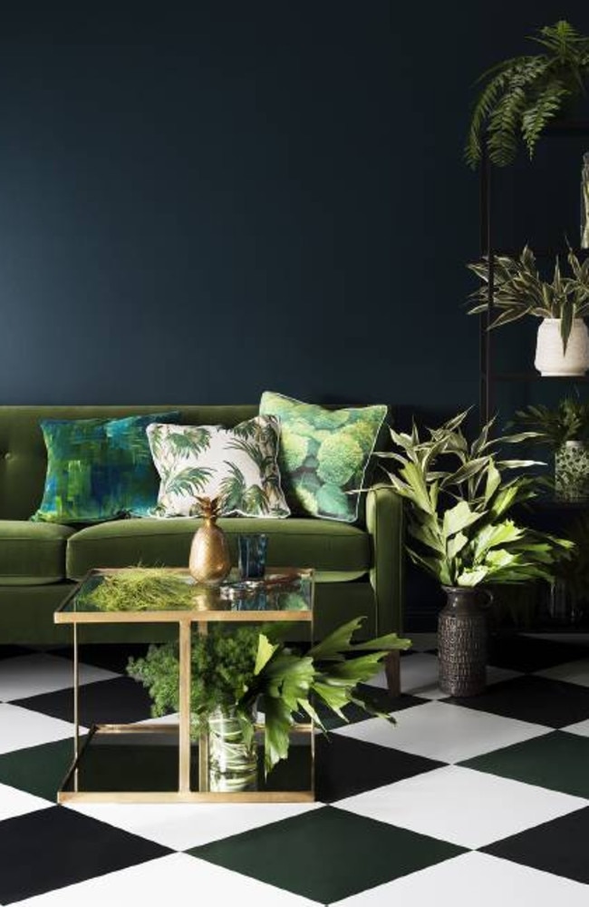
MAKE THE NEIGHBOURS GREEN WITH ENVY
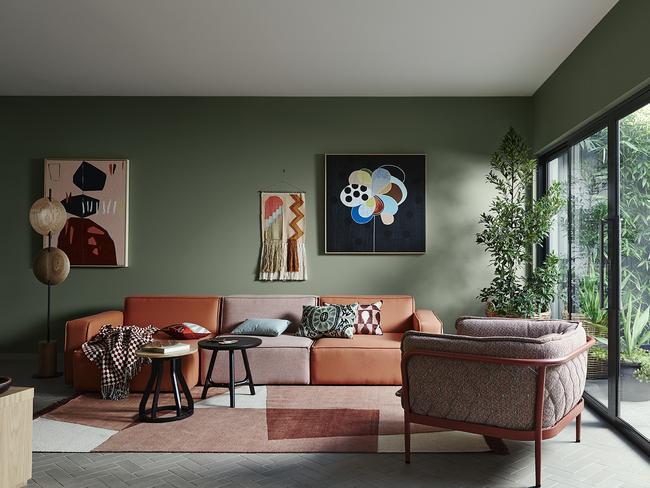
Ms Lucena-Orr said an emerging trend for 2018 is from the ‘Escapade’ palette, reminiscent of a bright, sun-drenched scene straight out of Palm Springs.
“From the Dulux Kinship Palette my pick is Dulux Herbalist,” Ms Lucena-Orr told news.com.au
“The green, Dulux Herbalist, is perfect for creating a restful and relaxed atmosphere.
“Colour trends continually evolve from year to year and one of the emerging trends we saw in this 2018 report is the Escapade Palette.
“We saw a glimmer of this theme last year, but this trend really stepped up this year significantly with the vibrant colours and botanical prints reminiscent of sun-drenched Miami and Palm Springs.
“A colour, Dulux Goyder Green, was seen in many installations in the Milan Design fair this year, which is quite new and one we’ve not seen in years.
“Colour inspiration comes from a variety of influences — fashion, media, trending TV programs like Game of Thrones, key news events, political environment, financial position, technological advances, new design and designers.
“Our palettes factor in the underlying insights from many key international sources.”

$19 Kmart item shaking up beige trend
Kmart’s newest collection proves that a once boring trend is now on its way out thanks to an “unexpected” new addition.

‘Need’: $6 Kmart item quickly selling out
A $6 item from one of Australia’s biggest budget retailers is quickly selling out due to its popularity.

If you have this in your home, you’re old
Kmart reckons a divisive trend popular among older Aussies is “here to stay”, despite it’s confronting ability to expose our age.