
Map of world’s leading countries shows huge hole over part of Australia – and that’s a worry
It’s a map showing only the world’s leading countries and, yes, Australia is on there. But a closer look reveals a giant, gaping hole.

It’s a map of the leading countries in the world and, as you might expect, Australia is featured.
Alongside Australia are many nations with similar GDPs and political systems – there’s Britain, the US and Canada, Germany, France and Japan.
But look closer and there’s something very odd about Australia on the map – it’s missing a chunk. A 1.421 million metre square chunk called the Northern Territory in fact.
The map starkly highlights a massive divide in Australia that consecutive governments have yet to close.
The image, posted onto website Reddit, was shared on Twitter by Melbourne-based demographer and self-declared “data and map lover” Simon Kuestenmacher. It has subsequently been shared a further 4000 times.
It shows only those parts of the world with a life expectancy of around 80 years or more.
Vast stretches of the world are simply missing. Africa is totally absent, as is Russia and the majority of Eastern Europe, South and South East Asia.
Most Latin Americans are also unlikely to reach the age of 80 apart from residents of Chile and Uruguay and French Guiana, an overseas region of France.
But in one corner of the map are two long living standouts: Australia and New Zealand.
According to the Organisation for Economic Co-operation and Development (OECD), in 2017 Australians had an average life expectancy of 82.6 years. Men could expect to live to an average of 80.5 and women to 84.6 years.
That puts Australia in the top 10 longest lived nations.
This world map shows only the regions with an average life expectancy of over 80 years. Source: https://t.co/GJJnFjGtuj pic.twitter.com/0gQDk5yWmZ
— Simon Kuestenmacher (@simongerman600) December 1, 2019
But why the big hole where the Northern Territory should be?
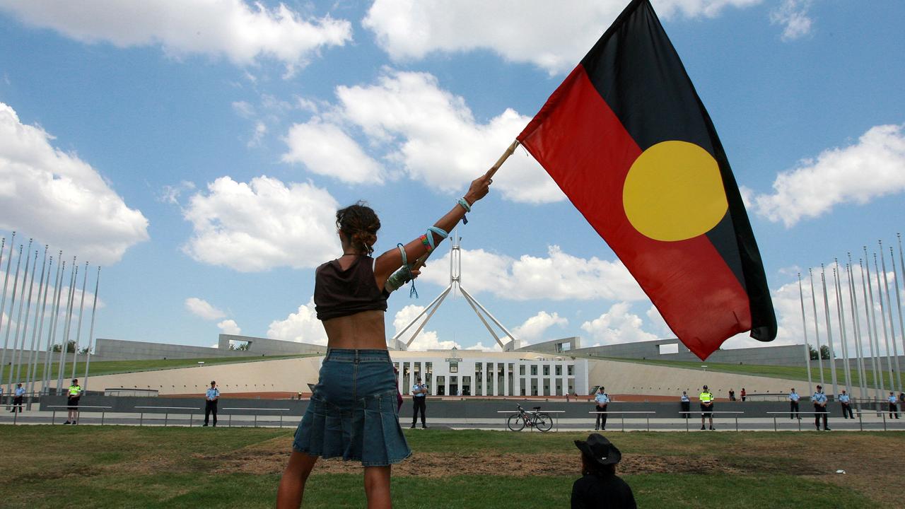
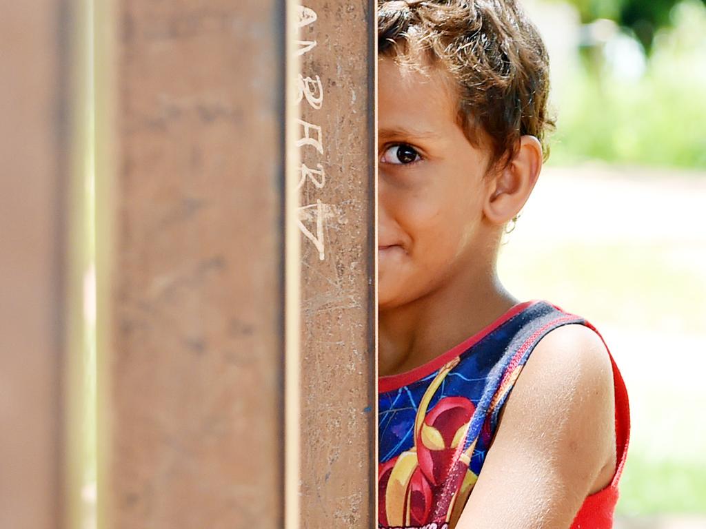
Because when you look at the life expectancy of just Aboriginal Australians, the average age of death drops dramatically.
According to figures from the Australian Bureau of Statistics (ABS), the life expectancy for the Aboriginal and Torres Strait Islander (ATSI) population is estimated to be almost nine years lower than that of the non-indigenous population for males, at 71.6, and around eight years for females, at 75.6.
Around 25 per cent of the NT’s 230,000 population are Aboriginal. Overall, the Territory’s life expectancy is only 78.7 years, four years lower than the Australian average and more on a par with Estonia, Poland, Turkey and the US.
In an analysis released late last year, ABS director of demography Anthony Grubb said even those low figures didn’t reveal the whole picture about how poorly Aboriginal Australians fare on the life expectancy ladder.
“Life expectancy within the ATSI population varied considerably, with the lowest life expectancy experienced by those living in the more remote parts of the country,” he said.
“Life expectancy at birth for ATSI people living in remote and very remote areas was 65.9 years for men and 69.6 years for women, while those living in major cities had the highest life expectancy – 72.1 years and 76.5 years for men and women respectively.”
Aboriginal people living in the Northern Territory and Western Australia had the lowest life expectancy estimates.
WHY THE DIFFERENCE?
In a 2016 report, the Australian Institute of Health and Welfare stated that disease, health behaviours such as smoking, social determinants such as education, income and employment and access to health services were all behind the lower life expectancy figures.
The difference is diminishing but it’s only “slight” said the ABS.
The Government’s Closing the Gap report into indigenous disadvantage has as a goal of eliminating the disparity in life expectancy among Australians by 2031.
It’s proving a struggle. There has been “significant improvements” in the indigenous mortality rate from circulatory diseases, a scorecard on the report has shown, but deaths from cancer are now rising.
Australia isn’t the only country with a disparity between its constituent parts. In Britain, the Scots have a lower life expectancy than the English, Welsh and Northern Irish.
It’s even more pronounced in the US. In the states surrounding major cities such as New York, Boston, Chicago and Seattle, as well as California and Florida, life expectancy is among the world’s best. Yet large areas of the southern US don’t come close to a life expectancy of 80.
A handful of parts of China make it onto the map including Shanghai, Beijing and Hong Kong, as do Taiwan and South Korea in the region. Cuba also has world-leading life expectancy
According to the OECD, the longest lived people in the world are the Japanese who can expect to reach more than 84 years of age. Spaniards reach a ripe old age of 83 to put them second followed by the Swiss, Italians, South Koreans, Norwegians and French.
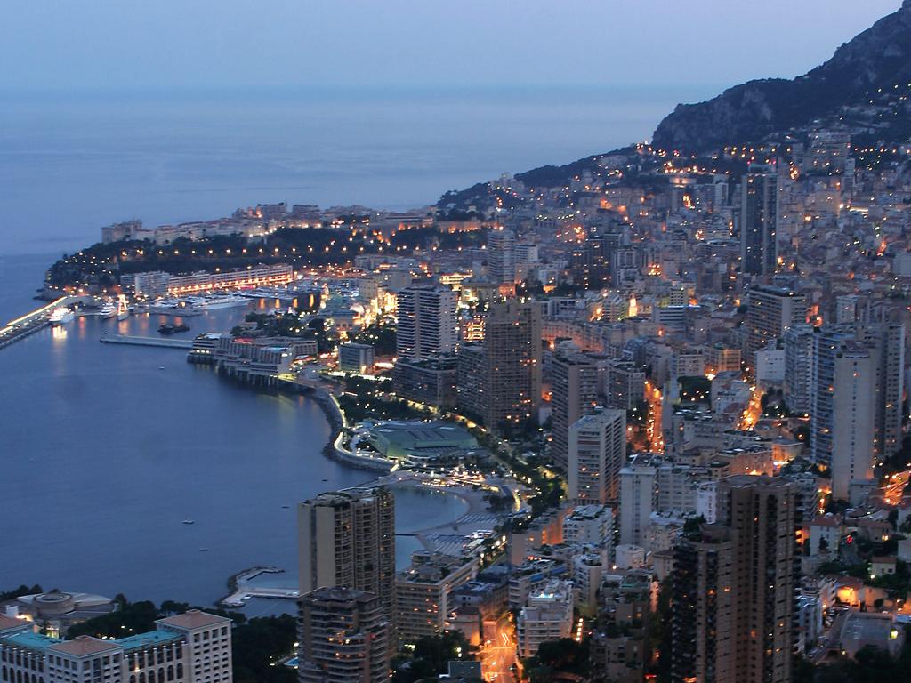
According to US figures, the people of Monaco live the longest. Residents of the tiny principality on the Mediterranean coast bordering France – known for its casinos and Grand Prix – live to a whopping 89.5 years.
It’s mostly African nations at the bottom of the unlucky life ladder. Residents of Chad, in the centre of the continent, barely make it above the age of 50 on average. The country has been besieged by natural disasters, poverty and war.

Cost of keeping bulk-billing clinics open
Bulk-billing GPs have walked away with more $2m in payroll tax rebates in just three months as part of a bold plan to keep clinics open.

‘Oh s**t’: 20yo dies instantly from party trick
A coroner wants change after a young mother of two died at her child’s birthday party from a common trick many wrongly believe is “harmless”.

‘Unhinged’: Scary TikTok trend exposed
Some influencers claim this one simple step could ease a lot of health issues, including bad breath and snoring – but is it safe?